SwiftUI can help us create high-resolution, interactive user interfaces quickly and easily. In this tutorial series, we’ll build a simple SwiftUI prototype for a news app.
Posts in this series:
- Part 1: Project Setup
- Part 2: Category Card View
- Part 3: Categories List
- Part 4: Dynamic Categories & Navigation
- Part 5: Profile View
Here’s how our prototype will look at the end of our journey.

We’ll start by building a Categories tab that we can use to navigate to individual categories. We’ll then create a simple Profile tab through which we can access various settings.
Note: given that this tutorial is a basic introduction to prototyping in SwiftUI, we will not be developing any functionality or including any real data.
We’ll cover the following topics over five sections:
- Using Xcode
- Layout and styling
- Accommodating various display sizes
- Working with images and icons
- Basic navigation
- Using dynamic content in our views
Setup
We can start by creating a new Xcode project. Xcode is an IDE made by Apple for making iOS, watchOS, and macOS, apps.
Launch Xcode > Create a new Xcode project > Tabbed App
We’ll call our project NewsPrototype. You can use your name for the Organization
Name and Organization Identifier fields. Our language will be Swift and our User
Interface will be SwiftUI.

Leave all the check marks at the bottom unselected and save your new project wherever you’d like.
Let’s check out what Xcode has created for us. Open ContentView.swift in the Project Navigator (View > Navigators > Show Project Navigator) as well as the Canvas pane (Editor > Canvas).
We should now see a preview of our app in the Canvas pane. If you can’t see it, click Resume in the top right corner of the Canvas pane.
Let’s set our preview device to iPhone 11 Pro Max by changing our build target in the upper left of the Xcode window.
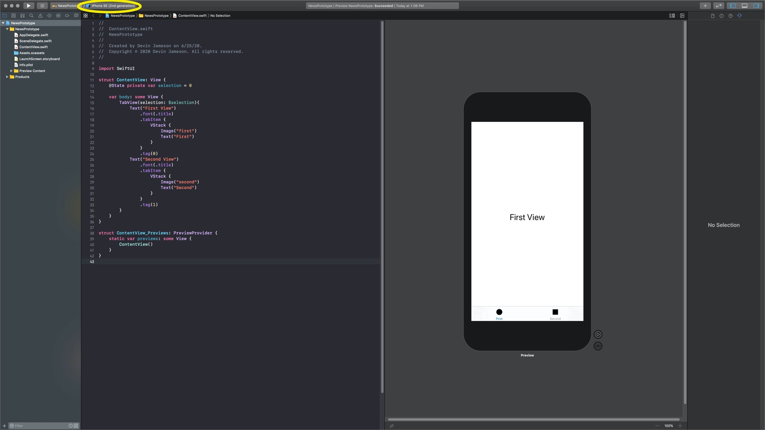
To enter Live Preview mode, click the play button to the bottom right of the iPhone. Then try clicking the tabs labeled First and Second to verify the preview is live.
Coding
Let’s get coding! Those tab bar icons could use some work. We can change them by
editing the images on line 20 and 29. Currently, these images are being pulled
from our Assets in Assets.xcassets. However, we want to pull these icons from
Apple’s icon library, SF Symbols. To do that, we’ll change "first" to
systemName: "globe" and "second" to systemName: "person".
TabView(selection: $selection){
    Text("First View")
        .font(.title)
        .tabItem {
            VStack {
                Image(systemName: "globe") // Use globe symbol
                Text("First")
            }
    }
    .tag(0)
    Text("Second View")
        .font(.title)
        .tabItem {
            VStack {
                Image(systemName: "person") // Use person symbol
                Text("Second")
            }
    }
    .tag(1)
}
To see a full list of the symbols made available by Apple, download SF Symbols.
If our Live Preview is working, we should see our icons update right away.
Note: generally, we would use a tab view only with three or more tabs. However, we’ll use two tabs in this tutorial to keep things simple.
Let’s go ahead and change those tab names, too.
TabView(selection: $selection){
    Text("First View")
        .font(.title)
        .tabItem {
            VStack {
                Image(systemName: "globe")
                Text("Categories") // Update tab title
            }
    }
    .tag(0)
    Text("Second View")
        .font(.title)
        .tabItem {
            VStack {
                Image(systemName: "person")
                Text("Profile") // Update tab title
            }
    }
    .tag(1)
}

Pro-tip: if your indentation gets wacky, just highlight the relevant lines and press Control+I to re-indent them.
If your Live Preview stops updating, restart it by clicking Resume in the top right of the Canvas pane.
See you for Part Two, in which we’ll starting building our Category view.