Choosing how to position an element in CSS is sometimes really a choice about what side effects are most acceptable.
Positioning layouts in CSS was once a very daunting task, and hacks like using tables for the entire layout were quite common. Over the years, the demand for better layout tools has led to steadily better support and techniques.
Today we have options, and learning to manage each of these techniques is the key to creating complex layouts that remain easy to change and flexible enough to handle multiple screen sizes.
Table of contents
Grid
Grid is the newest way to create layouts on the web. It is a powerful set of rules that allow you to position elements on a vertical and horizontal plane.
Unlike flexbox, grid should be used for larger page layout. Flexbox can, and should, be placed inside of a grid layout to help position the components a grid layout contains. Browser support for grid is great as well!
There are a lot of properties and functions to learn in order to implement grid, but once put in place it does wonders for keeping your layouts flexible and maintainable.
Here’s how to start with a grid layout on your page:
<body>
  <header></header>
  <nav></nav>
  <main></main>
  <footer></footer>
</body>
body {
  display: grid;
}
That’s it! You won’t see any visual changes just yet with this setup because, unlike
flexbox, the default layout direction is by row (meaning items are stacked
vertically on top of each other). But you’ve made an important step in setting up
your new grid layout — all the first-level child elements of body are now grid
items! You can now control their position, alignment, and widths with a few more
declarations.
Set your grid tracks with column and row templates
grid-template-rows and grid-template-columns are properties that explicitly
define the track sizing of grid items horizontally (column) or vertically (row).
You can define just one direction or both! You can define the size of each grid item
with a variety of measurement units. The order of values in the grid are applied
respectively to the order of elements in the DOM within the grid container (e.g. in
the example below, if the first element in the body is header, it will get a row
height of 100px)
body {
  display: grid;
  grid-template-rows: 100px 5rem auto 30%;
}

You can create implicit grid columns and rows with grid-auto-rows and
grid-auto-columns which only require a single measurement value that will apply to
all direct child elements in the grid.
body {
  display: grid;
  grid-auto-rows: 30px;
}

Specify grid flow with auto flow
grid-auto-flow controls how items are automatically placed in the grid. This
property is much like flex-direction because it directs the automatic stacking of
items, vertically or horizontally. The default is row, but a value of column can be used so
items are placed next to each other along the horizontal axis. You can use
grid-auto-flow without setting sizes for template rows/columns if you’re simply
looking to change the stacking direction.
body {
  display: grid;
  grid-auto-flow: column;
}

Additionally, you can set a value of dense which aims to “fill in the holes” as
soon as possible in the grid. You can also specify the direction of density with
column dense or row dense. The caveat to using this value is that it may place
an item out of order in your grid in an attempt to take up any unused empty space.
body {
  display: grid;
  grid-auto-flow: row dense;
}
Use flexible sizing with the fractional unit
Grid also introduces a new unit called a fraction or fr. fr defines the
proportion an item should take up relative to its container (think cocktail-mixing:
7 parts gin and 1 part dry vermouth to make a martini). In the below example, the
first two grid items will take up equal proportions, while the third item will take
up three times the size as the first two; the last item will be the same size as the
first two items.
body {
  display: grid;
  grid-template-rows: 1fr 1fr 3fr 1fr;
}

Draw your grid in CSS with template areas
grid-template-areas assigns names to grid cells that can be referenced in child
elements to place them on the grid. The cool thing about grid areas is that you’re
sort of drawing your grid with a declaration (this also makes for amazingly simple
media queries). Each separate string (within each quote block) represents a
distinct row; each item within that string represents a distinct column. You can
spread an item across multiple columns or rows by repeating the name (the cells must
form into a rectangular shape; you cannot disjoint them). This method of naming grid
areas is handy when dealing with high-level page layout for readability in a
complex quilt of elements.
body {
  display: grid;
  grid-template-areas:
    "head head"
    "nav main"
    "foot foot";
}
The template areas defined above need to correspond with particular elements by
using the grid-area property.
header {
  grid-area: head;
}

nav {
  grid-area: nav;
}

main {
  grid-area: main;
}

footer {
  grid-area: foot;
}

Adding a period within a row string tells the browser to render an empty cell.
body {
  display: grid;
  grid-template-areas:
    "head ."
    "nav main"
    "nav foot";
}

Grid items can be organized in any order. But be wary of accessibility issues with totally reordering DOM elements as it can be a frustrating experience with screen readers and tabbing.
body {
  display: grid;
  grid-template-areas:
    "foot . ."
    "main nav nav"
    "head head head";
}
Apply template patterns with the repeat function
If you would like to create a measurement pattern for your grid items (without writing out the same value over and over again), you can use the repeat function. This function takes two arguments: number of repetitions and width/height of each column or row. In the below example each grid row will take up equal height over 3 columns. This will also define the wrapping of elements in your grid.
body {
  display: grid;
  grid-template-columns: repeat(4, 1fr);
}

A repeat pattern can also take multiple measurement values to define a more complex pattern.
body {
  display: grid;
  grid-template-columns: repeat(2, 100px 1fr);
}

It’s also important to note that grid has also introduced other useful functions such as minmax and fit-content.
Create gutters in a grid with the gap property
Perhaps the most exciting property now available to us is gap (earlier specified as grid-gap),
which sets the gutters or gaps between rows and columns. Before this handy feature existed, setting
gutters was an arduous task requiring negative margins and precise-width
calculations.
gap is shorthand for row-gap and column-gap and takes most any
measurement value. Writing a single value applies the same gap to both rows and
columns; writing 2 separate values next to each other applies each gap to rows and
columns respectively. If you’d only like to specify a gap to either the columns or
the rows, use row-gap or column-gap with one value.
This property also works with flexbox and multi-column layouts.
body {
  display: grid;
  grid-auto-rows: 30px;
  grid-gap: 2rem;
}

Specify element locations with grid column and row
Not all grid positioning has to be done within the parent element; child elements
take a few properties for greater control. grid-area is used to define the
position of an element when using grid-template-area.
If your grid is drawn with template or auto rows/columns, you can
precisely position items onto specific grid lines. To do this you can use the
grid-column and/or grid-row properties. These are shorthand for
grid-[column/row]-start and grid-[column/row]-end, separated by a slash (e.g.
grid-column: grid-column-start / grid-column-end).
It’s important to note that grid lines start and end on the outer container and are numbered starting with 1. For example, a grid with 6 columns will have 7 grid lines.
body {
  display: grid;
  grid-template-columns: repeat(6, 1fr);
}

header {
  grid-column: 2 / 4;
}

We can also tell a grid item to spread itself across a certain number of columns or
rows with span
.grid {
  display: grid;
  grid-template-columns: repeat(6, 1fr);
}

header {
  grid-column: span 3;
}

Position items along an axis with self-alignment
In the flexbox section, we’ll discuss parent alignment with align-content,
justify-content, align-items and justify-items (which also apply to grid).
Now, we can apply some similar properties to the child elements themselves with
align-self and justify-self. Both take string values such as center start
and end. Align-self aligns on the block axis, while justify-self aligns on
the inline axis. Alignment takes the amount of space the content inside the grid item
takes up and places it accordingly.
body {
  display: grid;
  height: 100vh;
}

footer {
  align-self: end;
}

If you want to simplify even more, you can use the shorthand property
place-self, which sets align-self and justify-self respectively. You can use
two values to place an item, or one value that is applied to both properties. This
makes centering a breeze.
body {
  display: grid;
  height: 100vh;
}

main {
  place-self: center;
}

Design complex layouts with subgrid
The newest Grid feature (with excellent browser support) is subgrid. subgrid is a value you can apply to the child of a grid element that
allows it to inherit the tracks (rows and columns) along with the gaps from its parent. Previously, you would have to redefine the same column and row measurements for any children if you wanted to nest more grids.
It’s a pretty powerful layout tool that allows you to consistently align elements without having to overly define its location.
The best part? You can keep nesting your subgrids (as long as each parent is a grid item). You can also target the grid track names of a parent with subgrid.
<main>
  <section>
    <aside></aside>
  </section>
</main>
main {
  display: grid;
  grid-template-columns: 1fr 3fr 1fr 1fr;
  grid-template-rows: repeat(4, 10vh);
}

section {
  display: grid;
  grid-column: 2 / 4;
  grid-row: 1 / 4;
  grid-template-columns: subgrid;
  grid-template-rows: subgrid;
}

aside {
  grid-column: 3 / 4;
  grid-row: 1 / 3;
}

Flexbox
A good way to handle elements of variable sizes is to use the new flexbox properties introduced in CSS3.1. This gives us a lot more options to control layout and has solved some of the long-standing problems in CSS.
Flexbox is such a powerful tool and replaces so many other hacky solutions, so it is worth taking the time to understand how to use it.
Let’s jump in. Here is how to set up an element to use flexbox.
<div class="container">
  <div class="item"></div>
  <div class="item"></div>
  <div class="item"></div>
  <div class="item"></div>
</div>
.container {
  display: flex;
  flex-direction: row;
}
Setting the container to display: flex simply lets the browser know that we
intend the children to use flexbox for their layout. Then we add
flex-direction: row to the children to align them horizontally, and by
default they will be the same width unless they have a width set.
Determine flow with flex-direction
flex-direction allows you to specify whether your elements should be arranged
vertically or horizontally. By default, the value will be row, which simply
arranges you items horizontally. You can also use column to switch to a
vertical orientation.
.container {
  display: flex;
  flex-direction: row;
}

Keep in mind that using column may affect how the other flexbox properties
look on your items, and for simplicity we will mostly be talking about
horizontal items because that is by far the most common use-case, but keep in
mind that this other direction option does exist.
Overflow elements with flex-wrap
flex-wrap defines whether elements should be forced to fit in a single line
(no-wrap, the default behavior) or allowed to maintain their normal size with
wrap. Most of the time you will want the default behavior, but overriding
this property will let you use flexbox’s other properties without affecting the
widths.
.container {
  display: flex;
  flex-wrap: wrap;
}

When set to no-wrap, elements will still be sized proportional to each other.
For instance, imagine items in a list are set to be 100px wide, except for
the last one which is 200px. The items will resize to fit the container, but
the last item will still be twice as wide as the others.
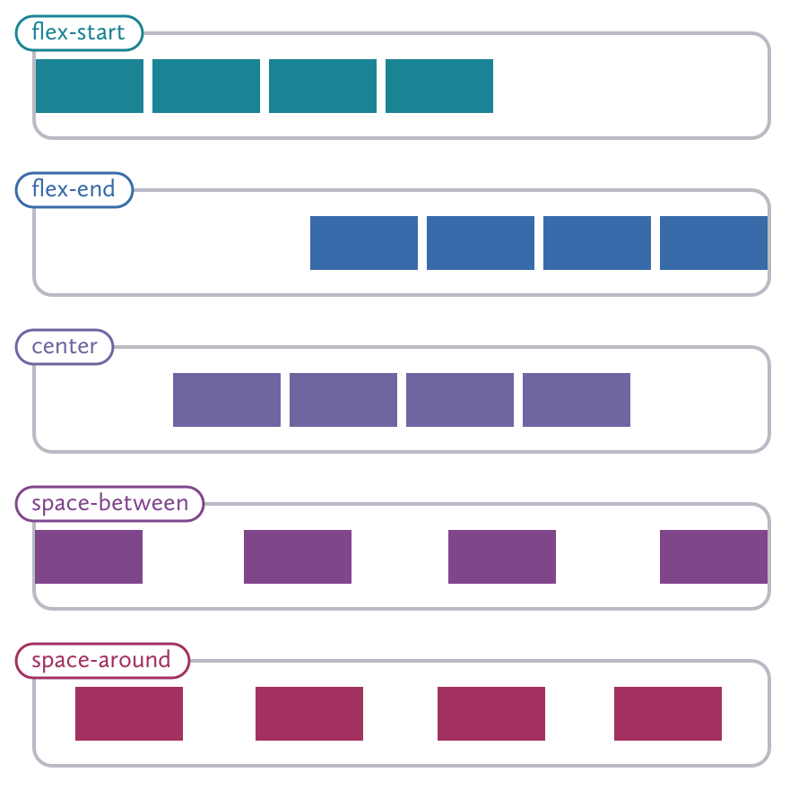
Space out elements with justify-content
justify-content determines how to space your content in your row or column.
The default value is flex-start, which will left align your items. Naturally,
we also have flex-end to right align the items and center to center them.
Things get more interesting with space-between, which give equal spacing
between items but not on the ends, while space-around gives equal spacing to
the ends as well.
.container {
  display: flex;
  justify-content: center;
}
This is best used when the items have set widths (or have reached their maximum widths).
This can be really helpful when lining up your flexbox items to your grid, without relying on things like floats.
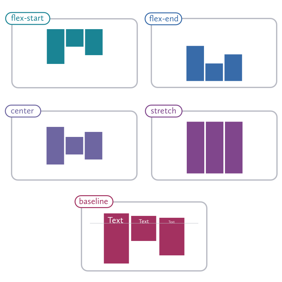
Space out elements with align-content
Align-content is similar to justify-content, but controls where the items
are on the cross axis. I say “other” because when you are using
flex-direction: row, then align-items is controlling the vertical
alignment, but when you are using flex-direction: column, it’s the other way
around.
You can align the items to the baseline of the text within each item by using
baseline. There is also an option to make each item span from one end of the
axis to the other with stretch.
.container {
  display: flex;
  align-items: center;
}
We can use align-items: stretch to solve the “equal height columns” problem
that has plagued CSS layouts since the beginning. You can also set both
justify-content and align-items to center to center your items in the
middle of your container, which is really helpful for things like hero areas
and splash pages.
There are several more properties that are used less often but that you might find useful.
Affect alignment of all child elements wiht align-items
align-items affects lines of content and where they should be within their
container. You can see below that the items in each line maintain their normal
heights (unless you are using stretch).
.container {
  display: flex;
  align-content: stretch;
}

Create gutters in a flex container with gap
Like grid, flexbox also use the gap property to create gutters in between elements. The usage is the same as grid and detailed in that section.
A few more properties
There are also a number of flexbox properties for the items in the container. These are quite a bit easier to understand than the parent properties and luckily, there is a useful shorthand that we can use to make this easier.
.list-item {
  flex: <flex-grow> <flex-shrink> <flex-basis>;
}
flex-grow: <integer>: This provides another way to give your flex items different widths. If you set all of your child elements toflex-grow: 1, but set the last child toflex-grow: 2, it will be twice as wide as its siblings.flex-shrink: <number>: Determines how the element will shrink when the container is not wide enough for the items to maintain their natural width. If the last element is set toflex-shrink: 2while its siblings are set toflex-shrink: 1, it will shrink twice as much as its siblings.flex-basis: <size>: What we should consider to the be natural size of the item. This can be thought of as the “breakpoint” at which the grow and shrink properties are triggered.
order controls the order in which the item appears in the container. Negative
numbers are accepted and will appear before what would normally be the first
element.
align-self has all of the same options as align-items, but lets you control
how individual elements are aligned. For instance, the siblings may be set to
flex-start, but you can chose an item to set to flex-end.
You probably won’t be using all of these together, but such a monstrosity would look like this:
.container {
  align-items: flex-start;
  display: flex;
  height: 40em;
}

.item {
  flex: 1 1 2em;
}

.item:nth-child(3) {
  align-self: flex-end;
  flex: 2 10 5em;
  order: -1;
}
Learning resources
Flexbox can be a hard thing to wrap your head around, especially if you are used to the quirks of traditional CSS layouts. Site like Codepen are a good way to learn is just to experiment and see what you can come up with.
If you aren’t sure how you would use flexbox in a real-world application, Solved by Flexbox is a great resource put together by Mozilla that features a lot of great practical ideas.
Position
Positioning gives us a completely different layout method. The default value
is static, and makes the element behave normally.
Using position: relative lets you specify an offset with top, bottom,
left, and right.
.logo {
  position: relative;
  left: 1em;
  top: 1em;
}
This can be useful to do a simple offset without using something like margin,
but it becomes really powerful when containing a child with
position:absolute.
Remove an item from the flow with absolute positioning
position: absolute bases the elements position relative to the nearest
parent element that has position: relative set. If it can’t find one, it will
be relative to the document.
.hero {
  position: relative;
}

.hero-icon {
  position: absolute;
  left: 20px;
  top: 10%;
}

Absolute positioning should not be used to lay out columns of content. Because
the elements are removed from the document flow, that means every time you add
content to one section, you may have to adjust the sizes of other sections by
hand, and it makes responsive design much more of a hassle than it needs to be.
Reserve absolute positioning for getting those small design elements exactly
where you want them to be. As a general rule, if an element can be simply
positioned using floats or a change to the display styles, it is probably
best to avoid absolute positioning.
Centering using absolute position
Something that can be very useful but stumps a lot of beginners is centering elements with absolute positioning. If your element has a set size, it’s just a matter of offsetting using margins. Let’s take the last example but center the icon both horizontally and vertically. To center an element using absolute positioning, just follow these steps:
- Add
left: 50%to the element that you want to center. You will notice that this aligns the left edge of the child element with the 50% line of the parent. - Add a negative left margin that is equal to half the width of the element. This moves us back onto the halfway mark.
- Next, we’ll do a similar process for the vertical axis. Add
top: 50%to the child - And then add a negative top margin equal to half its height.

This means that even though the container may change sizes, the centered element will stay right where we want it. The resulting CSS should look something like this:
.container {
  position: relative;
}

.centered-element {
  height: 100px;
  width: 100px;
  position: absolute;
  left: 50%;
  margin-left: -50px;
  top: 50%;
  margin-top: -50px;
}
Scroll elements with fixed positioning
position: fixed works like absolute, but is always relative to the
viewport rather than the document and will remain in place when the user
scrolls. This can make your app feel more like a native application, with a
fixed header or side navigation, or for any element you want
to keep in easy reach. Like absolute positioning, fixed elements will be
removed from the document flow, so you may need to add padding on an element
beneath them to make sure your other content will still be visible.
Create a sticky element within the document flow
position: sticky is the newest of the group (but still well-supported).
It’s a nice cross between relative and fixed position, however, it stays within
the document flow (meaning it maintains its margins, height, etc.). Using the directional
properties like top, bottom, left, and right allow
you to set a threshold at which point the element will “stick”.
Set up the layer order with z-index
The position property gives us the advantage of being able to specify the
z-index of our elements. If we go back to our metaphor of seeing elements as
pieces of paper, setting the z-index property allows us to specify whether
our paper is above or below the other pieces. A higher number will appear
above, and a higher number will appear below. You can also use a negative
number, which may make the element appear behind the parent (or even behind the
document entirely)! This can lead to a sort of arms race with higher and higher
numbers to ensure an element always sits on top. This can get pretty
unmanageable and it is better to use positioning and z-indexes conservatively.
Floats
When you style an element
with float: left, the following elements will reflow. The document flow is
just the order of the content and how the elements arrange themselves around
each other. If the floated element does not have a set width, it will collapse
to the width of the contents. If the following element is narrower than the
remaining space, it will move to the right. Keep in mind that elements set
to display: block will need to be given a set width or they will remain on
their own line.
You can prevent an element from reflowing by giving it a clear property in
your stylesheet. Options include clear: both, clear: left (which will still
allow reflowing following elements with float: right), and clear: right
(which does the opposite). You can also use clear: none to override the
default behavior.
Because floated children will cause their parent elements to collapse, you will
find yourself tempted to create new elements just to add clear: both and
prevent this behavior. While that does work, we want to keep our markup
semantic so this should be done just using CSS if possible. By using an
::after pseudo-element, you can create a clearfix:
  .container::after {
    clear: both;
    content: "";
    display: table;
  }
Using a preprocessor like Bourbon makes it easy to add this as a Sass mixin:
  .container {
    @include clearfix;
  }
Floats work best for large containers, but may not work so well for text
elements since it will be difficult to align. You may find that using
display:inline-block is better for these situations.