This post was originally published on the New Bamboo blog, before New Bamboo joined thoughtbot in London.
Flexboxes, a very recent addition to the CSS standard, allow you to leave the responsibility of arranging your layout to the browser. They have the additional benefit of simplifying your markup (no more wrapper elements), and reducing the dependency on JavaScript to arrange your UI independent of the ordering of the DOM.
More to the point, you can leave your CSS grid frameworks (960.gs, Semantic Grid, Frameless Grid, part of Twitter Bootstrap) at the door, because flexboxes obviate the need to create complex arrangements of rows, columns, and what is basically a noodle-soup of wrappers and divs and all manner of things that really have nothing to do with the actual content you care about.
With that in mind, I want to explore the sort of things you can do in combination with responsive design and minimal markup, and a calendar seems a good thing to try out!
Also note that, at the time of writing, this won’t appear correctly in anything except Firefox 29+ (Aurora channel), Google Chrome, or IE 11, so be sure to have a nosey in one of those browsers to get the full benefit of these examples.
See the Pen JjfAv by Lee Machin (@ljm) on CodePen.
Creating the list
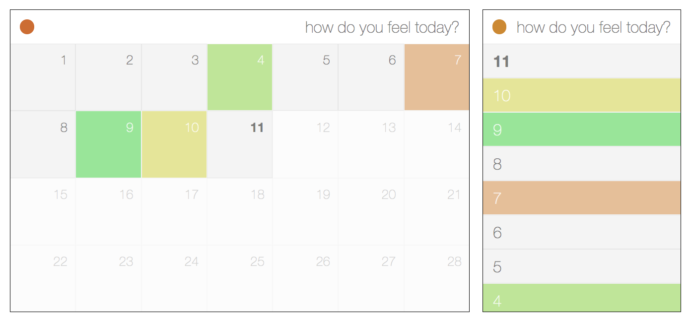
This calendar was designed with mobile-first responsiveness in mind, which basically means you write CSS to cater for the smallest display first and then add media queries when the design no longer appears to be functional. In this case, I started off with a simple list and then turned it into a grid when it started to look bad.
This is what I started off with. Flick between the HTML and CSS tabs to see what exactly is happening.
See the Pen FIklg by Lee Machin (@ljm) on CodePen.
The first thing you may have noticed is that the days are arranged in ascending
order in the markup; but the order is reversed when displayed. It doesn’t make
sense to have the current day right at the bottom of the page, and by specifying
the flex-direction, we can control whether the elements stack on top of each
other or float next to each other, and if they do it in reverse or in the order
the markup defines.
The cells themselves aren’t much more complicated. We just want to make sure
that the text is vertically centred, which we do by setting align-items to
center; and then we horizontally align the text to the left with
justify-content. Be aware that alignments can change behaviour depending on
the flex-direction you set. justify-content follows the direction (left to
right by default), and align-items runs perpendicular to it. So, if
justify-content aligns horizontally, align-items will align vertically. Also
note that flex-start and flex-end don’t always refer to left and right,
but also top and bottom, and also the reverse of each. It all depends on
the direction of flow.
Flexboxes don’t wrap by default, so the list still looks and appears to behave like a list element, and we haven’t had to add any markup to get the alignment right. But what about the grid view for larger screens?
Scaling it up
See the Pen JjfAv by Lee Machin (@ljm) on CodePen.
Not a great deal has changed. The elements within the calendar now flow from
left to right, and the flex-wrap property is set to wrap, so they flow
across multiple lines, pretty much like how floated elements work.
The cells are no longer full-width, and we want to show seven of them on each
row. Normally this would be achieved through judicious usage of margin,
padding, width, and maybe even some extra markup. All we need to use,
though, is flex-basis, which allows us to set the size of a cell. In this
case, it’s the width, since the flex-direction is row, and the cells flow
from left to right. The end result is that we have four or five rows of cells
that are fluid with the width of the page, but there is still valuable
real-estate at the bottom. We don’t need flexboxes to fix that, but we do need
to make sure that the page completely fills the viewport.
Finishing touches
We know that most months in the Gregorian calendar are just over four weeks
long on average, with the exception of February outside of a Leap Year, which is
exactly four weeks long. Setting the height, then, is as simple as knowing how
many weeks there are. For a typical February, that’s 25% (1/4), and for
every other month it’s 20% (1/5), because we round up.
Is that it!?
This is by no means the most complicated example of an automatic layout, and it’s not exactly impossible to pull off in older, cross browser compatible CSS. To think about it purely in those terms, though, is to completely miss the point. You could do a lot more complex things, but the simple stuff is even simpler. It requires practically none of the thought that other approaches demand, where you have to mysteriously twiddle digits (with to-the-pixel precision) until your layout behaves correctly.
It took a few lines of CSS and one ordered list to create a responsive calendar that re-orders and shape-shifts to best fit the display, and the rest was all in the name of prettiness and UX. I don’t want to think about what I would have had to do without that, or how much more inconvenient it would have been.
If you want to see what else you can do with flexboxes, be sure to point your browser to Solved by Flexbox. It contains some examples of more complex things (such as grids and vertical alignment) made simple.
Flexboxes, in a word, are fantastic.