My husband and I recently leased a new car, a Hyundai IONIQ. This is my first time driving a fully electric vehicle and also my first time in a car with such a gigantic touchscreen dashboard display. It feels futuristic, a far cry from my 2010 Ford Taurus.
A few months into driving it, I encountered a notification on the dashboard. A big orange-outlined circle with a coffee cup icon and the words “Consider taking a break”. I had no idea what that meant. Had I been driving for too long and the car was suggesting I make a pit stop to stretch my legs? Was I going over the speed limit? Did I miss a turn? After a bit of research, I learned it was part of a driver attention system, detecting “irregular behavior” such as drifting out of your lane or not adjusting the steering wheel for a certain period of time. These behaviors may signify fatigue or distraction, thus the nudge (and the coffee cup).
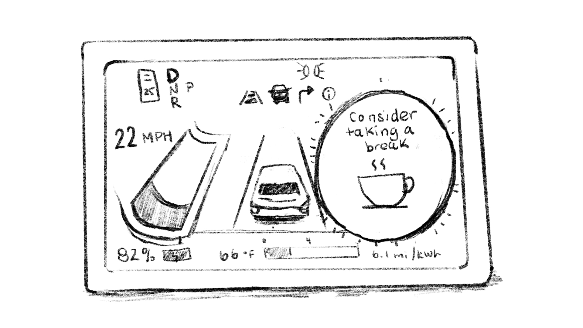
But was I tired or distracted? No. I don’t always stay within my lane, especially during Spring season in New England, where I have to narrowly avoid potholes every ¼ mile. I’m less annoyed about it notifying me (and the irony of it needing me to look away from the road to tell me to pay attention). I’m annoyed because of the condescending tone and the fact that I had to do some digging to find out why my car was sending me this message. Can’t you just tell me “stay in your lane”? Why tiptoe around it, especially when coming from a car and not a person?
Condescending or snarky UI copy isn’t a new concept. And I get it – as a business you want to come across more human, which sometimes means adding in humor or culturally relevant conversation patterns. But if that language obfuscates my understanding of the user experience or how to proceed, I’m going to leave very annoyed and not very amused.
A few other examples I’ve encountered in the wild:
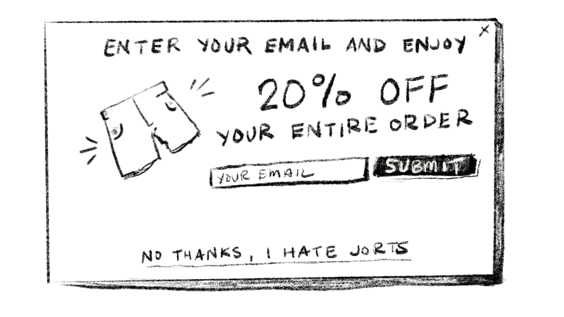
Confirmshaming
Confirmshaming aims to guilt you into opting in (or not opting out) of something. Instead of a “No thanks” or “Cancel” button in some type of upsell modal, you’ll get words like “I don’t want to save 20% on the world’s best mystery mayonnaise” or “No, I’m fine with losing customers”.
The undertone: You are naive about our offerings and are passing up something good.
Paused reminders
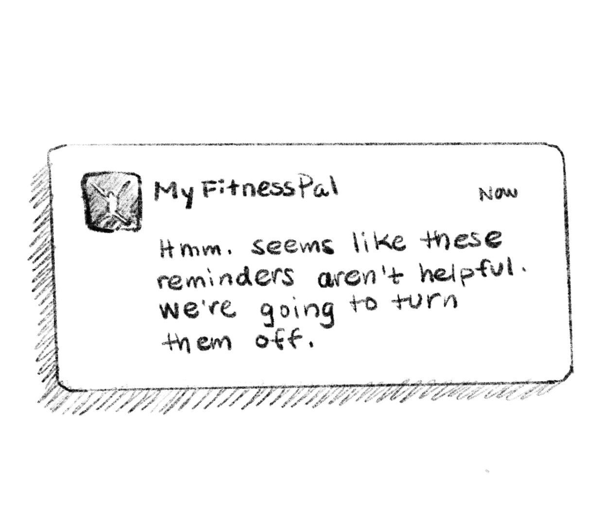
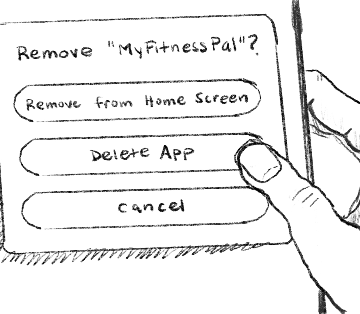
Apps like Duolingo and MyFitnessPal engage users with streaks, goal setting, and overall regular logging of your activity. You’ll get reminders through a push notification saying “Hey do the thing you said you’d do” as a way to keep you accountable. Ignore it for long enough, however, and get a final notification telling you they don’t think these reminders are working out for you so they’ll stop sending them. On the surface it seems like a kind gesture, but wording like that was off-putting enough for me to rage delete both of those apps years ago (maybe they’ve changed their copy since!).
The undertone: You are lazy and we’ve given up on you.
Over-encouragement
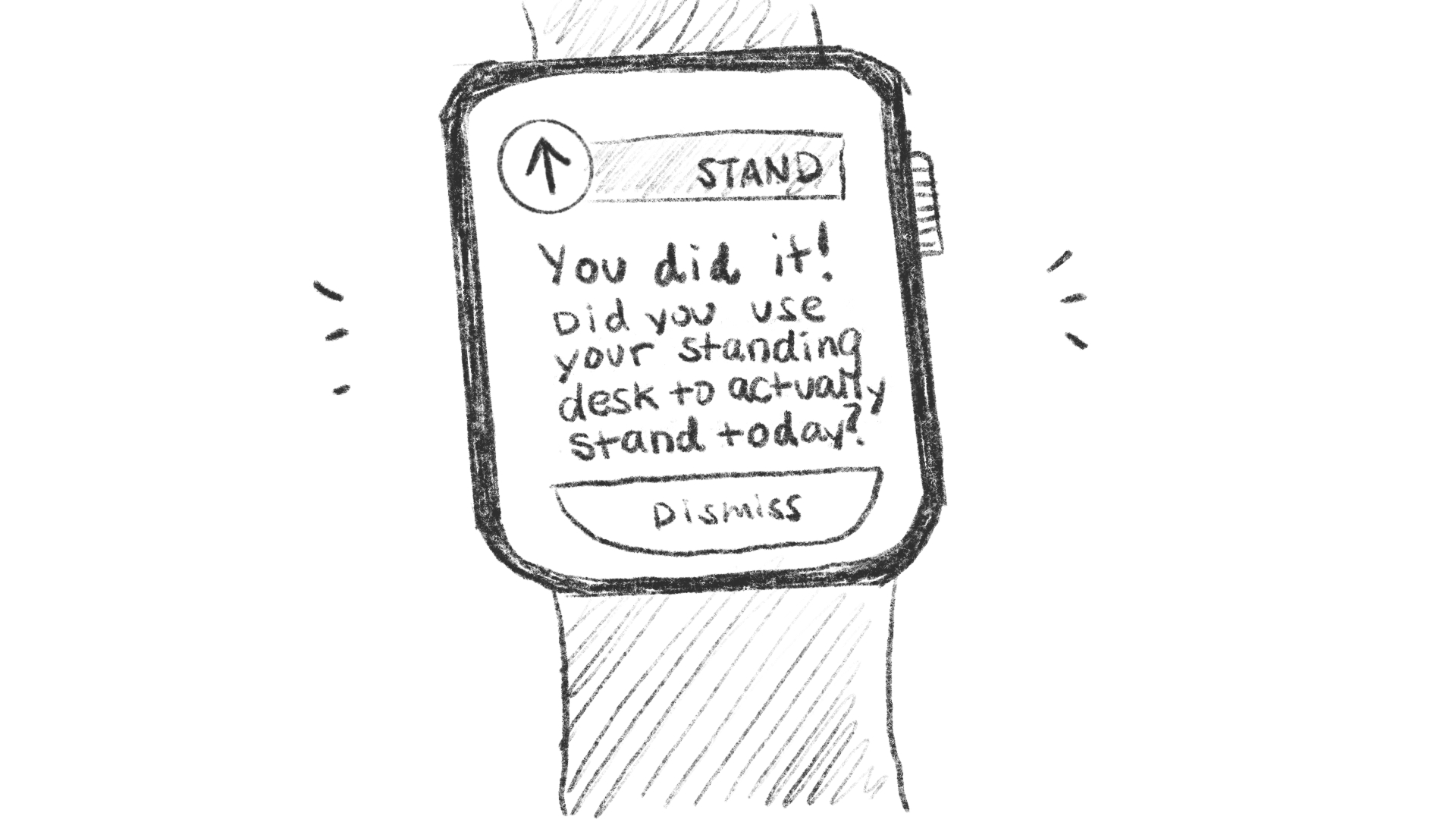
If you wear a smart watch and have notifications for various health trackers, you’ve probably been congratulated for simply walking around your house. Often they come through as encouraging, telling you how great you are for moving your body and taking 35% more steps than average. The reality is that unless you’re intentionally exercising, the messaging feels more like mockery. At that point, I’d prefer it to tell me I’m a disappointment.
The undertone: We are genuinely shocked you left the couch.
Logically I know the computers are not making a judgement about my opinions, behaviors, or abilities. But I do sometimes feel like my devices are snickering under their breath at what a dolt I am. And perhaps that is because I live in an area that is known for its candor and “kind but not nice” way of communicating. Brusk interactions like that can be off-putting or seemingly rude, but I much prefer it over polite sugar-coated messaging that lacks clarity.