Ensuring sufficient color contrast is essential for accessible UI design. While WCAG contrast guidelines define what’s required, it can be hard to know which color pairings meet the standard. Designers are often forced to break their flow to answer questions like, “Can this gray text be used on a white background?”
To help solve this, we built Contrast Description, a flexible Figma plugin that adds color contrast information directly into the Figma UI by adding descriptions to your color variables and styles with one click.
How it works
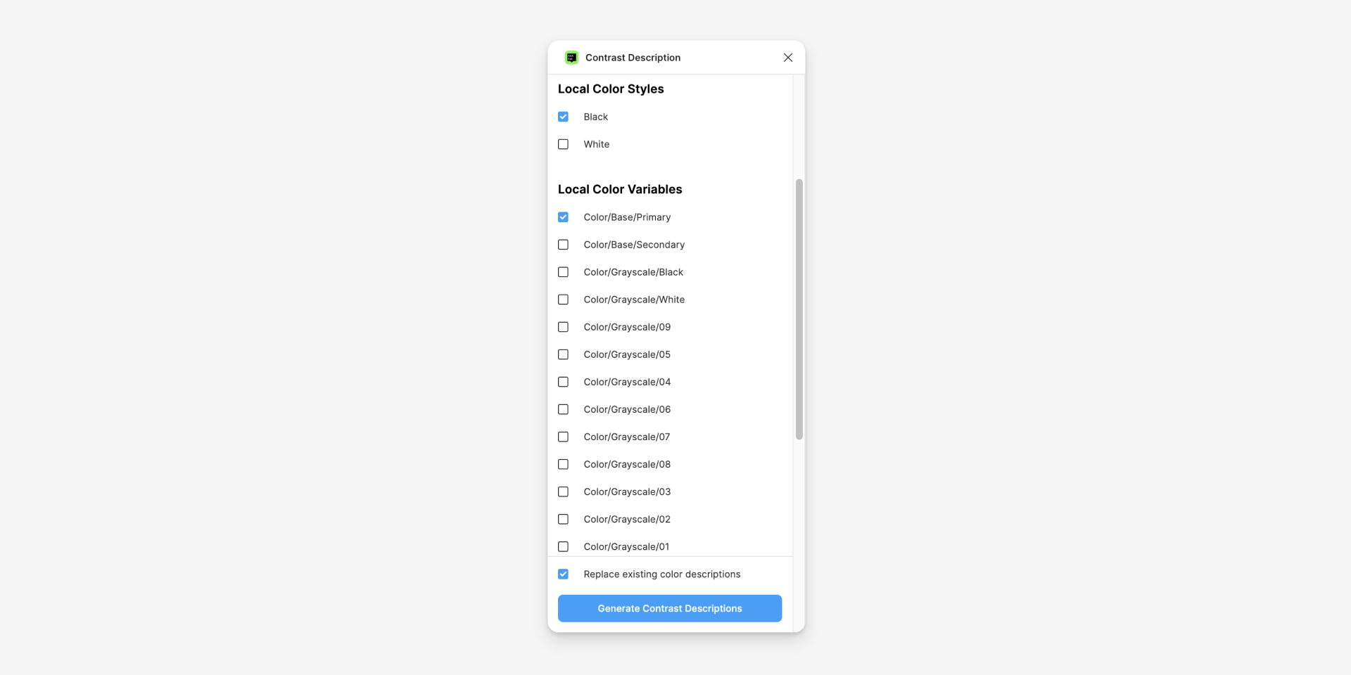
The plugin only needs to be run once. When you run the plugin, it asks which color styles or variables are used for text.
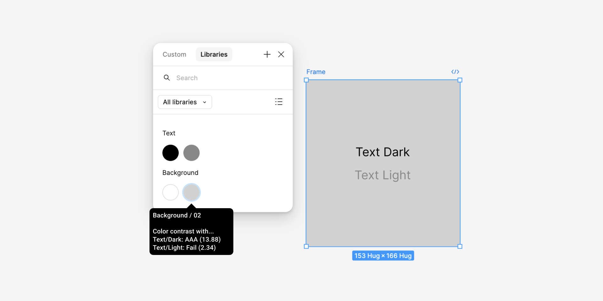
After running the plugin, accessibility color contrast information is added to the description of each local color style or variable. Anyone working in the file can now hover on a color swatch to see which color combinations are safe to use.
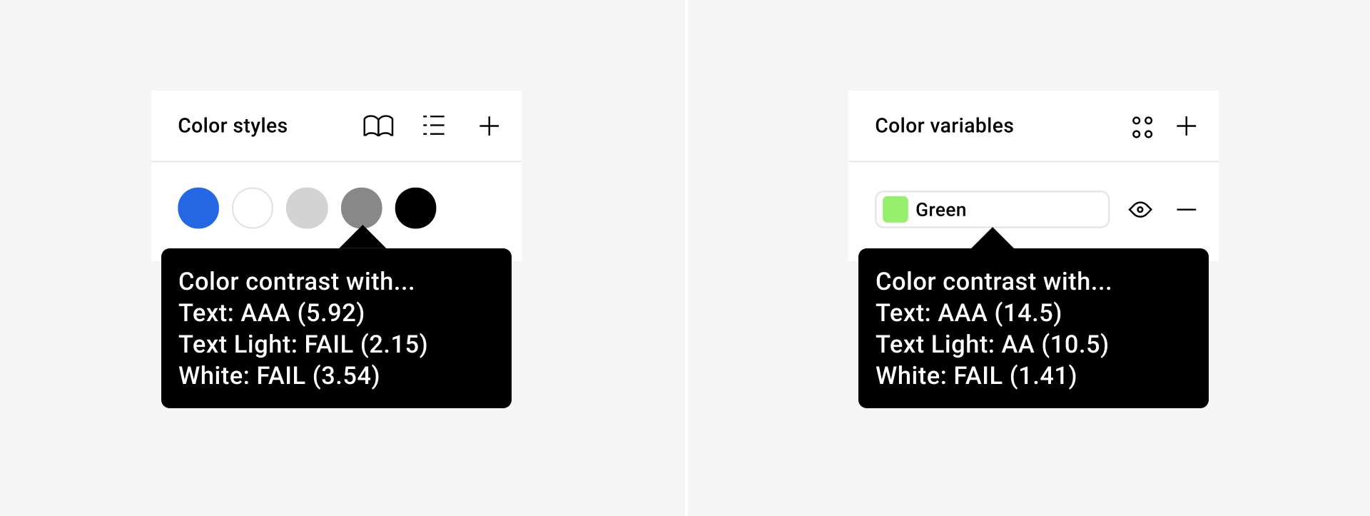
This makes it easier to follow color contrast guidelines while staying in your design flow.
Try it out
Check out the Contrast Description Plugin in the Figma Community and give it a try on your next project!
Note: we recently updated the plugin to support both Figma color styles and variables although there are some limitations for variables.