We had the pleasure of working both Groups Recover Together and Airrosti Remote Recovery, on new product initiatives as a result of the pandemic. In both cases, they were exploring technology as a means to maintain connection with their patients, successfully deliver remote care, and in the long-term, scale their business.
In both scenarios, there was a lot of domain knowledge and complexity to consider. Ensuring our team had a solid background of their business and current touchpoints, was critical as we began shaping our roadmap and prioritizing releases.
For the Groups Recover Together project, the first designer started their work with a single file. At the beginning, this single file was perfect since everything for the project was contained in one place. Collaboration was easy, changes could be made quickly with minimal friction, and there was plenty of space for exploring new ideas.
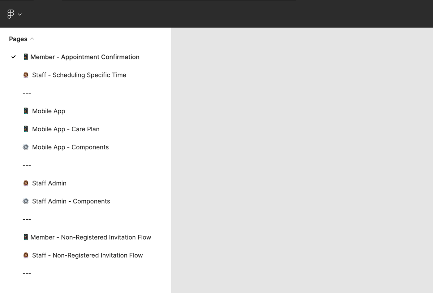
As the project evolved and more designers and developers joined the team, the single file quickly became unwieldy. Now the team was now working on multiple design flows with different requirements and different lead designers. Each flow lived on a separate page in the Figma file, but this didn’t allow us to provide a single source of truth for developers and still explore future changes.

We looked for ways to document our design work in a more useful and clear way and found success using Figma to support DesignOps.
Slow down to speed up
We made the decision that taking time to get organized would be worth it in the long run, and investing in improving our process would pay off down the line. We made space in our upcoming sprint to pause design work and focus on how we organized our files and the processes we followed that worked best for the full team.
We created separate files for each distinct experience along with a single design library file that housed shared colors, type styles, patterns, and components. This allowed the designers to continue their work in parallel while sharing common styles.
Each file also had a page for the “current” design that was referenced by developers, along with a variety of other pages that contained different design explorations. This approach gave developers the source of truth they needed while providing space for designers to explore ideas.

This worked up to a point until the list of explorations and future designs got out of hand. Again, the designers went back to the drawing board to design a solution to meet their changing needs.
The final solution utilized a single source of truth design file that reflected production along with separate files for design work that correlated to specific Jira tickets.

This system provided a lot of value for design work at a larger scale. Because each design ticket in Jira had its own file, a single link could be generated and stored in Jira so that it was easy for non-designers to find the files they needed to reference. As a ticket moved from design to development, the link remained the same and once the work was done, a designer could move the work from the exploration file to the main, source of truth file. Designers found this approach valuable since it gave clarity to the work that was currently being done while preserving a source of truth.
To help speed up the process, the design team created a template file for new explorations which contained everything needed to quickly explore a new idea.

Figma’s recently introduced branching for organization and enterprise accounts. This new feature could be used in a similar way, except that in those cases the entire design is copied over which can be a lot to take in when a designer is only working on a small part of the design. It also doesn’t work as well when there’s a desire to explore a very different direction from what has already been established.
Our Outcomes
Our designers approach organizing Figma with the mindset that as complexity grows, so should the level of organization. Putting too much time and effort into organization early on will only lead to more friction and repeat work, but if organization is introduced gradually as the project naturally grows, then it will provide increased returns in terms of saved time and effort.
With our components well documented and organized, the entire team was able to focus on their work, find the info they needed and successfully scale. For the Designers specifically having this level of detail documented, allowed their designs to reach a higher fidelity sooner.
Design Systems, and well organized components in Figma aren’t just a Design tool. These same components allow developers to find implementation details that take out the guesswork. In the end, the product evolves more quickly, at a high quality, using the same standards, patterns, and considerations. This ensures a cohesive feel is maintained to the end user.
As new hires are brought in, they can be more clearly brought up to speed on the space, the products, and guidelines for future changes. This allows them to get started and begin providing value sooner.
In Summary
More product teams have gone remote. This provides a growing team flexibility in how they work and who they can bring onboard, but does highlight the need for a well documented product and process to make sure they can do their best work and your product can evolve strategically. With a little bit of upfront planning, the full team will be more equipped to ramp up and move forward effectively.
We hope these learnings help you and are here to help if you wish to discuss further.
