Tile
Designing and building a user-validated onboarding flow for Tile’s iOS app

Challenge
Creating a fast and efficient user experience for IoT product

Outcome
Validate priority features, successful launch of first Tile product

What is Tile?
Tile solves the problem of people losing their stuff
We met their founding team to help make updates to their Heroku-hosted Ruby on Rails Selfstarter app. That Selfstarter campaign raised $2.6 million to fund the product's Bluetooth hardware and get the company started. We then worked together on user onboarding, and design and development of their iOS app.
Challenge
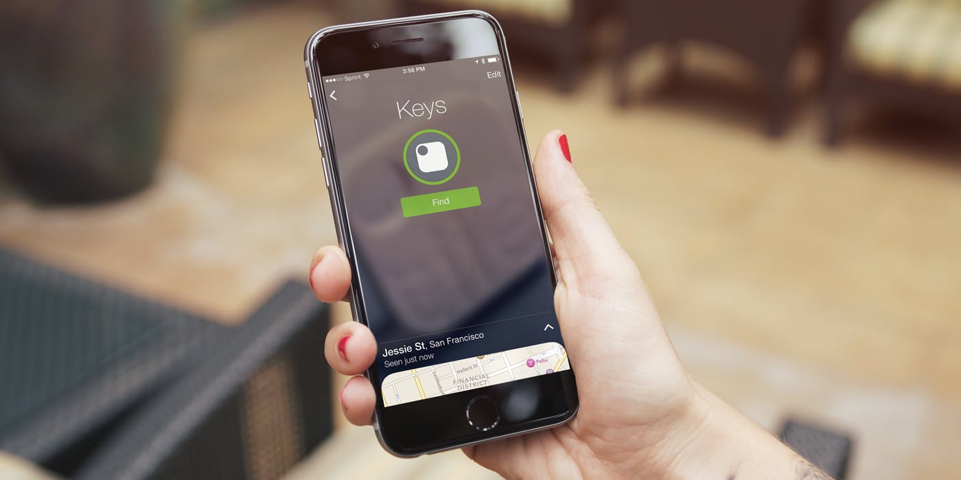
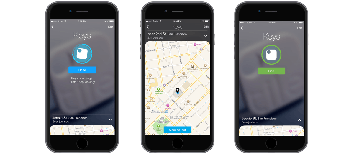
The thoughtbot designers and developers focused on the experience of receiving a Tile as a new customer, starting the app, and the flow of attempting to find a lost item with the Tile.
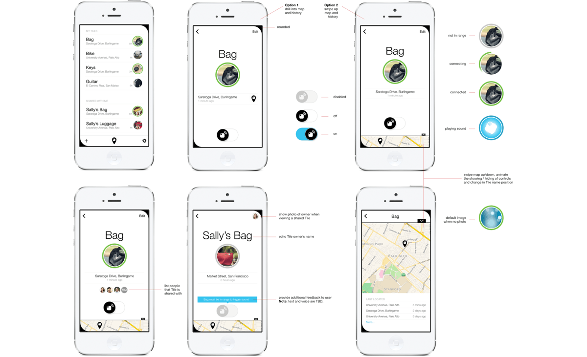
The project was kicked off by a product design sprint starting with the Tile team's mockups.
Because the designs we were testing with users were directly related to the Tile hardware, the engineering team created functional prototypes that allowed us to test our designs in a situation that was very close to how it would be used by Tile’s customers.
We disproved assumptions fairly quickly throughout testing, including confirming that visualizing signal strength of a Tile’s response to the phone tracking was not helpful. Sound, on the other hand, was much more important in helping users find their stuff. Many early versions provided by the Tile's head of UX tested the affordance for turning on the Tile unit’s sound.

Solutions
Weekly, we’d update a version of the finding experience, run a build, and bring in new users to test the experience.
To simulate the experience of finding a Tile, we’d hide a Tile and have users utilize the app to locate the Tile in a room similar to a living room. Map location and functionality for toggling on and off the sound of the Tile were key test objects.
Very user friendly design - takes a few seconds to setup.

Outcome
After about three weeks of iterating on the functional prototype, we brought the average test time users found the lost items down from 15m to 1m.
Over the next few months, two of our iOS developers developed the iOS app in collaboration with Tile's iOS developer and released to the App Store.
As a final touch, we illustrated the instructions for the onboarding process of a customer receiving their Tile. With international customers, the illustrated approach avoided language barriers.
With its unique challenges and hardware integration requirements, building the Tile app was an exciting project and the current version is available today in the App Store.

