LOLA
Improving Conversion and Code

Challenge
Improve conversion rate and code quality

Outcome
Funnel optimization, conversion improvement

Who is LOLA?
LOLA is a startup that offers subscription services and delivers 100% organic period products to your door.
They launched in 2015 and have had great growth and early traction. LOLA came to thoughtbot to support new product launches, improve customer conversion, and stabilize their codebase.
Working with the thoughtbot team has been a real pleasure. This project was highly iterative, and the team was always extracting feedback from key stakeholders at our business and baking it into the process. We are pleased with the outcome, and hope to work with them for a long time!
Improving Conversion
The LOLA website facilitated hundreds of thousands of checkouts, and we used that data to identify which areas of the funnel could be improved.
Our immediate goal was to identify why people were dropping off at certain parts of the funnel. The LOLA website facilitated hundreds of thousands of checkouts, and we used that data to identify which areas of the funnel could be improved.
The Design Sprint
Equipped with user feedback and metrics, we moved forward with a design sprint to test our assumptions and new solutions.
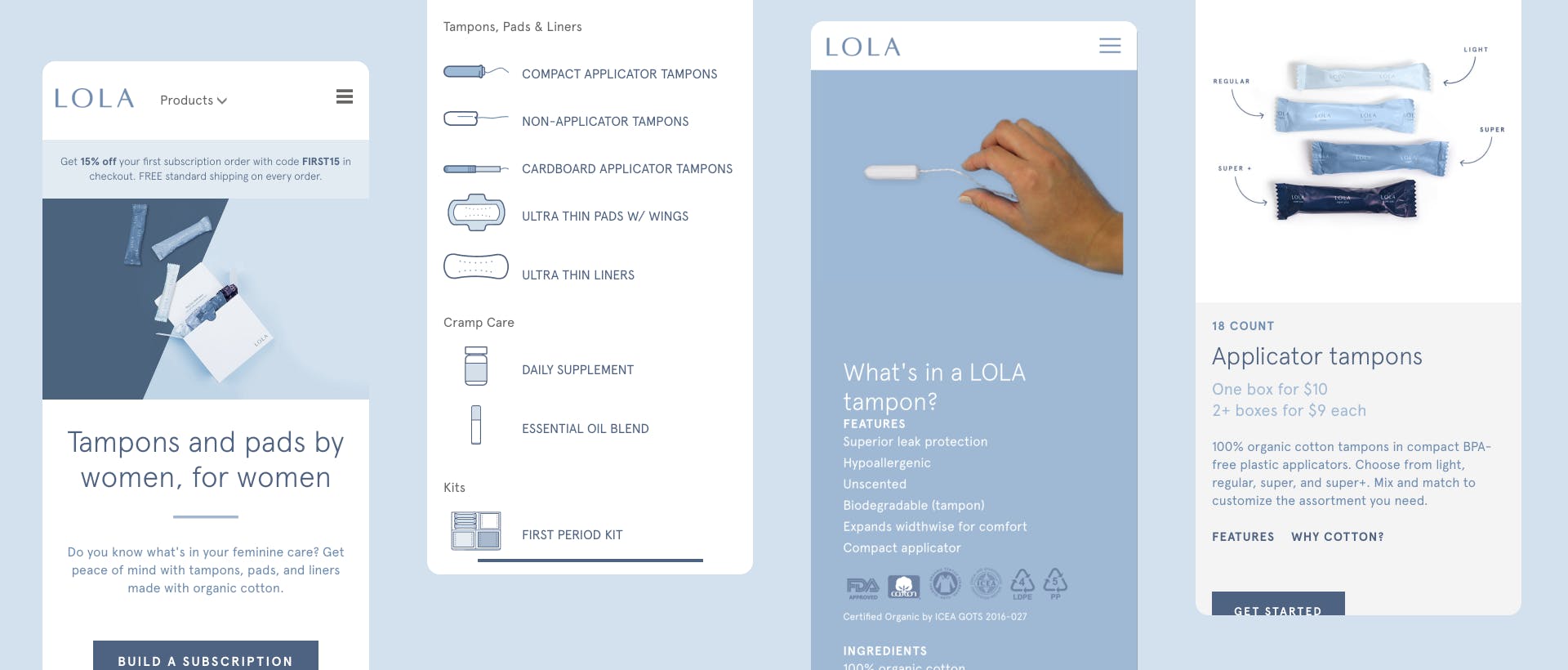
After a few rounds of design sprint activities and ideations, we came up with a prototype that addressed many of the questions and concerns that were brought up in the user interviews. The new solution was a simpler, more streamlined version of mylola.com. The team felt confident in it, and it performed well in the usability testing sessions at the end of the sprint.

A/B Testing Designs
Initially, the LOLA homepage had many competing calls-to-action, and the product pages featured a complicated and personalized checkout flow.
While our simplified version spoke to the pain points of our users, we still wanted to test it with a larger audience before we implemented them. We ran a series of experiments that A/B tested the redesigns with the current site.
To measure success, these experiments addressed different parts of the funnel, from homepage to checkout. We analyzed the data collected in Mixpanel, identified the metrics we wanted to change, the behavior we expected, and set goals. The results from the tests showed us how conversion was affected by our redesigns, and which designs we should move forward with. Our first experiment focused on the homepage. During the sprint usability testing sessions we learned that the competing calls-to-action were confusing, and the product offering wasn’t clear. If we cut the calls-to-action down, reorganized the modules, and made the product offering more obvious, would we increase conversion? We split traffic 50/50 between our redesign and the old design, and ran the A/B test for 3 weeks. The result were (slightly) positive, so we switched all of the traffic to the new landing page.
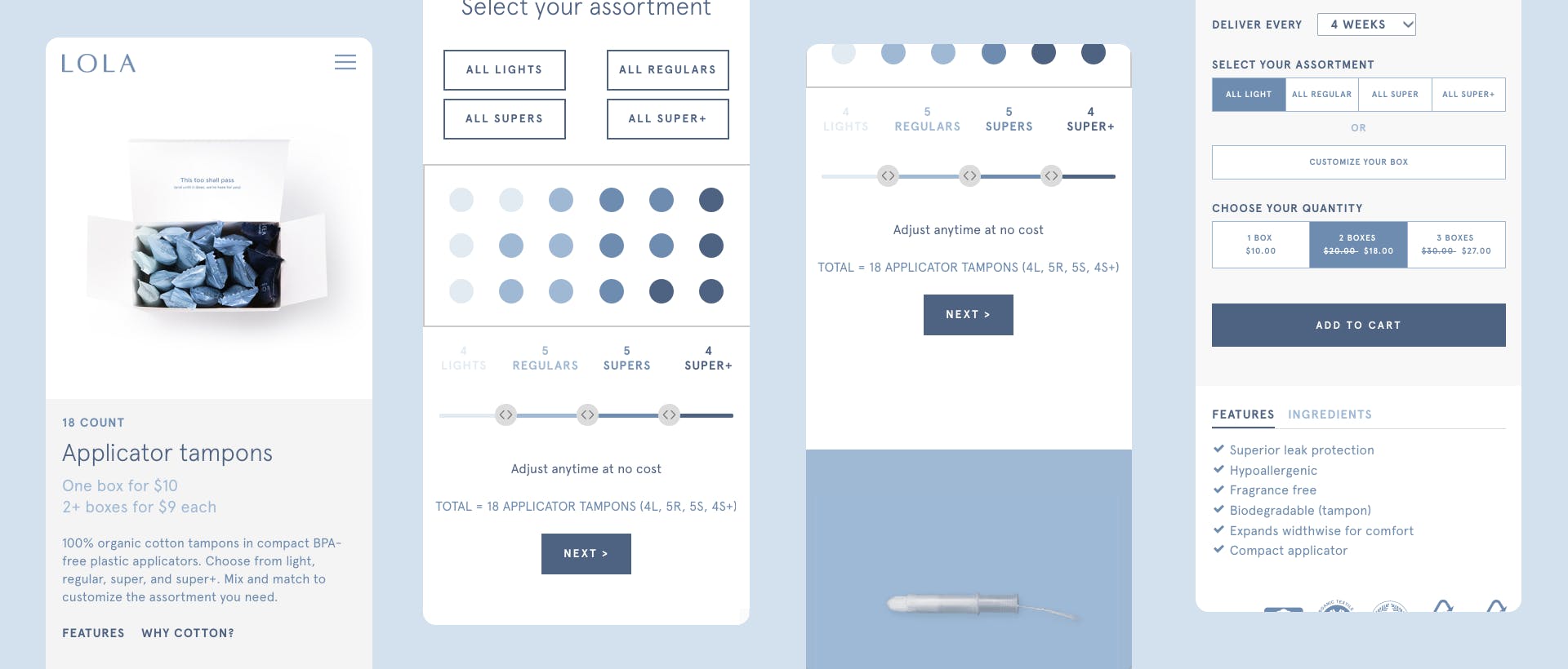
Our second experiment tackled product selection and configuration on the product detail pages. It was obvious from the data that there was a big drop off in this part of the funnel. We had also heard from user feedback that this step was overly complex and confusing. We tested the original multi-step configuration flow against a simplified one-step process that featured clearer and more concise product details. Again, we split traffic 50/50 and ran the A/B test for 3+ weeks. People made it through this step of the funnel at a rate 19.5% higher than the control. This got the LOLA and thoughtbot team very excited!
The LOLA team was incredible to work with on these and additional projects our teams collaborated on.

