We wanted to illustrate the difference between a vibe coded website and what a thoughtbot designer can produce. We also wanted to highlight the risk vibe coding poses to your business. So to demonstrate these points, we redesigned a vibe coded professional services website. Below are the before and after videos of the site.
Now, let’s dive into how we got there!
Introduction
The last 20% is the most important
Imagine ordering a package online and waiting for it to arrive. It doesn’t show, so you ring the delivery company. They say “Oh, we delivered it to a house in Dublin 8”. You say “But I don’t live in Dublin 8, I live in Dublin 2. You’ve sent it to the wrong area”. And they say “Perfect, that’s much closer than it was originally! If there’s anything else I can help you with, say the word”.
Would you be satisfied with that interaction? I hate to break it to you, but that is what your vibe coded website does. And worse, it’s telling your customers that you’re okay with that level of service and quality. And worse again, you could be facing MASSIVE FINES for your lack of care.
I’m willing to bet that your vibe coded site is sloppy. Maybe AI gets you 80% of the way there. But it’s the other 20%, the part that sends a package to your home and not to somewhere else in your city, that really counts.
Accessibility - where the fines come in
The Web Content Accessibility Guidelines (WCAG) is a set of internationally recognised technical standards created by the World Wide Web Consortium (W3C) that defines how to make digital content accessible to people with disabilities.
This is an area where AI and vibe coding tools seriously under perform. In fact, Claude itself says that it “treats accessibility fixes as optional trade-offs rather than requirements, even when the project’s own rules say otherwise….it’s a values problem in how the model weighs competing priorities.”
But the problem is that ignoring website accessibility is a severe financial liability that can quickly bankrupt an unprepared business. Here are some regional specific penalties you could face for accessibility breaches.
The European Union:
While differences exist between countries in the EU, under the European Accessibility Act (EAA):
- Non-compliance in Spain triggers fines up to €1,000,000 and total trading bans. Uh-oh.
- In Italy, authorities possess the legal power to fine non-compliant corporations up to 5% of their global annual turnover. Ouch.
- In Ireland, inaccessibility is a criminal offense, exposing company directors to €60,000 in personal fines and up to 18 months of prison time. Yikes.
The United Kingdom:
The UK Equality Act came into force in the UK in 2010. This act enables disabled consumers to sue private businesses directly in County Court for “injury to feelings,” generating individual payouts of £3,000 to £7,000 plus compounding court costs under the Equality Act.
United States of America:
In the US, under the strict terms of the U.S. Americans with Disabilities Act (ADA) Title III, there are zero company-size exemptions. The Federal Trade Commission (FTC) has also fined vendors millions for deceptive compliance claims, proving shortcuts only draw a larger target on your digital infrastructure.
You think you won’t be fined?:
Predatory serial litigants have started to weaponise automated scanners to hit small e-commerce shops and enterprise brands alike, forcing out-of-court settlements and legal fees that easily cross £40,000 per case.
If you want to check the accessibility of your site, run it through this accessibility checker. And, if you designed it with AI and want to avoid the fines heading your way, please contact us here so that we can correct the inevitable issues you’ll find.
Background of the project
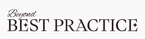
Beyond Best Practice
Meet Matt Haslam, a close, personal friend of our Director of Software Development, Rob Whittaker. Matt has achieved great success managing clinical practices in the medical, dental and veterinary sectors. He cleverly spotted that while many folks in these industries are great clinically, they sometimes struggle to create sound businesses. So Matt set up Beyond Best Practice; a premium consultancy to help clinics with the business side of their work.
Matt used AI to create his website. Matt is a vastly experienced, capable person. His website doesn’t show this.
Matt was a good sport and allowed us to tear down his site and to redesign it as something better.
Project goals
The goals for this redesign were focused solely on the User Interface (UI) of the site. They included:
- Making the site look and feel premium.
- Making the UI compliant with the law in terms of accessibility.
- Adding some elements that will help the site stand out from other AI slop.
We didn’t delve into editing the content itself (there is too much text), the brand feeling, the goals of the website (other than reaching out to Matt), and the UX (driving people towards reaching out to Matt). We left those mostly untouched, but these are also areas that a thoughtbot designer could help with and rectify.
For now though, we focused only on the UI.
Problems in the vibe coded site
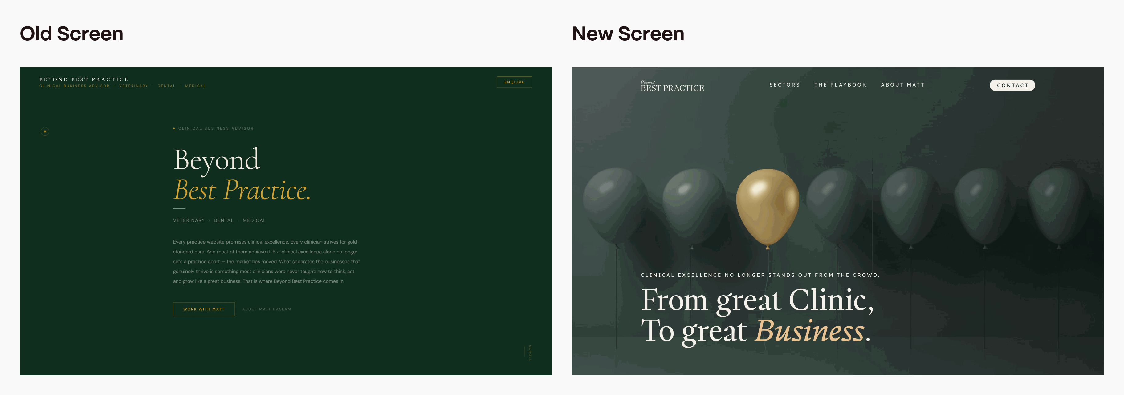
First impressions
If you looked at this site very quickly, you might think it looks nice. But if you dig a little deeper you’ll start noticing some problems.
Take a look at this navigation bar for example. It’s atrocious.
What is going on with the logo?:
Those pieces of text below “Beyond Best Practice”; are they supposed to be clickable? They are also barely readable at only 10px font size. And they only have a contrast ratio of 3.17 which fails at both the WCAG AAA and AA levels.
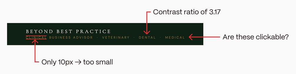
And look at what happens when I scale it on mobile.
What the hell is this supposed to be? Is it a logo? I’m not sure. But I know it’s sloppy.
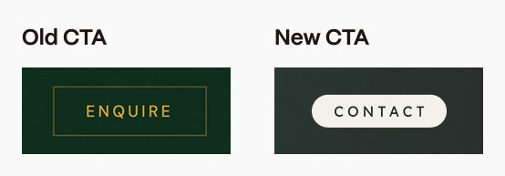
Call to Action:
The primary call to action (CTA) also doesn’t really stand out. Firstly, the button is relatively low contrast. The font is also only 12px, which is below the minimum recommended font size. 16px is the widely accepted minimum for body text to ensure basic readability and accessibility.
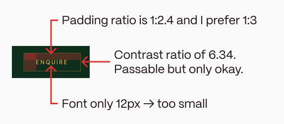
For buttons, generally the horizontal padding is around three times more than vertical padding to let the button breathe. The AI button isn’t bad, but is still only 1:2.4 and I prefer 1:3, especially for such a crucial CTA.
This combo of low-ish contrast, tight-ish spacing and too-small font means the button is relatively subtle. This is not good because it’s the primary call to action, the whole purpose of the site, and it isn’t that visible.
Accessibility
Colour contrast:
The minimum colour contrast required to pass at WCAG AA level for normal text is 4.5:1 (or just 4.5).
But in Matt’s site, there are countless cases of basic accessibility contrast failings:
- “Premium Positioning”, “Client Retention” and the other framework headers have a contrast of 2.77.
- “About Matt Haslam” in the hero section has a contrast of only 2.27.
- The footer details take the biscuit though. With a contrast ratio of just 1.7, they are practically invisible to the naked eye. Congratulations Mr. Footer!
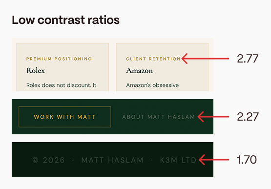
In fact, we found over fifty (FIFTY!) instances of very low contrast accessibility concerns. In a single page website, one might have thought this was not possible. But thanks to AI, you, yes YOU, can now create your very own inaccessible websites too. Hooray!
Other issues:
The site contains other accessibility issues too. We have ten instances of text which is sized 10 pixels or smaller (as stated above, the minimum recommendation is usually 16px).
We have six cases where a label element does not surround a form control and the
And we have a further six, more serious issues where an input, select, or textarea doesn’t have a properly associated label.
Overall, this site has an AIM Score of 2.7 out of 10 for accessibility. But I’d personally give it an “A”. An “A” for “Abysmal”.
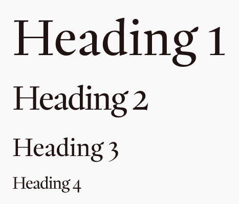
Typography
Just using a serif font does not make your site premium.
We already know the site has accessiblity issues with the colour contrast of text. But here are some other typographical issues in the site.
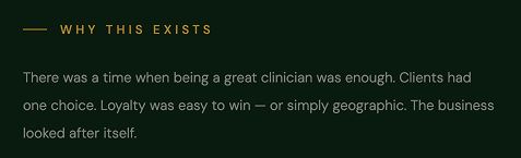
Firstly, the body copy is often too small. The main body copy in areas like “Why this exists” is 12.8px; much too small to read comfortably. Being hard to read isn’t premium. It’s just bad.
In fact, when viewing the site in the same browser window, there appears to be an almost random collection of font sizes including:
- 10.4
- 11.2
- 12
- 12.8
- 14.4
- 15.2
- 16
- 17.6
- 17.9
- 19.2
- 20
- 32
- 38.4
- 43.2
- 44.8
- 48
- 51.2
- 67.2
Differences, like between 12px and 12.8px, may seem small. They may even be hard to put your finger on when you look at the site. But they contribute to an untidy, disjointed UI.
Other issues
Another quick zoom around the site brings forth some more inconsistencies:
- Building on the rather random font sizes, there also appears to be no visible grid or spacing system. Grids help to keep things aligned, easy to scan and easy to digest.
- There are obviously too many walls of text, which is making the site very hard to scan (and most users only scan your site).
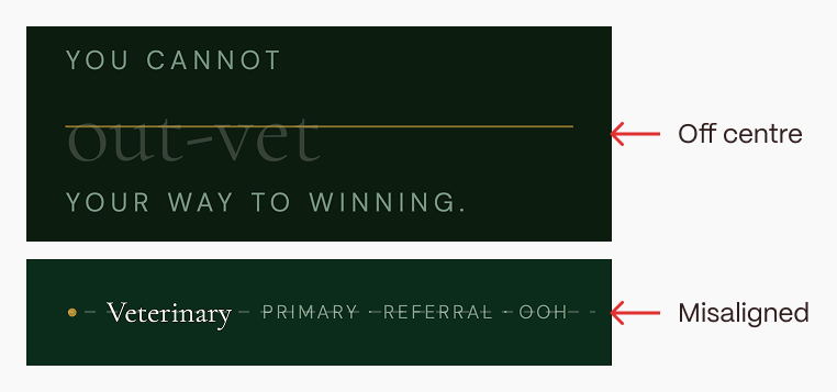
- There are these odd strike throughs in the “Why it exists” section. They’re weirdly off the centre of the word and genuinely look broken. Typical slop.
- In the “Sectors” section, the primary word, like “Veterinary”, looks misaligned with the following words “Primary”, “Referral” and “OOH”.
- There are also six different background colours which feels excessive for a one page brochure site.
- The mouse trail. Why?
Fixes
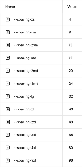
Grid
Firstly, to help with that disjointed feeling, we created a grid system. A grid system is a two dimensional framework that assists in aligning content and space on a screen. All our fonts, spacings, corner radii etc. come from this grid.
The grid has a 4px base, so everything is divisible by 4.
Colour
Secondly, we came up with a new colour palette. We wanted it to feel premium and calming.
To keep it accessible, we wanted to have some high contrast colour options. But keep in mind that using pure black (#000000) and pure white (#FFFFFF) creates a harsh contrast, which can lead to visual fatigue, and they don’t comply with A11y accessibility rules.
Using colour theory, we settled on muted browns (representing security, structure, and reliability) and muted greens which symbolise renewal, growth and emulates the restorative qualities of the outdoors. Given Matt’s background as a vet, this felt appropriate.
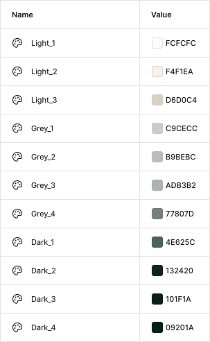
The AI had done an okay job in this regard, but it didn’t have enough contrast in the colours it chose.
We also reduced the amount of background colour options from six to just two.
Typography
Next up was typography. The AI site used a combo of a serif font (Cormorant Garamond) and a san serif (DM Sans). This is actually a reasonable approach and an okay combo.
But to make a site feel premium, we figured it needed something with a bit more wow. Something less common across the web.
We settled on a combo of PP Writer (serif) and Lexend (san serif). The latter is a free font you can download from Google Fonts. The former is a premium font created by Pangram Pangram Foundry and is inspired by the French Renaissance type.
You can access a free version of this font to play around with, but for commercial purposes you need to purchase a licence. If that’s not within your budget, there are plenty of other free options available on Fontshare.com (which we find has fonts that are a bit less common than Google Fonts).
We created our H1, H2s and so on using a combo of PP Writer and my grid. We did the same for the body copy with Lexend.
We also played around with the font characteristics in specific areas. For example, for subtle sub headings, we opted for Lexend in all caps. When you have all caps text, you can slightly reduce the text size and create a little more letter spacing to enhance the legibility. So we increased the letter spacing to 4px, which created a rather unique sub heading type option.
Now, nothing feels off-the-shelf, which is important in a premium site.
Navigation
To start work on the navigation, we decided to clean up the primary CTA first. We’re operating on a dark background, so we made the primary CTA light with dark text. The text is also 16px and the button size has a horizontal/vertical ratio of 3:1. So now, our essential CTA pops.
We added some core navigation sections, such as the sectors Matt’s company operates in, the playbook Matt follows and an easy way to learn more about Matt. “About us” pages typically rank second behind homepages in terms of website views. Our site is a single pager, but having a navigation link to the “About Matt” section helps users discover it more easily.
Finally, we created a logo that feels more premium than a typical AI logo.
Now our navigation bar is readable, usable, and our CTA grabs the attention.

Standing out from the slop
Apart from a custom logo, we also added some delighters; joyful little interactions that won’t be replicated in an AI generated site.
The most obvious is the background of our Hero section. Beyond Best Practice is about standing out from the crowd. Therefore, rather than just using an image, we created a unique, custom WebGL effect using Unicorn Studio to illustrate this and to ensure the site stands out.
The golden balloon follows your cursor up and down, it glows a deeper golden colour when you hover over it, and if you swipe your cursor over the gold balloon at speed it squishes and reforms, sort of like a real balloon.
These thoughtful, custom interactions tailored to a specific context are not things that can be replicated easily by AI.
Animations
Sticking with the interaction theme, we also added some carefully curated animations to the site.
Good animations should enhance the experience of scrolling the site. But, when used incorrectly, they can become distracting, inaccessible and chaotic, with elements flying everywhere. It takes thought and restraint to add subtle interactions that enhance the premium feel of a site, rather than dominating it.
Some ones we included here were:
- The page loading animation which plays only once upon opening the site.
- A subtle, slow releasing line under the navigation items when they are hovered on.
- The star icon twists subtly into place on scroll as the problem text becomes visible. This one replays in both directions of scroll.
- The practices section has several animations working together at once.
- Firstly, the background colour changes from light to dark which adds some visual intrigue to the page.
- The scroll bar under the image allows users to see how far through the sticky scroll section they are.
- The images don’t simply change with the sectors; they scale up from 0 to 100 from a central start point. Again, this is just a little bit more thoughtful than having them change instantly or fade into place.
- The “Exceptional business thinking for” copy stays the same, while the sector copy animates into place.
- These replay on scroll too, and are repeated in the “About Matt” section, although this time without the image changing.
- The Playbook topics slide gently into place on scroll. This is a smooth, repeating action which adds some subtle intrigue and to a premium, thoughtful feeling.
- The “How to go Beyond best practice” section contains a lot of text, so we animate that in with a simple fade on first load. This doesn’t repeat. The logic is that this section is only for folks who want to get into the weeds of what is involved. It doesn’t need to grab attention like the practices, playbook and About Matt sections do.
Accessibility in the code
In terms of accessibility, we corrected all the text issues by increasing the minimum font size to 16px and by ensuring we have a contrast of between 5.77 (the lowest contrast text) and 15.09 (for the highest contrast text). We also widened the letter spacing in some fonts that are 16px for increased legibility.
We fixed the labelling issues listed previously for input, select and textareas, and included alt text for the images we introduced, making the site much more understandable for screen readers.
We also added the prefers-reduced-motion CSS feature to detect if a user has enabled a setting on their device to minimise the amount of non-essential motion. This setting is used to convey to the browser that the user prefers an interface that removes, reduces, or replaces motion-based animations. While we might personally like the animations on the site, they can trigger discomfort for those with vestibular motion disorders, so it is good practice to include this feature.
With the assistance of a code audit by a thoughtbot developer, we could improve the actual code of the site even more. But for now, while focusing on the UI, we have solved the main accessibility issues and avoided lots of juicy fines!
Conclusion
Here are some final before and after shots, side by side.
Good design is intentional design. Your AI tool of choice is looking at patterns in work it stole from designers who understood design principles and what they were trying to achieve. They understood what was most important to their users in a very specific context. Your AI slop doesn’t understand any of this.
It’s true that a designer using AI can operate faster and at a higher level than before. But AI tools only work if you understand what you’re trying to achieve and the underlying design principles behind good design.
If you can see some of these mistakes in your vibe coded site and if you’re happy to have your site redesigned for free so we can make content about it, get in touch!