These are essential duos
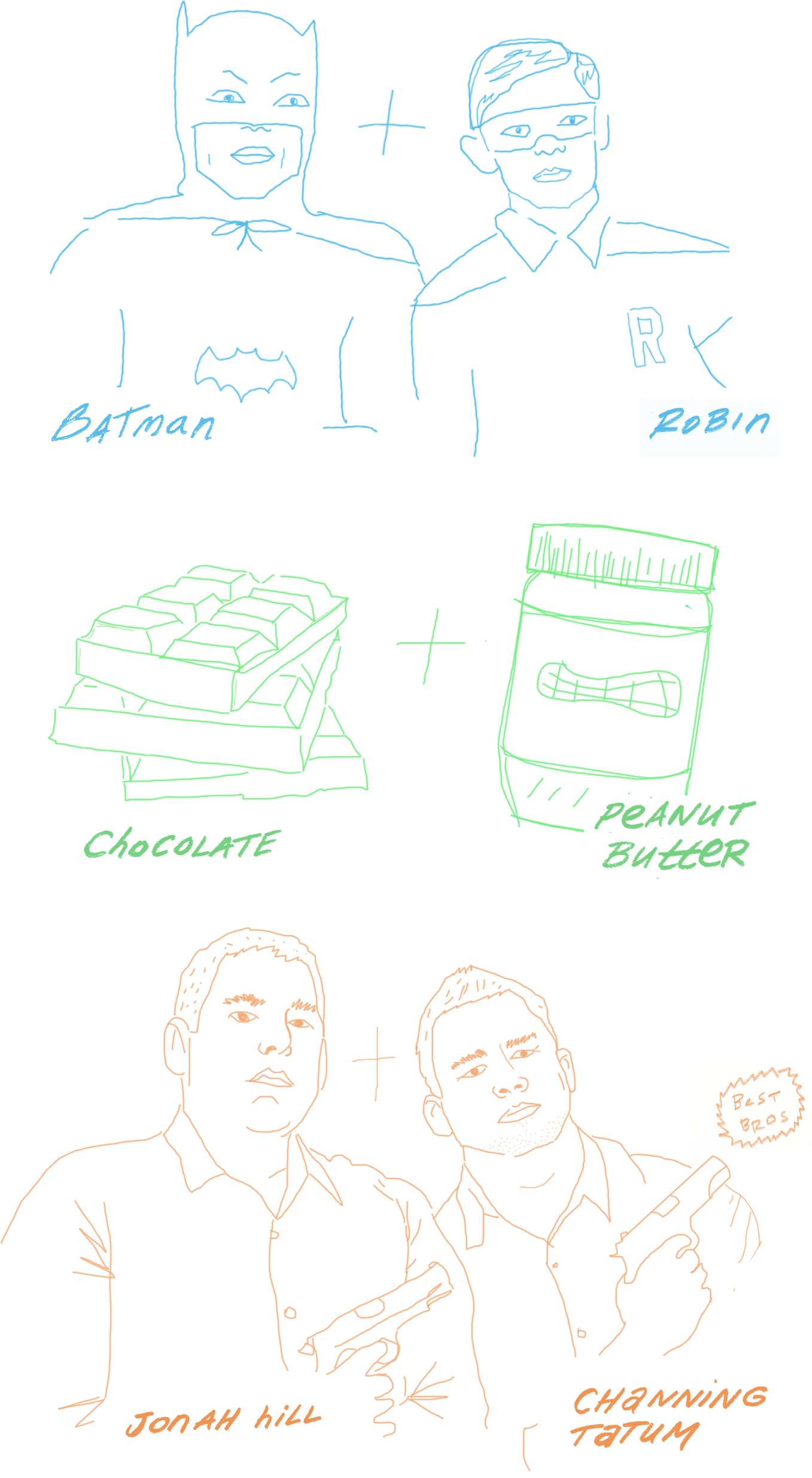
Batman and Robin, peanut butter and chocolate, best buds in action movies. One without the other just doesn’t work, and the same goes for design and prototyping. They belong together, and that’s where Adobe Experience Design (XD) comes in. XD is the buddy movie starring design and prototyping. It’s “21 Jump Street” with Channing Tatum and Jonah Hill. It’s the app that puts both of these things together under one roof.
That’s a great thing, because jumping from a design app to a prototyping app is counterproductive. You’re losing time that is better spent strengthening the product. Adobe XD gets back that time.
A focused beginning
We recently used XD on a client project and, on the whole, it was awesome. I’m not going to lie: XD isn’t there yet. It’s basic and stripped down, but there’s beauty in that. Coming from Adobe, one would expect a feature-laden, bloated product. That is not the case with XD. The interface is clean and lightweight and its feature set feels just right for quick iteration.

The beauty of XD
XD is fast. You can design and prototype in one spot and then share it out to your team for review via the web. Just like that, XD eliminates image exports and time-sucking trips to Marvel, Invision, or whatever tool you use to “wire” things up.
XD is delightfully rough around the edges. It’s hard to obsess over tiny details because it simply won’t allow it. XD’s limited tool set and gestalt help you avoid time wasters: whether it’s tweaking type choices, dialing in that perfect linear gradient, or establishing an elaborate grid.
XD doesn’t have a layers panel because you don’t need it. Grabbing objects is intuitive and organization is easily maintained by grouping objects. The woe of naming layers is also no more. We’ve all ended up with layers named “Layer 10 copy copy” at some point. With XD that concern is gone and your file feels tidier for it.
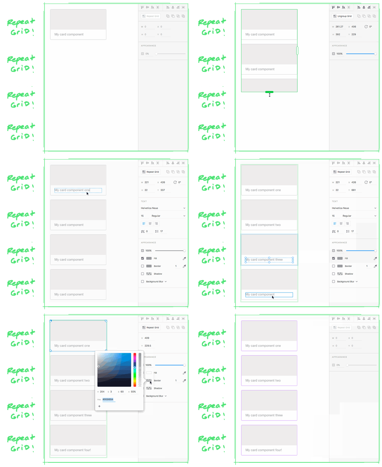
XD has a magical thing called repeat grid. Repeat grid takes away the monotony of manually copying and pasting components in your design. With it, you can create a grid of repeating components with one click. The padding between each component is easy to adjust. More so, the content within each component is dynamic but the styles are global. So it’s easy to create realistic mockups fast.

The not so beautiful
It’s invaluable to finally have the duo of design and prototyping under one roof. However, the prototyping experience is basic. XD is great at linking complete screens together. The problems arise when you couple that with its lack of symbols. This leads to a lot of duplication of artboards, design components, copy, etc. This, in turn, creates hard to maintain files.
Another minor gripe with XD is its lack of a few hotkeys necessary for speedy work. It’s hard to work fast without hotkeys for: a colorpicker, a toggle for borders, and a toggle for fills.
On the whole though, XD’s ugly side isn’t really ugly at all. There are so many positives to the app that you’ll find yourself not caring about these nitpicks quickly.
A bright future
Adobe has delivered a focused product with XD. They are continually iterating based on an active member community. This is exemplified with monthly releases whose new features are the result of votes from the community.
My last project team’s experience using the product for real client work was great. It removed overhead from the process and focused our work on the thing that matters most: creating an easy to use straightforward product.
If you haven’t tried it yet, give XD a whirl on your next project – for free!
