Photo by Jamie Beck
Sketching on an iPad
When I first held an iPad I knew it would have significance to a web designer as a sketching tool. It’s portable, connected, and friendly, and with the apps that have emerged since launch we now have many options to choose from based on what needs and wants we might have. I’m reviewing three apps: Adobe Ideas, Draft, and Sketchbook Pro from the perspective of a web designer, focusing on tasks such as layout sketching. I aim to help you decide which tool or tools is best suited for you and your working environment.
Tools of the trade
Before discussing the apps I should point out I do all sketching on the iPad using a stylus, specifically the Pogo Sketch, so unless you find your index finger particularly capable, I suggest purchasing a stylus.
Adobe Ideas
Free (app store link)
Adobe Ideas is a basic sketching app that is geared towards clean results and simple, quick usage. You have one marker tool at your disposal which can be adjusted with radius, color and opacity controls via a vertical slider. When sketching, the UI is limited to a slim control bar on the left which can be hidden, but it’s unobtrusive enough that it doesn’t distract.
Adobe Ideas’ files are vector based which comes with two fantastic upsides: you’re able to zoom in and out easily and to extraordinary levels, and the exported file is a lightweight .PDF which can be manipulated or printed easily. The resolution independence means you can magnify to add small, sophisticated details, and pan around the canvas in case your drawing ends up bigger than you intended. Sketches are auto-saved so you don’t have to worry about losing work or saving files. I use Adobe Ideas on a daily basis and since it’s free I highly recommend giving it a try.
- Pros: Free, simple but powerful toolset, lightweight vector export
- Cons: None
Draft
$9.99 (app store link)
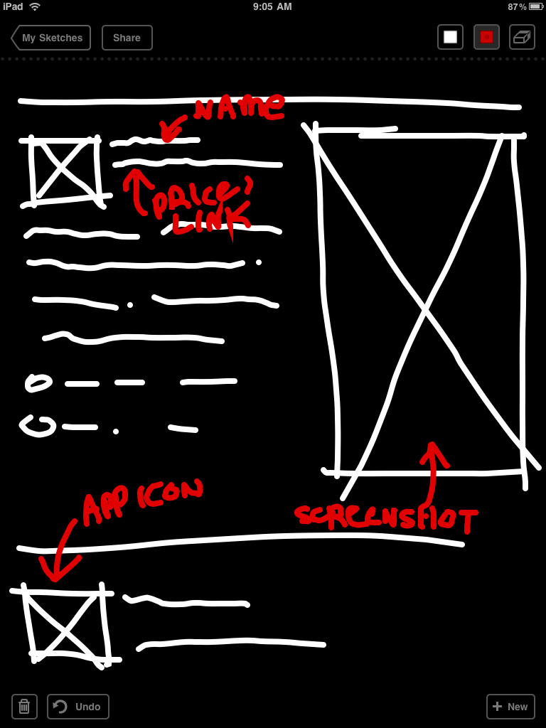
When 37 Signals released Draft I was curious how their pragmatic approach would translate in to an app, particularly one in a realm I am highly interested in. Draft is task oriented: the tools are extremely limited (one brush radius, and only white and red) and one eraser. The advantages to this approach are a consistent output, and with no options to monkey with you are kept from getting lost worrying about style. This is, in essence, a grand equalizer - someone with artistic abilities and someone without will produce very similar sketches using Draft. Draft has a static canvas which can become a problem if you run out of space, but I quickly got used to the limitation. At the time of this writing, Draft only has one level of undo which can be frustrating given the longstanding prevalence of multiple undos in most creative apps.
Draft’s killer feature, however, is integration with 37 Signals’ own chat app, Campfire. Through a sharing button you’re two taps away from posting the image instantly in a Campfire chat room —and if you use Campfire as extensively as we do at thoughtbot, this feature will blow your mind. Draft is all about communicating ideas quickly, and if you think of it as a portable, miniature dry erase board you will be satisfied.
- Pros: Task oriented approach, excellent Campfire integration, consistent output
- Cons:
$9.99 is potentially prohibitive to some users given limited features, only one level of undo
Sketchbook Pro
$9.99 (app store link)
Autodesk’s Sketchbook Pro is a different breed of sketching app from the previous two. It’s a derivative of a desktop version, and it inherits many of the features and capabilities. And when I say “capabilities” I mean a shocking feature set that is almost hard to believe it’s available on an iPad - such as layers, natural brushes, .PSD export, and a professional color picker. When you’re sketching on Sketchbook Pro it feels very close to sketching on paper with traditional media. Despite the iPad’s lack of pressure sensitivity, brush strokes can taper off at the end giving a very natural and satisfying experience. There is also the ability to magnify the document, but since it’s a bitmap image zooming exposes pixelization.
For replicating natural media there is no comparison - Sketchbook Pro is incredible, but for web design and communication purposes the wide variety of features and brushes can often leave you tweaking and stylizing, instead of focusing on the task. It has a deep UI that requires a learning curve but mastery can open some exciting possibilities and ease of use. For those experienced in traditional media and who may feel stifled by Adobe Ideas’ uniform tools, Sketchbook Pro will go a long way towards satisfying your delicate artistic sensibilities.
- Pros: Amazing natural media capabilities, professional toolset, .PSD export
- Cons: UI takes getting used to, numerous features can distract from task oriented sketching
While using these apps I’ve experimented and looked for useful ways to shoehorn them into my work routine. Both Adobe Ideas and Sketchbook Pro allow for importing of images which you can draw on top of - as an example I’ve drawn on a browser window and utilized a grid system:

Conclusion
All three of these apps are well designed and well executed, so choosing one (or a tag team of two) depends on which best fits in to your workflow. If flat, smooth sketches and vector-flexibility is key to you, Adobe Ideas is a fantastic solution. If you’re an avid Campfire user or value a focused approach, Draft is a great choice. If you’re a suppressed artist living in a designer’s body, Sketchbook Pro will let you embellish sketches with an imbued sense of creativity.


