Perhaps you are a company entering the rushing rapids that is app and web development. You’ve got a great idea or even a great product but in the rush to develop, the lack of a system is making the process difficult to maintain. Or you’re the company with a great product with an established user base, but you now notice inconsistencies among new features that are giving you pause. Enter design audit, stage left. This process is built to realign the success of a product with the goals of the company and the needs of users. The design audit process can vary in length depending on how deep the audit delves, but regardless, time taken to do an audit is preemptive and saves you time and money down the road. By being proactive now, you are addressing inconsistencies before they turn into bigger, more costly problems.
So what is a design audit?

The term “audit” is a blanket term that refers to an in-depth review and analysis of a system, prototype, process or an idea. For design audits, this can refer to websites, branding, prototypes, and other product forms. Ideally, it manifests in two parts: internal and external. The internal portion is focused heavily on the goal of identifying inconsistencies within a company’s image and design — including, but not limited to the aforementioned items. Conversely, the external portion is meant to identify industry standards/“best practices,” competitors’ design choices, why they use them, and which options from them work best to address your particular needs.
Why should I design audit?
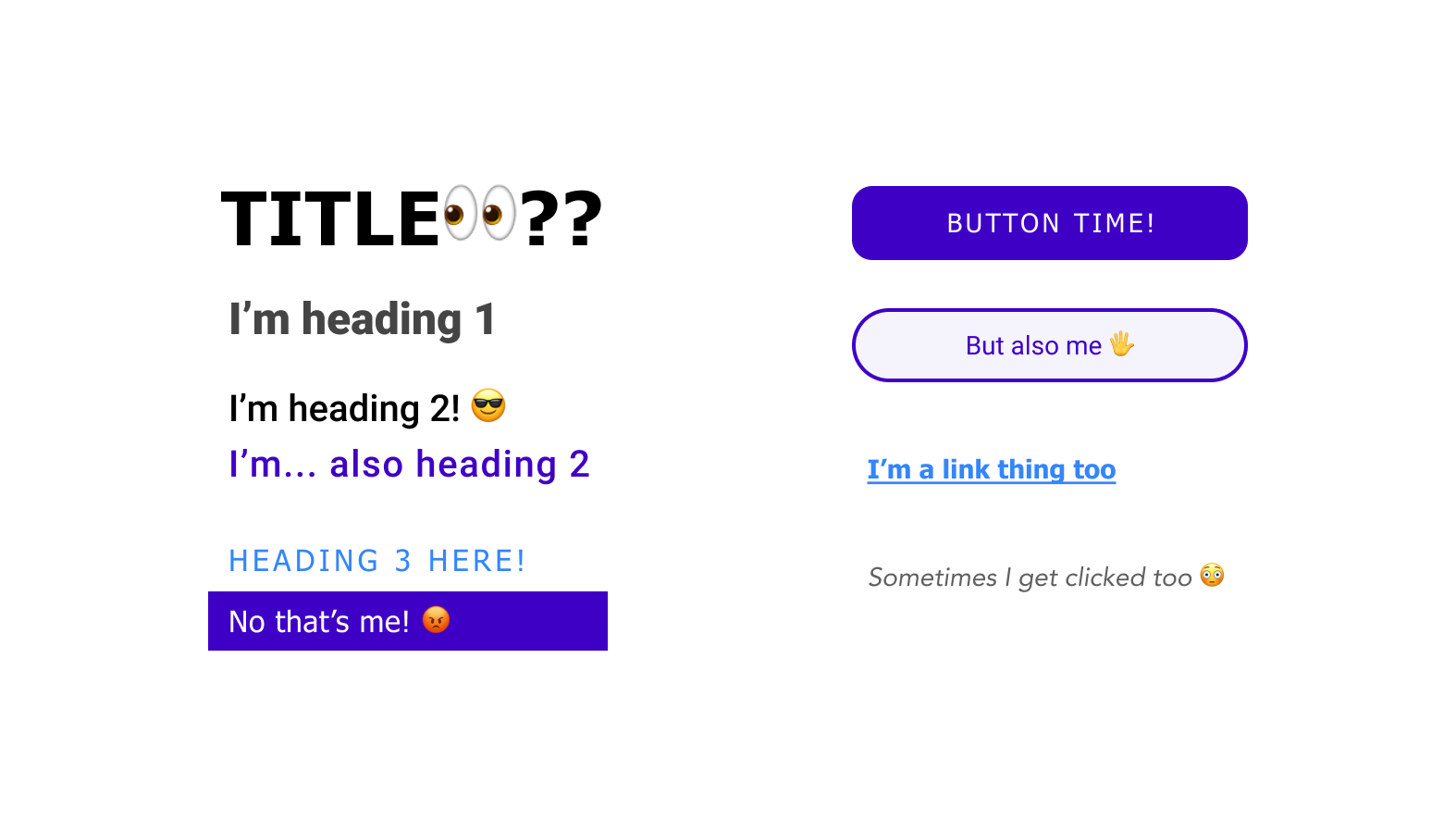
So that’s great and all, but why should you take the dive into a design audit? Especially for teams that are compartmentalized, it can be easy for decisions to begin veering off on their own related, but nonetheless inconsistent directions. For instance, you may notice that a portion of your site fails accessibility guidelines, while a different page reports lower bounce rates than your average. Maybe you have eight different buttons that do the same thing, and your newsletter sign up looks different on every page. These kinds divergences add up and send confusing signals to users. Ultimately, confused users do not convert or form long-lasting relationships with brands.
Design audits are there to help get your team on the same page by ironing out any inconsistencies that crept up over time, whether due to rotating team members or lack of documentation. It’s a great way to hit the reset button, purge some legacy or outdated design practices, and move forward with new ones. The more content included in the audit is correlated to more consistency across the brand. This flexibility allows the tool to form to the needs that you have as a business whether it’s building user trust, faster implementation and releases, or something else entirely.
When should I design audit?
It can be hard to catch those inconsistencies I mentioned, so here are some good times to think about performing a design audit:
- Your company has a change in market — scale, demographic, etc.
- Your team is growing and new employees are contributing to your brand
- Design has become difficult to iterate on or contribute to (likely from a lack of design system)
- You’re about to release your app to customers for the first time
- You’re moving from prototype to development and you want to make sure you build the right thing
- 2-3 years into the lifecycle of your website/app
What does a design audit look like?
Step 1: Identify scope
What are we analyzing? Is it limited to just a particular flow? Is it the entire website? The entire brand? By honing in on the scope of the audit, we can stay focused as we move forward.
Step 2: Screenshot and compile
We’re looking for things we would consider a component— e.g. buttons, headings, dropdown menus— and screenshot all the different treatments. Side flows like 404 error screen, Terms of Service, and confirmation screens are particularly common areas for design inconsistencies. By doing this inventory, we are able to better understand the chaos of implementations and identify opportunities to converge them.
Additionally, we’re checking for inconsistencies in voice & tone, photography, outdated marketing initiatives and other brand inconsistencies beyond visual treatments.

Step 3: Review and recommend
Within the review portion we’re aiming to organize our screenshot library into buckets and to find patterns. Those emergent patterns serve as guidance for our recommendations going forward. Here we find what works the best for your situation and determine how to support that goal as much as possible. Some options for resolving the issues might include:
- A full rebranding
- A style guide and implementation
- Reorganize and reprioritize an already existing design backlog
Sound good?
As you can see, design audits come in all shapes and sizes and work to address many different challenges. If anything here resonates with you and you’re interested in what a design audit could do for your company have a look at our Interface Design Audit service!
