Using third-party component libraries like MUI, Ant Design, React Bootstrap, Bryntum, or AG Grid is a great way to move fast, especially for complex interactive elements like date pickers or interactive tables. There is a trade off though. It can be difficult to add custom styles or handle unique use cases because the libraries want you to stay in their system. You often can’t safely adjust the DOM, and if you do, it requires JavaScript to add a custom class or wrapper which can be brittle.
:has to the rescue
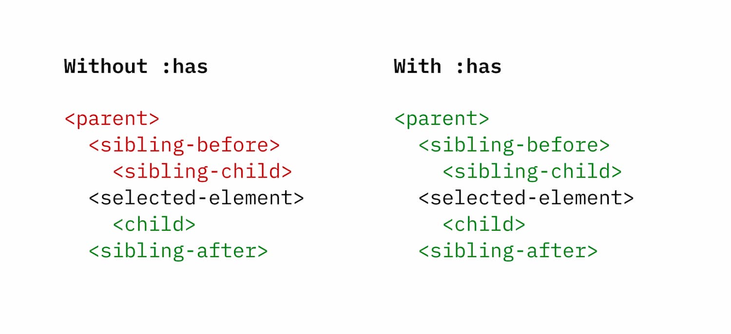
Allow me to introduce (or reintroduce) you to the relatively new CSS pseudo-class :has. This tiny but mighty tool allows us to traverse up the DOM to style parent or sibling elements and it became invaluable on a recent project when working on custom styles for elements in a JS component library.
Let’s say you’re adding an input element from a component library to your project. The HTML and hooks for customizing are pre-defined. But this locks you into the structure the library has set.
<div class="input">
  <label>Email</label>
  <input required> <!-- "error" class added for error state -->
</div>
You want the <label> to turn red when the field has an error, but, for error states, the library only adds a class to the <input> sibling after the label. How would you approach this?
Without :has, Likely your only option is to use JavaScript to conditionally add a class to the container, or reconsider your style choices. Neither is a great option. But with :has you can handle this with just CSS.
.input:has(.error) label {
  color: red;
}
This keeps your overall code complexity down since you don’t need to use JavaScript and it keeps all of the “logic” for your styles contained in CSS.
Practical applications
:has is growing in popularity but personally I didn’t know where to start incorporating it into my process. I’d read articles and seen some incredible demos from folks like Josh Comeau and Ahmad Shadeed but it never really clicked until working on a project with a third-party JS component library where I had limited control of the DOM but wanted unlimited styling flexibility.
Here are just a few ways :has can come in handy.
Check your parents
:has unlocks the ability to style parent elements, something that has been impossible with CSS until now. You’re no longer constrained to only select down (child) or forward (sibling after). You can go as far up the DOM as you want, allowing you to style any element in the DOM, from the root parent, to a child of a sibling.
Adding :has(something) to a parent class allows you to add conditional styles like in this menu where the presence of the “sold out” badge dictates the styles of the sold out card. This is very useful for styling components in JS libraries that contain items that change state but don’t add any indication of that state to a parent element where you might want to add styles.
.card:has(.badge--soldout)
See the Pen Style parents based on child content with :has() by Andrew Spencer (@iam_aspencer) on CodePen.
Detect next siblings
Working with table data can be tricky, especially if the table is from a component library. In this example, certain <tr> elements act as parents of what are technically sibling <tr> elements. :has provides more flexibility for styling specific rows, like this selector that flips the next sibling selector to target the <tr> before an element with class .parent.
tr:has(+ .parent) {
  border-bottom: 2px gray solid;
}
See the Pen :has selector by Andrew Spencer (@iam_aspencer) on CodePen.
This effect could be achieved with :not(:last-child) and a border-top, but :has gives you more flexibility.
.parent:not(:last-child) {
  border-top: 2px gray solid;
}
Monitor state of child elements
Buttons that contain other buttons are forbidden with the W3C HTML Spec but that doesn’t stop many component libraries from including interactive elements that contain other interactive elements. Here’s a selector I used to add a hover state to a grid cell when the buttons within it were not hovered.
.grid-cell:hover:not(:has(.button:hover))
See the Pen Monitor state of child elements with :has() by Andrew Spencer (@iam_aspencer) on CodePen.
Theme the whole page based on one component
:has isn’t limited to nearby elements. Because you can select all the way up to the root <html> or <body> tags, you can use the presence of a single component to drive page-wide styling. This is especially handy when the presence of a specific component should shift the entire page layout or color scheme.
body:has(.special-component) {
  /* different styles for any element on the page */
}
For example, the above selector body:has(.special-component) would allow you to style any element on the page based on the presence of an element with the special-component class.
This becomes even more powerful with CSS custom properties. If a library uses custom properties for styles, as many do, you can override them conditionally without touching the library’s internal settings.
A note on :has :not
Combining a CSS function like :not with :has increases what’s possible but pay attention to the order, :not(:has) vs :has(:not). Why does this matter? Polypane reminds us that functions and pseudo selectors expect to be attached to another element and if they aren’t, they add an implicit universal selector (*). For :has though, the selector you place inside is already applied to the child element so the selectors actually read:
div:has(*:not(button))- Inclusive: Select any div that contains at least one child element that is not a buttondiv:not(.div:has(button))- Targeted: Select any div that does not contain a button
:has support?
Browser support for :has is strong with every major browser now supporting it, but it’s not universal. It’s supported for 92.66% of global browser usage as of July 2026. If you need broad support, wrap the :has selector in a @support and provide a fallback.
Next time you find yourself stuck with DOM elements you can’t adjust, :has… has your back.