LXD Research & Display, LLC
Modernizing and rebranding an LCD manufacturer’s website in just a few weeks

Challenge
Modernize and rebrand a website in just a few weeks

Solution
Web Design, Ruby on Rails development

Outcome
A modern, responsive website that out strongly against the competition.

Who is LXD Research & Display, LLC?
LXD makes custom LCD screens for a variety of industries
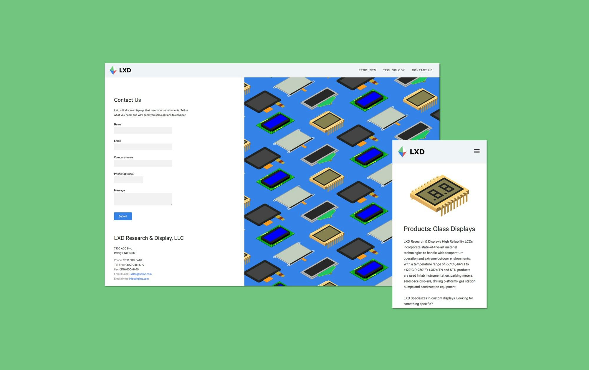
They came to us wanting to revamp their website and make it visually distinct from their competitors. They had a short timeline, so thoughtbot used that time constraint to focus on impactful illustrations, getting rid of unnecessary copy, and making a lightweight responsive website.
The thoughtbot team was able to build a highly aesthetic website for our unusually restrictive use case. We needed the LXD website to have an eye-catching modern design, while also continuing to clearly present the long product lists that our customer’s require. We are very happy with the results.
Learning About the Industry
Before getting started, thoughtbot needed to learn more about the LCD industry
The team worked closely with the client to better understand every product they created and how they worked with their customers. Because it is such a niche market, unique considerations were important to understand.
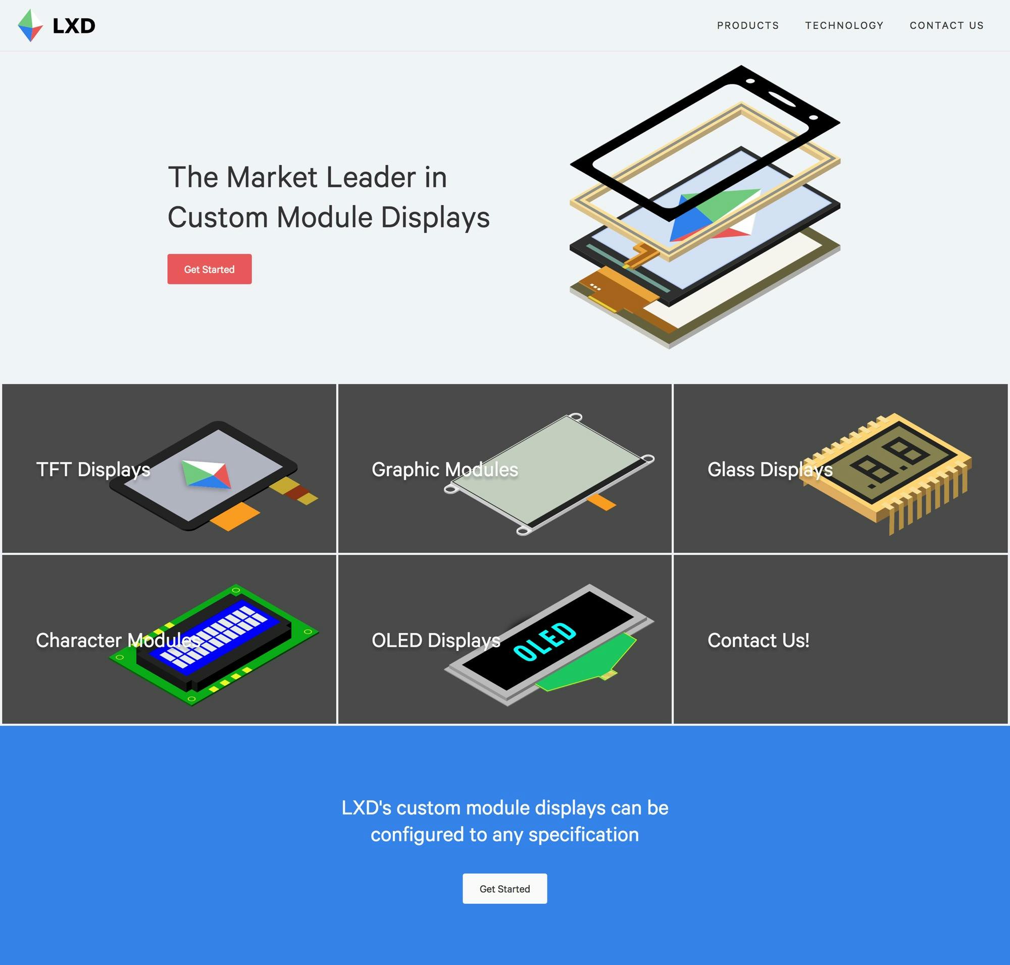
Once the problem was defined, thoughtbot iterated quickly over several different designs. Designers freshened up the logo, making it bolder and simpler to better match the redesign. LXD’s website was full of lengthy tables with data about their various products, and thoughtbot looked into several ways to make these tables easier to read on various screen sizes. Finally, the team stripped down the amount of information on all the pages, using solid, playful colors and streamlined text to make the overall site easier to scan and navigate.

Fleshing Out the Visual Design
thoughtbot was inspired by the colors of LCDs themselves, and made heavy use of these basic colors throughout the site.
The modular design and blocky layouts are likewise a callback to the modularity of the devices themselves; "building blocks" is a central theme to the visual design.
thoughtbot first considered illustrations when we saw that every LCD website used lackluster stock photos that were usually Photoshopped. These images did little to convey the quality of the products, and thus couldn’t be trusted. After considering high-quality photos of the screens, but quickly ruled that out due to time and budget constraints. Instead, the team looked more at the manufacturing diagrams themselves, and were heavily inspired by the clean, isometric illustration style. The designers decided to capitalize on this and created similarly isometric drawings of all the general types of products.
The Outcome
By the end of the project, thoughtbot designed and built a modern, responsive website.
It stands out strongly against the competition, and better showcases LXD’s services.
