BeeOdiversity
Uncovering UX opportunities for a greentech startup

Challenge
Improve conversion rate for enterprise app

Outcome
A prioritised roadmap of UX optimizations with sample designs, prototypes
Who is BeeOdiversity?
Helping companies preserve biodiversity on their sites
BeeOdiversity is a Belgian greentech company with a suite of digital applications that provide measurement tools, advice, and nature-based solutions to help companies preserve biodiversity and reduce pollution on their sites. Their solutions for measuring on-site biodiversity/pollution even includes using bees as natural drones!
One of their applications, titled BeeOImpact, is meant to be used by large corporations (industrial, agricultural etc.) to monitor the impact their activities have on the surrounding environment. The application is being co-created with several of their clients and is currently still in beta version.
Thanks to thoughtbot's recommendations we were able to better organise the information in our app, and funnel our users toward our consulting services when appropriate.
The Challenge
Creating a great user experience
The BeeOimpact app has been growing. While the app is well-built and functional, the BeeOdiversity team felt the user experience could be improved and positively impact their bottom line. The team wanted to create a UX that ensured more companies would convert from using the monitoring application to seeking BeeOdiversity’s consulting offering. Since they lacked dedicated designers to work on this challenge, they engaged with thoughtbot for a 10 day UX audit.

The Solution
Step 1 - Understanding
thoughtbot's first step was to understand the business, the team’s goals, and the application itself. Ideally, we would have started by interviewing some customers. Since that wasn't possible, we spoke with a sales representative for the company who knows the pain points of customers very well. We also connected with BeeOdiversity’s CTO who gave us a great understanding of the application itself and what it can do. Finally, we spoke with the CEO who brought us through the business objectives of the company and the role of BeeOimpact. This ensured thoughtbot and BeeOdiversity were aligned on the goals of the company, the application, and the UX audit. This step took around a day and a half.
Step 2 - Familiarising ourselves with the application
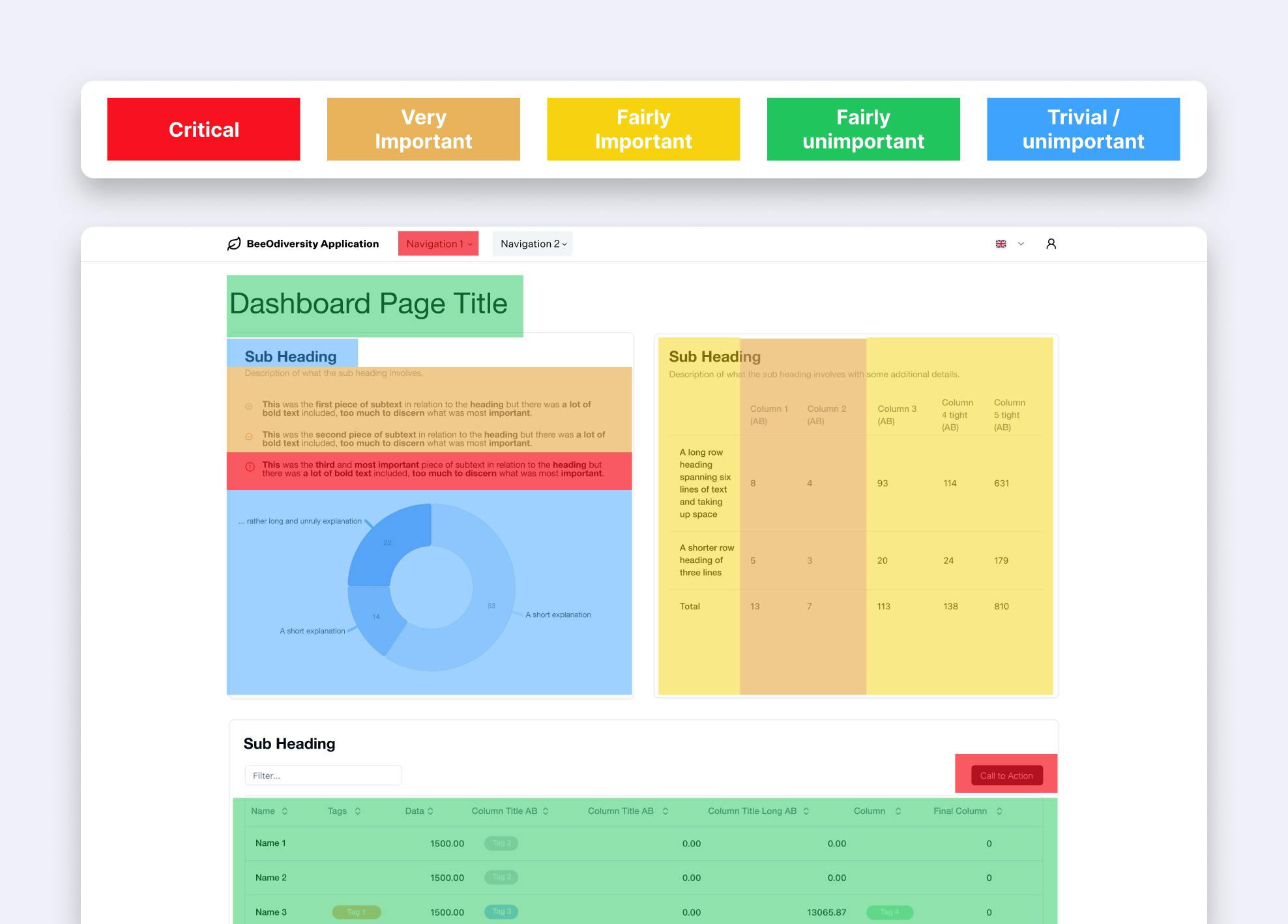
Our next step was to familiarise ourselves with the application and to identify areas of weakness or inconsistency. We spent some time testing out the functionality of the application, taking notes as we went. We also ran a heat mapping exercise to prioritise which elements of the content-heavy pages were most important to users. The thoughtbot team presented this back to the BeeOdiversity stakeholders for confirmation and to stay aligned. This step took roughly two days to complete.

Step 3 - Applying design best practices
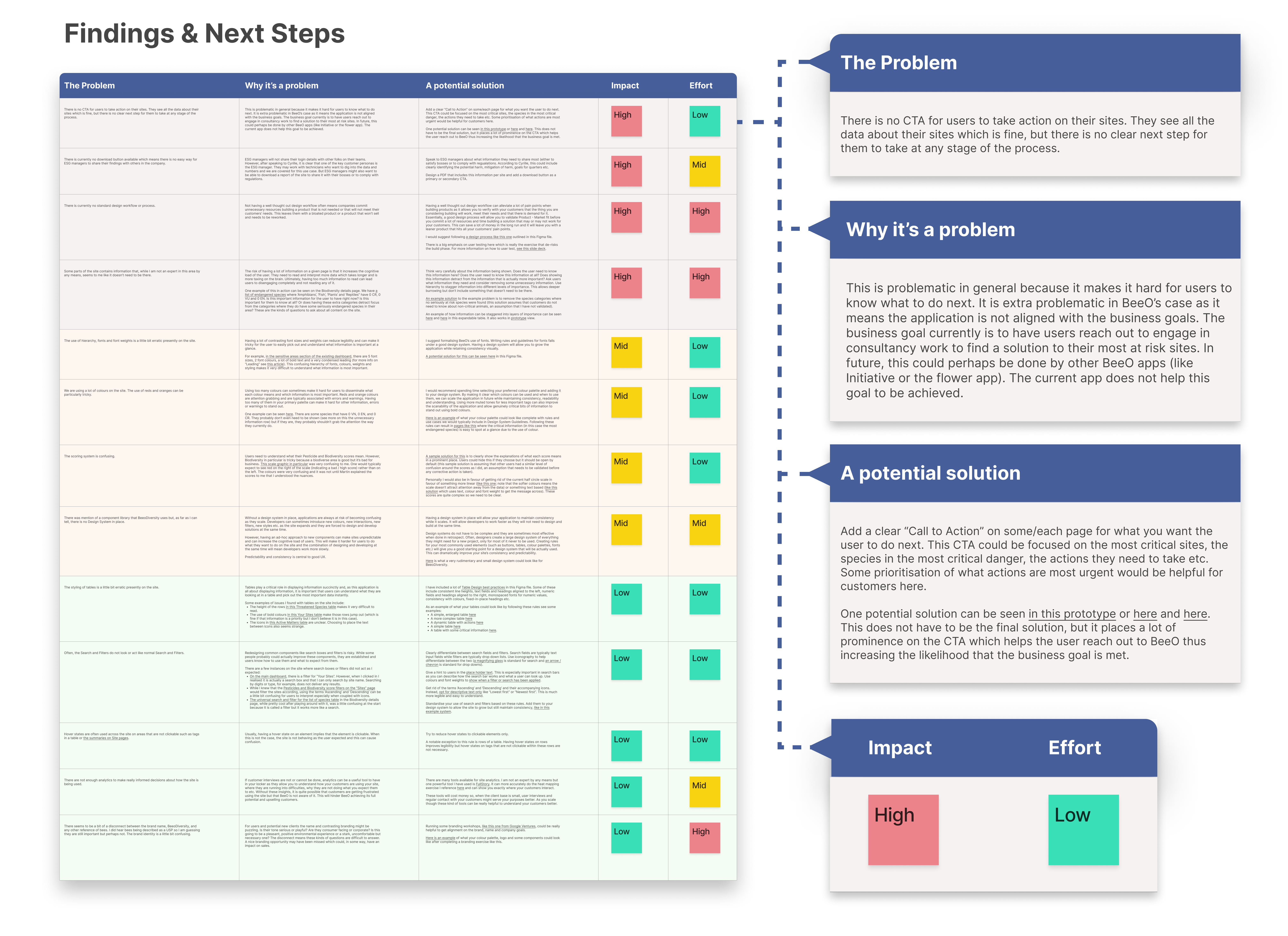
Next design heuristics and best practices were applied to the problem areas identified. This was done with a clear pattern in mind. First, we would identify and define the problem. Then we would explain why this is problematic. Finally, we explained the design best practices for solving the problem. Theory, empirical research and resources were all included with the proposed solutions where applicable. The thoughtbot team prioritised each item based on the impact of the solution and the effort required to execute it. This created a digital roadmap of improvements for BeeOdiversity to work on. This step took around 3 days to complete.
Thanks to thoughtbot's recommendations we were able to better organise the information in our app and funnel our users toward our consulting services when appropriate.
Step 4 - Sample Solutions
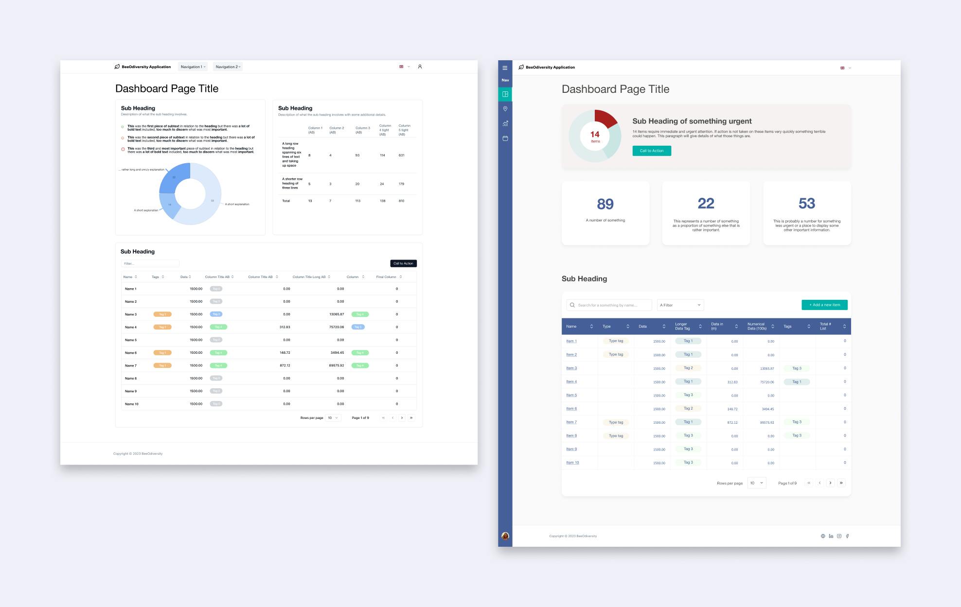
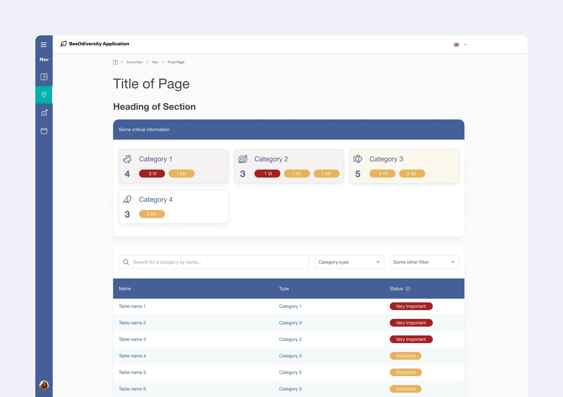
thoughtbot's fourth and final step was to provide some sample solutions to the problems we identified so that the BeeOdiversity team could see the solution theory in action. This included a detailed design workflow for future work, high fidelity designs, a clickable prototype and even the foundations of a working design system. This step also took roughly 3 days to complete.

The Outcome
A research-backed action plan for UX improvements
BeeOdiversity left the thoughtbot engagement with a prioritised list of findings for their application and confidence in the path forward. The list shows what the problem is, why it is a problem, the theory behind the solution and example solutions. Each item is marked by impact and effort to create a roadmap of changes that BeeOdiversity can execute.
Once implemented, the changes identified will improve the application’s user experience and increase conversions to the consultancy part of BeeOdiversity’s business, generating more revenue and happier customers.


