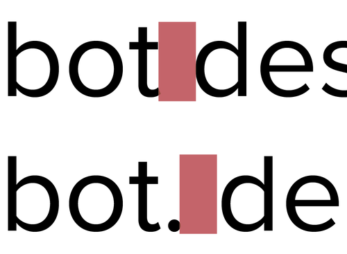
I have lots of typographic pet peeves. Lots. But the biggest one is when people put two spaces after a period. It leaves me looking like this:

Every well-designed typeface already includes extra space for the first space after the period. This gives the reader just enough breathing room to recognize that this is the end of a thought. When you add two spaces after the period you are breaking the reader’s flow.

Now, you might be thinking ‘Why was I taught to do this in grade school?’. That’s the remnants of the days when we were typing on typewriters. The monospace fonts used in typewriters couldn’t accommodate for the extra space needed at the end of a sentence, so to make that break obvious people were taught to add two spaces. This became obsolete once personal computers had variable-width typefaces but some people never left the habit behind.
Need more than just my word? Every major manual of style holds this rule, including MLA and the Chicago Manual of Style. HTML follows this rule too: it will collapse two spaces down to one.
Please: for my sanity and your reader’s flow, stop putting two spaces after a sentence. Save your spaces for your code.
