At thoughtbot, we often work with clients who need more than just a beautiful design and clean code. They need to understand why we made certain decisions and how to maintain consistency as their product evolves. After wrapping up a recent client project where we built both the visual design system and the CSS architecture, I realized how critical it is to leave comprehensive documentation that bridges the gap between design and development.
“Comprehensive” might make you think No one will read that… so here’s what we’ve learned about creating handoff documentation that actually gets used.
The problem with “figure it out” handoffs
We’ve all been there. A designer hands off a Figma file with 47 components and says “everything you need is in here.” A developer delivers a codebase with the comment “the CSS is pretty self-explanatory.” Six months later, the client’s internal team is creating inconsistent button styles and writing duplicate CSS because they don’t understand the underlying system.
The issue isn’t that the work is bad, it’s that the reasoning behind the decisions isn’t captured anywhere. When team members change or new requirements emerge, the institutional knowledge walks out the door.
Documentation that bridges design and code
On our recent project, we created documentation that lives in two places: inline within the Figma design system and as a comprehensive CSS strategy guide for developers.
In-context Figma documentation
Rather than creating a separate design system document that inevitably gets outdated, we embedded guidance directly into the Figma file where components live. Each component includes brief notes covering:
When and how to use components:
- “Use the card component for displaying discrete pieces of related information”
- “Cards work best in grid layouts with 2-4 columns on desktop”
When to follow patterns vs. when to break them:
- “Stick to the established card structure for consistency, but you can modify the header style for special content types like testimonials”
- “If you need a card without an image, use the text-only variant rather than leaving the image area empty”
Specific usage guidelines:
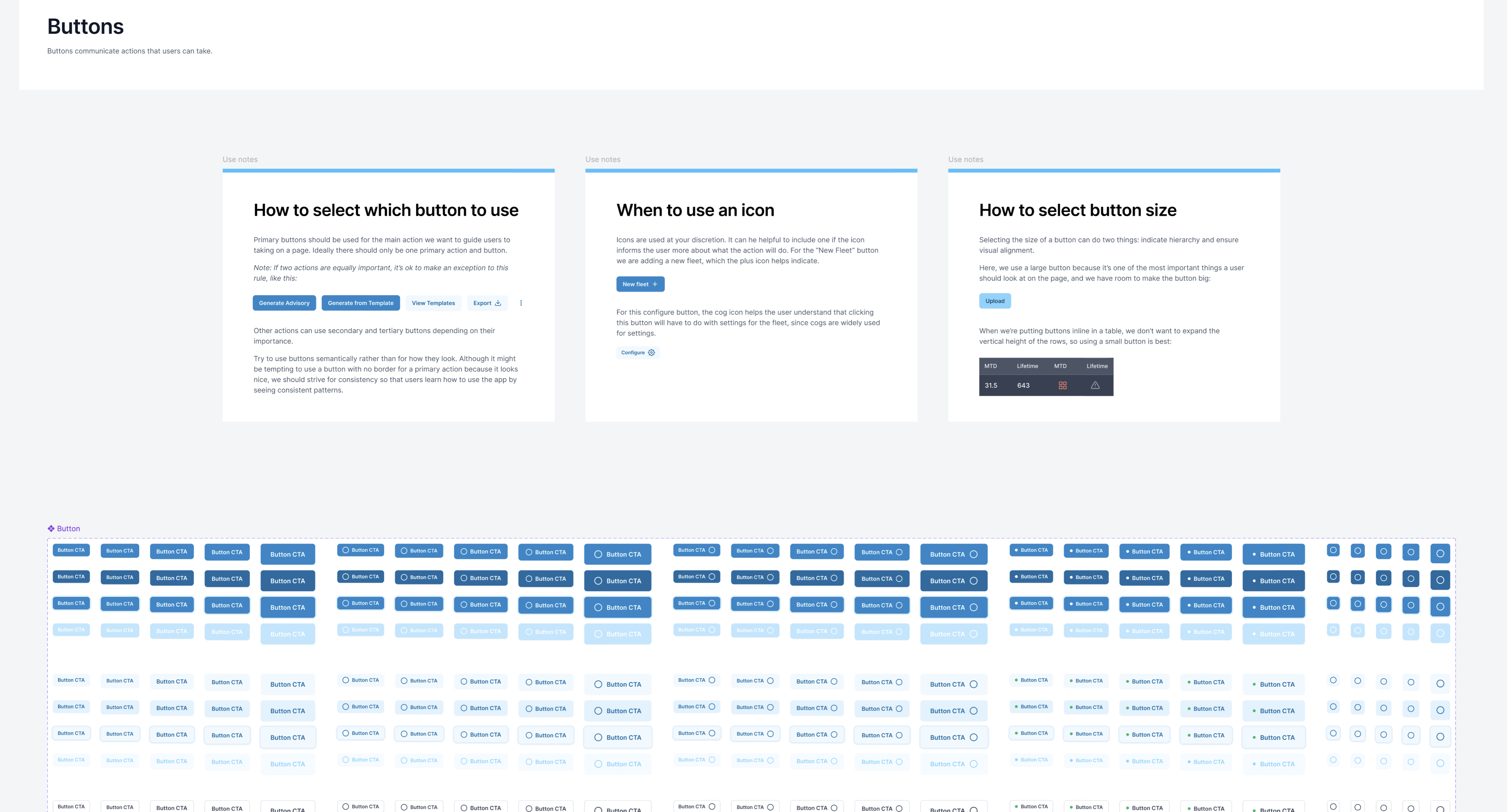
- “Primary buttons are for the main action on a page (usually one per screen)”
- “Secondary buttons are for supporting actions and can appear multiple times”
- “Use the danger button variant only for destructive actions like ‘Delete Account’”
This approach means designers and developers reference the same source of truth, and the guidance is visible exactly when someone needs it.
CSS strategy documentation for developers
For the development side, we created comprehensive documentation that explains not just what we built, but why we built it that way. Our CSS strategy combined CUBE CSS utilities with BEM naming conventions, but more importantly, we documented the reasoning:
Why we chose this hybrid approach: We wanted the maintainability of utility-first CSS without sacrificing markup readability. Pure utility frameworks like Tailwind can make it difficult to distinguish between a sidebar, header, or layout wrapper when scanning HTML. Here’s an example of what we included to illustrate this in our documentation:
<!-- Hard to understand the semantic purpose -->
<div class="flex flex-col bg-white shadow-lg rounded-lg p-6 mb-4">

<!-- vs. our approach -->
<div class="card u-flow-space-m">
How to extend the system: New developers can follow clear patterns for adding components—create minimal wrapper styles in the blocks/ directory, then use utility classes for internal layout. This keeps components reusable while preventing utility class bloat in the markup. Here’s an example of what we included to document this:
For new components, create a new file in the blocks/ directory for the component’s container styles:
// blocks/_feature-card.scss
.feature-card {
  background-color: var(--color-surface);
  border: 1px solid var(--color-border);
  border-radius: var(--border-radius-m);
}
Within your component container, rely on utility classes for layout and spacing:
<div class="feature-card">
  <div class="u-flow-space-s u-text-center">
    <h3 class="u-text-bold">Card Title</h3>
    <p>Card description content</p>
    <div class="u-flex u-justify-center u-gap-s">
      <button>Action 1</button>
      <button>Action 2</button>
    </div>
  </div>
</div>
When to break the rules: Sometimes components need extensive custom styling (complex data visualizations, unique interactive elements). We documented when this is acceptable and how to approach it.
What good handoff documentation includes
Based on this project and others, here’s what we recommend including in design system handoff documentation:
For designers (in Figma):
- Component purpose: When to use each component and when not to
- Flexibility guidelines: Which elements can be modified and which should stay consistent
- Usage examples: Screenshots showing the component in different contexts
- Interaction patterns: When to use primary vs. secondary actions
- Accessibility notes: Required labels, color contrast considerations, keyboard navigation
For developers (in the codebase):
- Architecture decisions: Why you chose specific methodologies or frameworks
- Extending patterns: Step-by-step instructions for adding new components
- File organization: Where to put different types of styles and why
- Best practices: How to maintain consistency as the system grows
- Quick reference: Essential classes, variables, and patterns for daily use
For everyone (shared documentation):
- Design principles: The underlying philosophy that guides decisions
- Content guidelines: Tone, voice, and content patterns
- Brand application: How visual elements support business goals
- Maintenance plan: Who’s responsible for updates and how often to review
Making documentation that gets used
The best documentation in the world doesn’t matter if no one reads it. Here’s how to make yours actually useful:
Keep it contextual: Put information where people need it, not in a separate wiki that requires hunting. We put the CSS Strategy document right in the repo itself for easy access while working on the system.
Include examples: Show don’t just tell. Code snippets and visual examples are worth paragraphs of explanation. Tools like Storybook or Lookbook can be helpful for creating structure around this if you want to do it for each component.
Explain the why: Don’t just document how to use something. Explain why it exists and what problems it solves.
Make it scannable: Use clear headings, bullet points, and code formatting. People are usually looking for specific information, not reading cover-to-cover.
Keep it current: Outdated documentation is worse than no documentation. Build updating it into your process.
Start with your next project
You don’t need to overhaul your entire process overnight. Pick one area (like component usage guidelines in Figma, or a CSS organization guide) and try including it in your next client handoff.
The goal isn’t perfect documentation. It’s documentation that helps your client’s team make consistent decisions when you’re not there to ask. Because the best design systems aren’t the ones that look perfect on delivery day, they’re the ones that still look cohesive a year later.