The Boston Globe recently raised the bar for responsive web design.
Please allow me to lower it.
For our playbook, I wanted to provide a pleasant reading experience for desktop and mobile web browsers. However, I’m lazy.
My answer to “what’s the simplest thing that could possibly work?” was a single-column layout with a maximum width that would also fit mobile devices:
margin: 0 auto;
max-width: 480px;
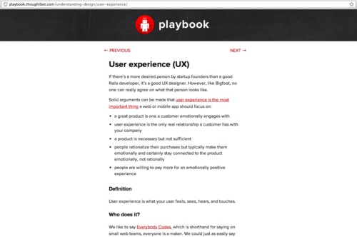
That makes the User experience section look like this on a desktop…
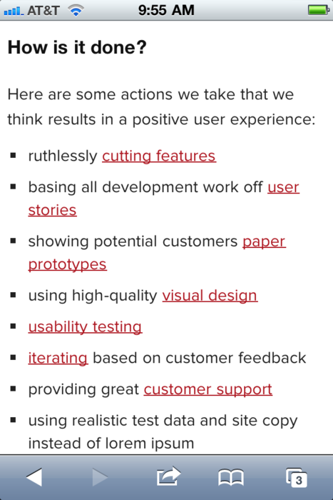
… and like this on an iPhone…

No media queries or other additional resizing tricks except for messing with the viewport a little and hiding the browser bar when possible:
It also means fewer conditional statements, which we aim to eliminate.
max-width isn’t supported in IE6 but we don’t support IE6.
Responsive web design is already very elegant in its simplicity. My thought is that for use cases like landing pages and content sites, it can be even simpler using a thin, vertical one-column layout.
I’ve heard landing pages convert better using a vertical, single-column layout. The premise is anything that distracts the user, including navigational elements and sidebars, will hurt conversion.
For the playbook, the average time on the site is 4:40. So, I’m feeling pretty good that the layout is working well to focus readers on the content.
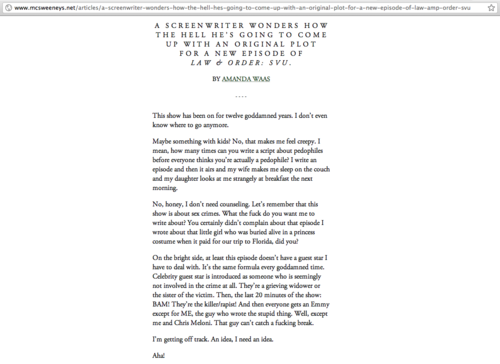
My guess is other content sites like McSweeney’s Internet Tendency do similarly well keeping its readers engaged on their 400px-wide desktop version:
With the addition of one line of code…
<meta name="viewport" content="width=device-width">
…they could make their mobile web version immediately readable without zooming instead of presenting a garish request to download software for “optimized” reading:

It’s so easy, even a lazy man can do it.