We occupy three-dimensional space. Sometimes it’s fun, sometimes it’s dangerous, but that is where we live and it influences how our brains are accustomed to interacting with the world.
In fact, we’re so accustomed to it that we will subconsciously assign fake three-dimensional attributes to digital elements on a flat screen. Dropdown menus don’t just replace the content they cover, they feel physically “above” them. When we scroll down a page, the elements that move off-canvas are still in our mental map, even though they are no longer being emitted by the screen. They aren’t pixels of color; subconsciously, they are real. We can’t help ourselves. But we can use the illusion of depth to make sense out of our designs.
Think of the visual elements in your application as pieces of paper. Some of the pieces can move independently of the others, while some are taped together. Some are fixed in place while the user scrolls, and some are hidden off-screen.

For example, a header might have important navigational links which the user needs no matter where we move the other pieces, so we position it in place “above” the other pieces. We can take it one step further and give the header a drop shadow or a slightly translucent background so we can see the content slide behind it. By using some visual styling, we can create the feeling of interacting with something more than just pixels on a screen.
Separating your content into logical groups with their own interactions will make navigation effortless. Grouping similar elements not only make it easier to arrange and organize your content, but makes it possible to give different interaction treatments to each area for different contexts.
How do we know how things should be grouped? We turn to Gestalt theory. It is a wide-ranging study which explains how we make associations between visual objects. We will expect objects to be related if:
- Proximity: The objects are close to each other
- Enclosure: The objects are within a visual container
- Similarity: The objects look similar
- Figure and ground: The objects are visually distinct from the background

Proximity
Things that are alike should be grouped together. This seems obvious enough, but sometimes these connections can be hard to define and categorize. When the user looks for related things on a page, they expect them to be nearby. When an interaction isn’t where they expect it to be, they will spend time looking all over the page, with building frustration. Pulling similar elements together can also help a page feel simpler and less cluttered.
If you aren’t sure where a piece of content belongs on a page, consider ordering their proximity like this:
- Directly related content
- Suggested content that is main content on its own page
- Unrelated global content, like navigation
Your main content should be front and center, with as little clutter as possible around it. Navigation links should be grouped into headers, footers, and sidebars. Consider using popovers, modals or accordions for useful but secondary actions.
This rule also goes the other direction. If a piece of content is not directly related to the main content, make sure there is separation so the user knows that it is distinct. Content that is completely unrelated and unimportant should not appear on the page and should be moved to a page of its own.
Enclosure
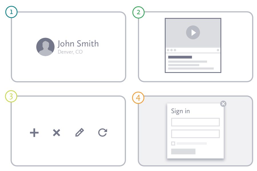
Enclosure can be used to reinforce proximity; either tying content together or to differentiate it. Comments about a blog post should be close to the blog post itself, and including them in the same visual column or surrounded by the same border helps to make that connection. Using a container, links to edit or delete an item can appear on the item, rather than simply near it.

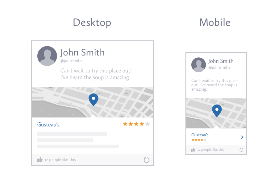
Cards might be enclosure in its purest form, and they are quickly taking over the internet. In some ways, this trend represents a moving away from pages as completely contained information, and embracing the aggregation of data that makes the web so powerful. It is also part of a new wave of design patterns coming to us from mobile-first thinking, which focuses on displaying chunks of content on a wide variety of devices and contexts.
You can also divide an enclosure by using lines, nested containers, or simply differently colors backgrounds. It can cause some extra cognitive overhead for your user if things get complex, so default to grouping with proximity and keep your enclosures subtle.
Similarity
If visual elements have the same style, we will also expect them to behave the same way. Unfortunately, mismatches tend to build up over time. They can happen when pulling together assets (like icons) from disparate places on the web, or when multiple designers are working on a project without enough communication. Building a styleguide helps fight the inevitable erosion, but it takes dedication to maintain.
Your users are primarily making these connections within your site, but they bring with them the experience of design patterns used elsewhere on the web. Experimentation is good, but defaulting to consistency with established patterns will cut down your design time and shorten the learning curve for your users.
Figure and ground
Another way to distinguish new content is to create the illusion of it being above the main content. This is best used for very small pieces of information, and can take a few different forms.

Popovers (sometimes called “Dropdowns”) offer a way to hide content until it is needed while still keeping it nearby.
Tooltips are just popovers containing a label or short description. They are revealed on hover and are most commonly used to explain an icon’s meaning or give a little more detail where room is tight.
Modals then are like the older sibling to the popover. They are larger to accommodate more complex interactions or content like images and videos. They sit at the top of the entire window and often block any action on the content underneath with an overlay. Triggering a modal usually requires clicking an explicit link rather than simply hovering over an area.
