The thought of designing a product from nothing can be scary. It’s very tempting to start fast and maintain that pace. This usually means building up a series of pieces linearly. In theory they are then tied together into an app or a website. While this is a valid approach, there are good and bad times to work this way. To understand when, it’s best to think about what makes a good app or website.
Dieter Rams is one of the greatest designers – ever. A minimalist at heart, he has created a collection of excellent products in his lifetime. In an attempt to distill his philosophy he proposed ten principles to guide others. The principles don’t only apply to industrial design, they transcend the whole practice of design. A well designed app is:
- innovative
- useful
- beautiful
- understandable
- unobtrusive
- honest
- long-lasting
- consistent
- simple
I think the most important of these principles is consistency. Without consistency we’ve found ourselves struggling to meet the other principles quickly. Without consistency something may not be simple, understandable or useful. The principles often rely on each other. Thinking about small details all the time can make consistency harder, isolating the pieces can make it worse.
It’s easy to build a mess of well considered pieces that are poorer as a whole.
Before concentrating on smaller details we design a solid plan, a map. How does the app flow and feel? We find it important to think big at this stage. It’s easy to build a mess of well considered pieces that are poorer as a whole. We’ve also found it can be difficult to consider the effect a tiny element can have on others when working backwards. We also avoid creating pixel-perfect mockups too. Too much detail early on can lead to losing sight of function—colour comes after shape.
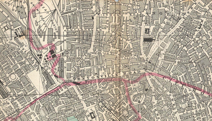
Consider the differences between London and New York City. Built up over hundreds of years, London is an ancient city. Starting as a small settlement, constant expansion led to a tangled mess of streets. In London each person focused on their patch of land and left the rest to others. Meanwhile New York is a modern city, planned from the beginning. The city is consistent, you know what to expect. Both cities are beautiful, but one is easier to use than the other.


Communication is key
As a team we take a step back, gather our research and work together to build a map. This usually emerges as a wireframe. Keep it simple, but consider the journey the user will take. We don’t expect it to be beautiful or final, the product may look nothing like the first draft. What matters is that we have thought about it before diving into more detail. This can be slow, inefficient or seem prescriptive but it often saves us from pain later—communication is key.
When is the best time to think small? It’s a great way to maintain momentum and build with efficiency, once we have a clear plan and direction. We’ve also found it’s a very good way to approach a design overhaul of an existing product. In this scenario we’ve found it makes sense to tackle the problem in smaller, more manageable pieces.
When we are starting from scratch we start with a clear and defined map of the product. Later on starting to think smaller and nail those details. Validation is also key for us, a product design sprint is our favourite tool for this. Followed by a phase of wireframe design backed by a good set of stories. We use tools and methods together, and exploit all their strengths.
