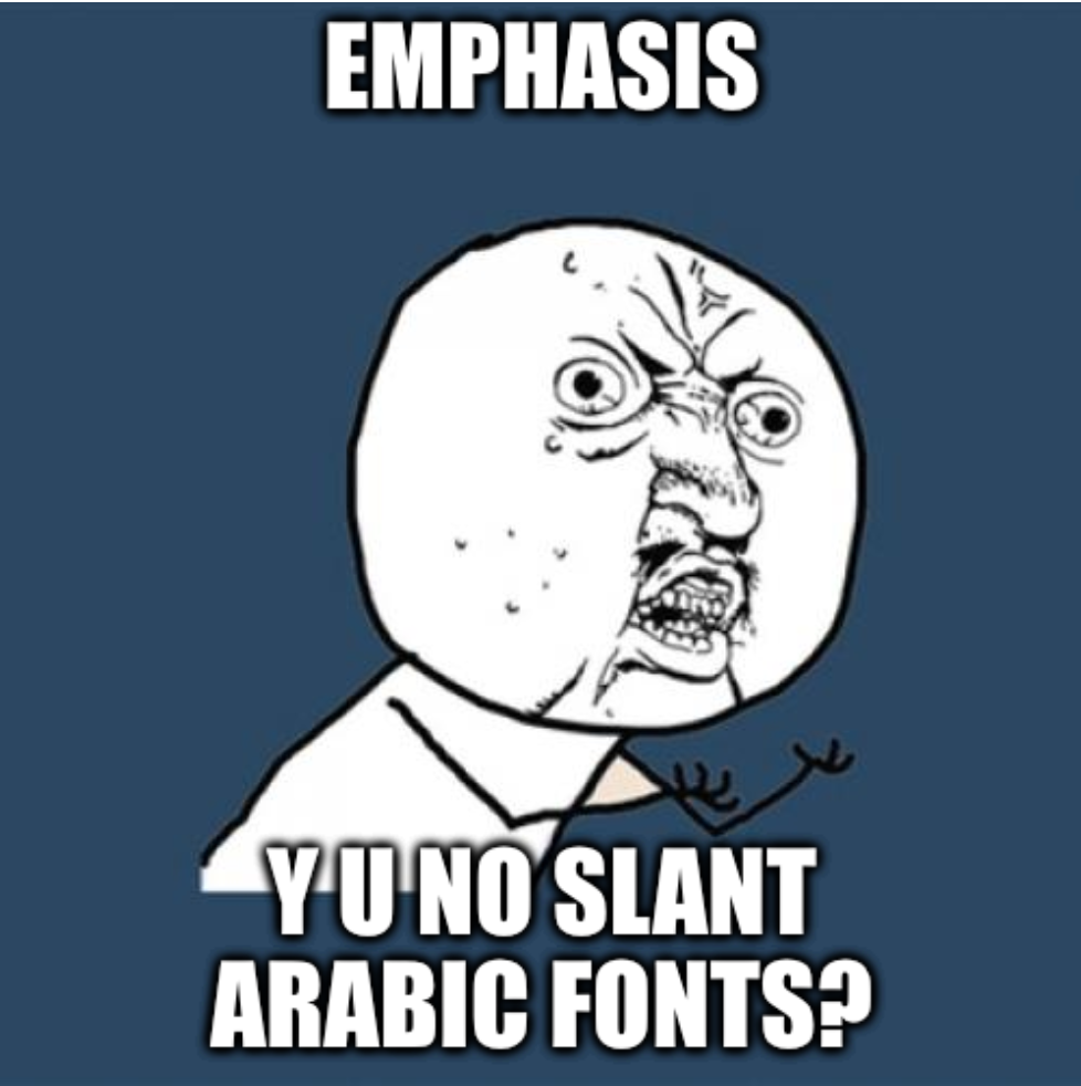
A few years back, I had a conversation with Dr. Nadine Chahine, I asked her about oblique (italic) fonts and their use in Arabic, and why many Arabic fonts don’t provide italic formats. She explained that historically speaking, latin fonts had different styles such as Roman, Italic, and Black Letter. At some point, the Italic font became a secondary font to support other primary fonts used for emphasis, titles, and bibliography among other uses. With time, the slanted style of the Italic font was subsumed by primary fonts and oblique styles were developed for most latin fonts.
Arabic typographic tradition has similar cross-font connections but with different goals. For example, the Naskh/Thuluth or Rayhani/Muhaqqaq connections, which are body/headline connections. The Arabic language’s tradition however, does not have a body/body-emphasis connection like with the latin language.
Thus, obliques are a special latin calligraphic style that got imported into the typographic and technology worlds. Importing the idea of obliques wholesale into Arabic brushes off the nuanced details of Arabic typography causing more problems that it would solve.
Should we slant right or left? Naskh font slants a few degrees left, while Kufic Ma'il slants right; which one should we force against its tradition? If we force Kufic Ma'il to the left, the letters baa & jeem will look all too similar. These questions and many others need to be resolved before adapting oblique fonts to signify emphasis.
Dr. Chahine suggests dropping the whole slanted direction and adapt other practical methods. She suggests mixing fonts where one font is a primary font and the other an emphasis font. Similar to the original genesis of italics. For example mixing Ruq'ah with Naskh.

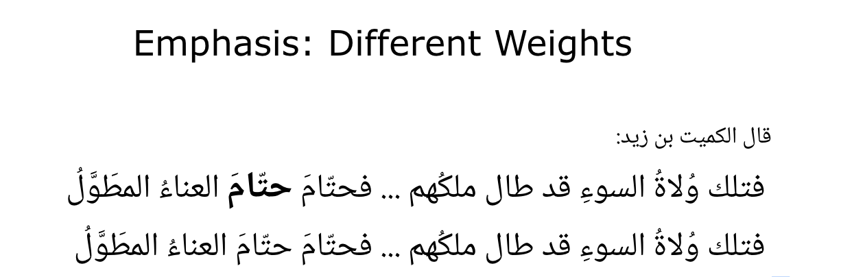
Another direction is using different font weights. Typographers could put more effort into creating different fonts e.g thin, regular, medium, bold, and black. Dropping the whole obliques design efforts once and for all.
This blogpost was originally posted in Rami’s personal blog.