On Giant Robots, we’ve switched from using Skolar and Proxima Nova via Typekit for our body and header typefaces, to Chronicle Text and Sentinel via the typography.com cloud. We’ve adjusted line-height, weights, vertical rhythm, and the CSS we use to render the type. Typographers sweat every curve and corner when designing a typeface, and as designers we need to take equal care in selecting them. This article explains the intent and technical reasoning behind each adjustment, beginning with the choice of the new typefaces.
Body Text — What Makes Chronicle Text Better
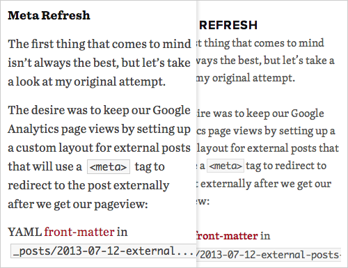
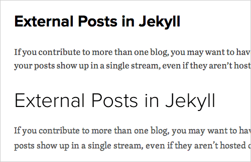
The current design using Chronicle Text is on the left. The first thing to notice is Chronicle Text’s larger size — it’s the main reason the typeface appears more readable, but both faces are set to 16px. Skolar looks smaller because its ascenders and descenders don’t reach the boundaries of its glyph’s bounding box — each glyph in a typeface is contained within a bounding box, the digital descendant of the sort. When type was made in metal, each glyph of the same size was cast into a sort of the same size; Chronicle Text would have just filled more of the sort than Skolar.
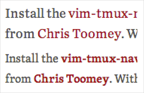
Chronicle Text also has a large x-height, the height of its lowercase letters. It’s proportionally taller than Skolar’s x-height, and still clearly differentiated from the uppercase. More height means larger letters and larger counter forms, the enclosed or partially enclosed spaces within a letter. At small sizes, the lines around a counter can blend together due to anti-aliasing and create a fuzzy texture; note the small counter on the letter “e” in “Toomey”.
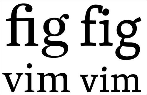
Skolar is very curvy, you can see how much more consistently vertical and horizontal Chronicle Text’s strokes are in “vim” vs the arched feet of Skolar’s “vim” — the “v” even has an ink trap. This may reproduce well at medium sizes or in print, but on screen at 16px, these details are obscured by pixelated approximations.
Chronicle Text’s lines look closer together due to its larger apparent size, so its line-height needed to be increased. Line-height is somewhat dependent on font weight, x-height, medium, and preference, but a good guideline is to avoid creating a lined texture with too large a line-height, and a dense texture with too little — if the space between lines is smaller than the space between words, it’s definitely too small.
Typography.com allows you to select OpenType features à la carte like kerning pairs and ligatures, but you need to enable text-rendering: optimizeLegibility in your CSS to render these features. There’s a cost to render time relative to the amount of text, but we think it’s worthwhile since our articles are usually short to medium length.
Subheads — Standing Out and Pairing Up
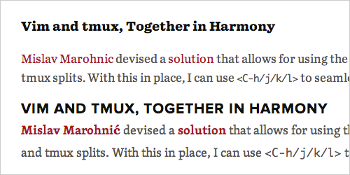
We previously used an all caps Proxima Nova for our subheads. Ellen Lupton (among others) has a rule of thumb to never change more than two things to differentiate a piece of type. The Proxima Nova subhead was larger, bolder, a different case, a separate typeface, and had a different bottom margin than the paragraph text. It’s been replaced by Sentinel Bold, which only changes the typeface and the weight. Sentinel is a beautiful almost-slab-serif from Hoefler & Frere-Jones, and a recommended combination with Chronicle Text. We almost used Chronicle Text Bold for subheads, but decided to go with H&FJ’s recommendation. Sentinel, like slab serifs in general, is built to be bold, so less detail is lost at heavier weights.
Typographic choices are often a matter of taste, and the choice between Sentinel Bold and Chronicle Text Bold is an example. Differences can be small when comparing two typefaces of the same category, and sometimes you have to rely on taste or some other meta information to come to a conclusion. In their rebranding of the Whitney Museum, Experimental Jetset used Neue Haas Grotesk, the product of a collaboration between Swiss and New York type designers, mimicking the collaborations behind the museum’s collection and architecture. In this case, the typeface’s history, not just its appearance, played heavily into the designer’s choice.
Thin Weights and Headlines
H&FJ makes beautiful headline typefaces, but many of them have specific personalities that will end up dominating a page if you’re not careful. We want our headlines to be obvious but unobtrusive, so we chose to keep Proxima Nova at a heavier weight. We didn’t use a light weight anywhere except the headline previously, and it displayed poorly on older and Windows systems. Increasing its weight improves the site’s consistency, scannability, and the reading experience for many of our visitors.
Vertical Rhythm
Vertical rhythm encompasses a lot of ideas on layout, all of which revolve around the vertical spacing of items and type on a page. Print designers work with the finite widths and heights of paper. To avoid overrun, print designers have to use a vertical grid just like most websites use a horizontal one, this ensures that each page ends in the same place, and any two pages on the same system look aligned side-by-side. Since we have no control over our canvas on the web, many of these paradigms no longer make sense. Line heights need to be taller to accommodate longer lines, and the page is arbitrarily cut off in the viewport, vertically and horizontally. The idea of vertical consistency should apply in some places, but not others.
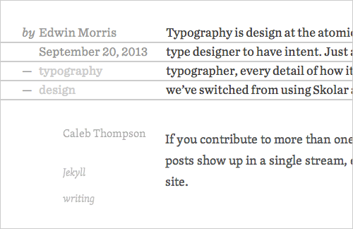
Our sidebar showing tags and the author was previously unaligned with our content; this is easily passed over, but becomes obviously wrong once noticed. In the new design, all the side-by-side pieces are aligned to a vertical grid.
Wrap-up
I think it’s important for us not to be under the illusion that anybody else caresSaul Bass on making beautiful work
Tens (sometimes hundreds) of thousands of people read our blog every month, and although very few of them likely noticed the change, we feel an obligation to create a great reading experience designed with intent down to every detail. If you have a question on anything mentioned, or notice anything unmentioned, tweet @thoughtbot.
Follow @ehmorris on twitter