When we design a product, we choose words and group content to help users use the product. Those decisions form the basis of the product’s “information architecture.” During this process, it’s tempting to project our ideas of who our users are, how they behave, and what they want.
To combat against this tendency toward our biases, we run design exercises such as card sorting.

What is “card sorting”
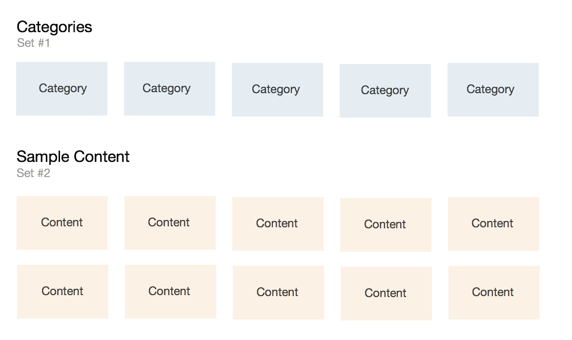
Card sorting is a design exercise that guides us toward creating the most coherent information architecture of a product. During a card sorting session, participants are asked to associate two sets of flashcards by grouping them. While the first set of flashcards contains categories, the second set contains sample content.
For example, if these are our categories:
- Subscribe
- Unsubscribe
- Connect
Then our sample content might be:
- Follow someone
- Post a new message
- Send private message
- Like a post
- Share a post
- Delete content
- Unfriend
We observe how they map one set of information to another to create category-content mappings. When we conduct card sorting, we ask this question:
How do people organize content into categories?
The way participants group and sort the cards will reveal a users’ mental model and guide the information architecture of the product.
Preparation
Card sorting is a low-cost and time-efficient way to validate assumptions and identify new learnings about our users and product.
Here’s what we need:
- 30 minutes
- 3-5 participants
- Flash cards or Post-it notes
After we’ve scheduled time to meet with our participants, we:
- Create category cards (set #1).
- Create sample content cards (set #2). Set #2 should have about twice as many cards as Set #1.
Running the exercise
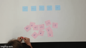
Each participant goes through this exercise one at a time.
- Ask the participant to match cards in set #2 (sample content) to corresponding cards in set #1 (categories) based on what makes sense to them. There is no right or wrong answer.
- Observe and take notes of the participants’ category-content mappings.
- At the end of each participant’s session, take a picture of which cards in set #1 were matched to cards in set #2.
- Repeat.
Gathering results
In order to learn about our participants’ category-content mappings, we plot our collected data onto a spreadsheet. We’re looking for common patterns in the resulting mappings, as these are the things that will influence our product decisions. Here’s how we organize the spreadsheet:
- Label the first row with category card names.
- Label the first column with sample content names.
- Since we have images of results by participant, place a tally inside the cell where category column and sample row intersect.
- Repeat for each participant.

The resulting spreadsheet reveals the frequency of each category-content mapping by participants. We now have our data gathered.
Deriving outcomes
To determine the best outcomes given our data, we identify the strongest and weakest category-content mappings.
The cells with the most tallies represent strong category-content mappings.
Cells with the fewest tallies represent weak category-content-mappings.
In my example, I had only four participants.
So, the most number of tallies that a cell can have is four (IIII).

The strongest category-content mappings are represented by the categories with the largest number of tallies. There is general consensus about these informational relationships.
For example, all of our participants readily associated “Community” with terms such as “Mainville Middle School 2013-2014” and “thoughtbot SF”. This insight informs how we represent community information in the product.
Now, let’s identify the weakest category-content mappings.

Cells with fewer tallies represent weaker category-content mapping. Another way to identify weak category-content mapping would be to look for rows with a wide distribution of tallies.
Weak category-content mappings deserve our attention because they reveal a lack of consensus about how one type of information relates to another. They highlight cognitive gaps that must be addressed so that our wider user base can understand how to use our product.
Typically, categories with lower tallies could be reconsidered, as they did not reveal themselves to be a significant group of information.
Questions to ask ourselves
Here are some questions to ask in order to learn from the results:
- What common patterns have been revealed?
- Are there any unexpected groupings from the participants?
- Which relationships were discovered?
- Should I consolidate any of these categories?
- Do I need to create any new categories?
- What have I learned about the participants’ mental models?
- How might I create a workflow that matches the participants’ mental models?
Next steps
To address uncertainties about users’ understanding of a product, try running this low-cost and time-efficient exercise. For assistance running this or other product design exercises, contact us.