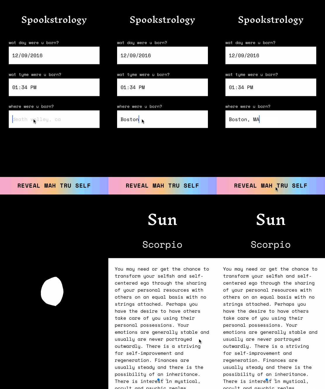
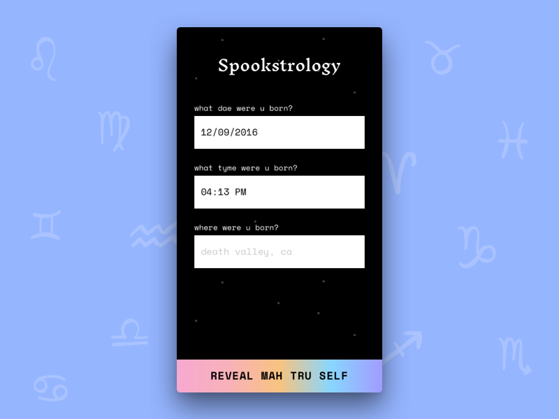
At the end of the year, thoughtbot hosts Ralphapalooza — a two day internal hackathon to learn and explore new technology (and hopefully ship something while doing so). This year we wanted to do something different, creative and fun but also get it out the door and into the world by the end of the hackathon. The end result of those two days was Spookstrology, an astrology app built in React Native.
We came up with the concept of a “spooky” astrology app to look up your various astrological signs. We chose this because it gave us the chance to get creative with the visual design and tackle design challenges than what we usually face in day-to-day client work while also being a fun and light-hearted project.
We were trying to figure out the best medium to build Spookstrology and we ultimately chose iOS. We could’ve easily made this a web app, but the challenge of shipping an iOS app in two days seemed more exciting. Could it be done? Turns out, it can.
What we came up with
Spookstrology takes the time, date and place of your birth to calculate a portion of your astrological birth chart. It returns your Sun Sign (the sign you’re most familiar with which is based on your birth date) as well as your Ascending and Moon sign.

On the development side
The primary reason we went with React Native was how fast it allows us to iterate. It also allowed the designers, Cristina and Ali, to tackle the design implementation while Blake focused on integrating with APIs, laying out the foundation of the app, and fixing bugs.
One major challenge we faced was finding a suitable astrology API that provided the content we required. We ended up finding Vedic Rishi which suited our needs for the hackathon perfectly. Once we found the correct endpoints, integrating with it was a breeze.
On the design side
React Native can be picked up pretty easily by designers and front-end developers who are familiar with web technologies such as Flexbox. Constructing elements on the screen share some similarities to HTML (JSX) and the syntax (StyleSheet) for styling elements on the screen largely mimics CSS. This let the designers start implementing the designs right away.
We sketched out some basic wireframes and the flow of the app on a whiteboard to get us started, then we began pulling together a moodboard. Vaporwave art, Hotline Miami, and witch house music inspired our visual direction. The end result of this hard work? Lots of gradients, hand drawn iconography and one spooky result.

In the end…
Some things aren’t meant to be forever. After our free trial of the API ran out, we weren’t sure if a two-day experiment warranted a monthly price tag for us. We learned a lot about React Native, had fun, and even picked up some astrological insights along the way. Spookstrology, you’ll live on in our sketch files, code and in our hearts.

Interested in learning more about using React Native in your projects? Check out our other posts here.
