Quicky Forecast
Helping companies get a quick and simple overview of sales activities
Challenge
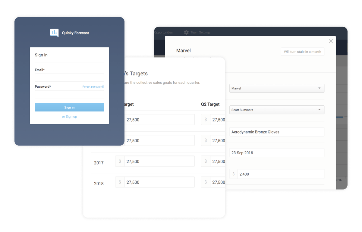
Buiding a lightweight sales dashboard
Outcome
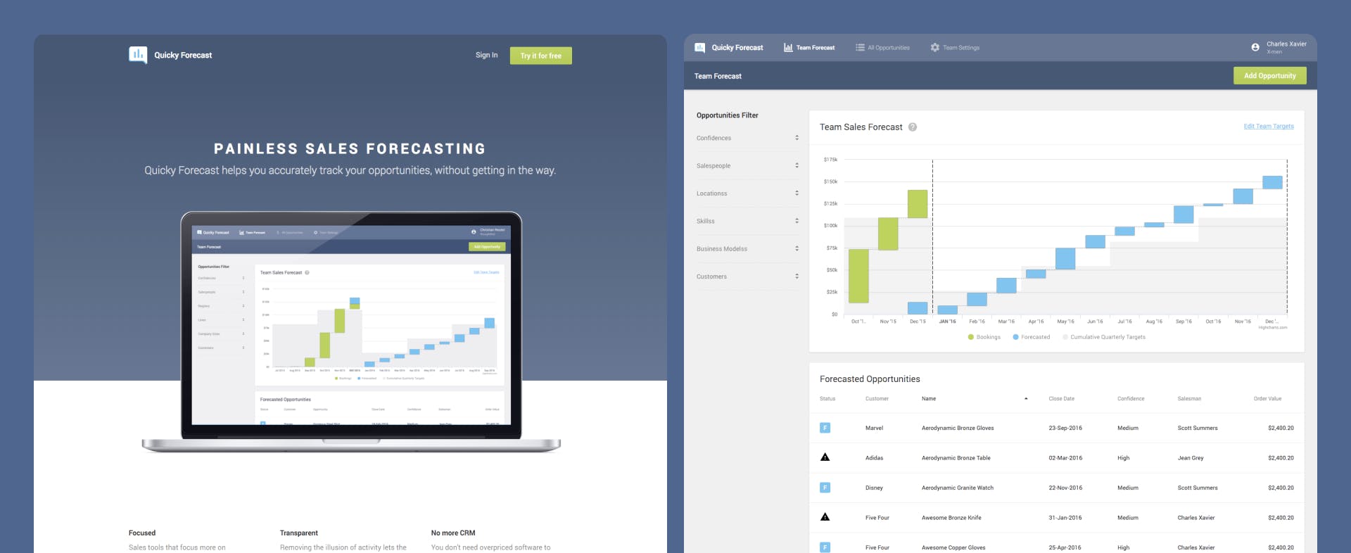
A simple sales data dashboard, easy to use and understand
Who is Quicky Forecast?
Quicky Forecast came to thoughtbot with a lot of experience in sales.
Having dealt with numerous frustrations around bad sales getting in the way of simple forecasting, their idea was to build a sales forecasting tool that would improve efficiency, user experience, clarity and work flow.
Many forecasting tools focus on measurement rather than progress and quality, making it hard for users to get a true overview of opportunities. Customer relationship management (CRM) tools are overpriced and unnecessarily complex. In a worst case scenario, they give salespeople the means to disguise their actual progress.
Quicky Forecast removes this illusion of activity, by offering a UI that promotes simplicity and transparency. In just a glance, the entire team can understand the sales forecast situation, see what's closed, what's forecasted, and when. Rather than just generating sales forecasts weekly or monthly, Quicky Forecast is always available and ready.