When we released Neat—a semantic grid framework built on top of Sass and Bourbon—earlier this fall, it was welcomed with great enthusiasm in the Sass community. Today I’m pleased to announce that Neat is finally out of the beta, introducing new responsive features, a visual grid, and better support for non-Rails projects.
Responsive Web Design
The breakpoint() mixin becomes media() in Neat 1.0 in order to keep the
syntax as close to CSS3 as possible.The update also introduces
new-breakpoint(), a helper function that you can use to define new media
contexts and use them throughout your project.
A media context is comprised of a width breakpoint and an optional total
column count that would redefine the grid. For instance, using a four-column
grid for mobile devices would involve defining a new media context with a
max-width of 480px and a grid column count of 4, like so:
$mobile: new-breakpoint(max-width 480px 4);
Once defined, you can use the $mobile context throughout your project using
the media() mixin:
div {
  height: 500px;

  @include media($mobile) {
    // All layout mixins in this context will use a base grid of 4 columns
    height: 100px;
  }
}
Which would output the following CSS:
div {
  height: 500px;
}

@media screen and (max-width: 480px) {
  div {
    height: 100px;
  }
}
Additionally, you can now use both min-width and max-width in the same
context:
$tablet: new-breakpoint(min-width 481px max-width 991px 8); // Use an 8 column grid on tablets
Keep in mind that each call of the media() mixin would result in a separate
@media block in the CSS output, a
Sass limitation that is still being actively
discussed.
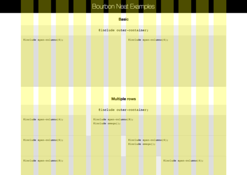
Visual Grid
Due to popular demand, we’ve baked in a pure-Sass visual grid in this milestone release. You can now display the underlying grid either as a background or as an overlay, and even change its color and opacity to better fit your content. Add the following line in your Neat settings to turn the visual grid on:
$visual-grid: true;
You can then change its look by overriding the default variables:
$visual-grid-color: yellow;
$visual-grid-index: front;
$visual-grid-opacity: 0.3;
Bonus: If you use new-breakpoint() to change the base grid, the visual grid
will automatically follow. You’re welcome.
Non-Rails Workflow
If you are planning to use Neat on a non-Rails project, you’re in for some good news. Neat 1.0 comes with a command line interface that allows you to install, update and remove the framework without hassle.
Start off by installing the gem in your Ruby environment:
gem install neat
Then run the neat install command in your project Sass folder:
cd your-project/your-sass-folder
neat install
To update Neat:
gem update neat
cd your-project/your-sass-folder
neat update
Make sure you don’t alter any internal Neat files as any changes would be
overridden when you run this command. Lastly, you can remove Neat either by
deleting the folder or by running neat remove.
Minutiae
This update also comes with a few bug fixes, namely the compatibility between
nested columns and the shift() mixin, and a new _neat-helpers.scss file that
you can use to access helper functions without having to import the whole
framework.
Your Turn
The only thing we’re missing at this point is your feedback, so give Neat a spin and let us know what you think through comments, tweets and pull requests.
