I gave a talk on Tropical.rb and, while writing it, I had a goal of not using bullet points in my slides. That made me create a lot more slides, and many of them contained images. I used AI to generate the illustrations for my presentation, but it required some work to get them to look how I wanted. Here’s what I learned along the way.
Getting What You Want
The first step when generating images is figuring out what you actually want. We might get stuck on analysis paralysis, so try to get something on the screen as soon as possible.
Iterate Over Ideas
I think that was one of the best parts of using AI. Sometimes, I had to
illustrate some abstract concepts like “HTTP requests”, so I didn’t know what
image I wanted in the first place. With AI, I could just give it a basic prompt
like A drawing representing an HTTP request
, and it would at least get
something on the screen. Once I see it, I can get inspired and iterate on that
idea.
Play around with prompts a bit and iterate over the results. You probably won’t get it right the first time.

Some things were very easy to generate, while others were impossible. For
example, I wanted a cartoon version of “The Thinker” statue, so I just
prompted The Thinker statue, cartoon style
and got exactly what I wanted
on the first try.

On the other hand, I wanted to generate a version of the “Drake meme”, but because it references a real person, the AIs wouldn’t generate it. It was so frustrating because I didn’t even want Drake himself in the image, just the meme format. I ended up giving up on this one.
Be specific
The more specific you can get, the easier will be to get what you want. I’m not an artist, so sometimes was hard to convey what I wanted because I didn’t know words for it (LLMs like ChatGPT to help you figure that out).
Try using references like “anime style”, “Van Gogh”, “synth-wave”, “cyberpunk”, etc. You can be even more specific specifying a particular piece of art or sub-genre (e.g., chibi manga). Using a particular artist’s name can also help, but the AI might refuse to generate it for copyright reasons.
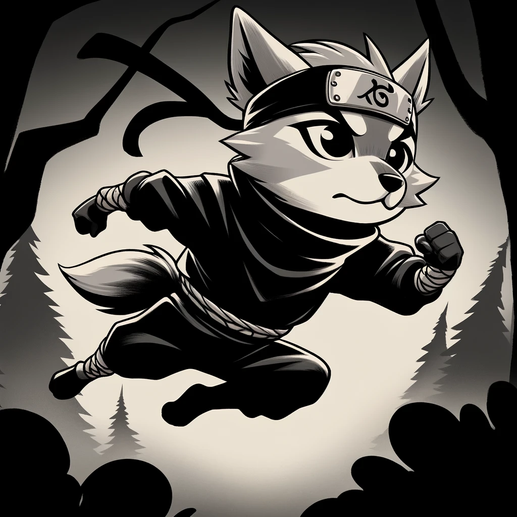
Negative prompts are very helpful too. If the AI is doing something you don’t want,
tell it to stop. For example, append no text
, no background
, or
don’t draw faces
to your prompts.
Dealing With Text
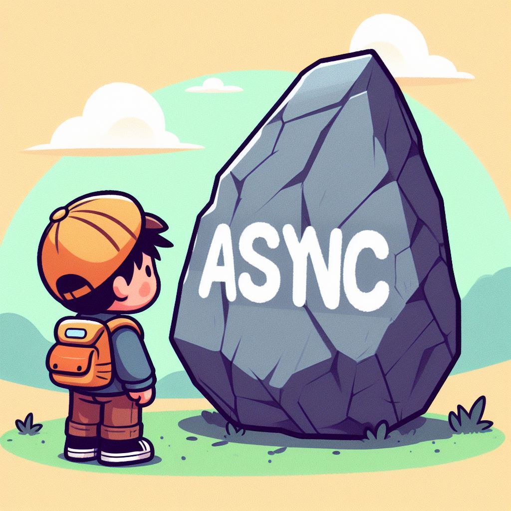
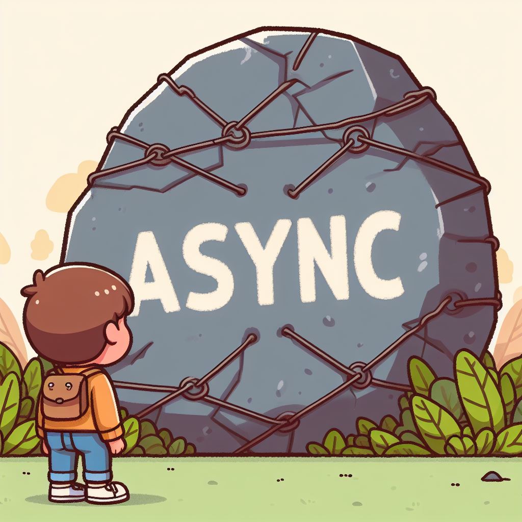
While it’s much better than it once was, AI still often struggles with text. For instance, it wouldn’t generate an image with the word “async” correctly spelled. It would either skip the N or merge the Y and N in a weird way that looked like a new letter. I tried prompting “ASYNC” in uppercase, but it did not help at all.
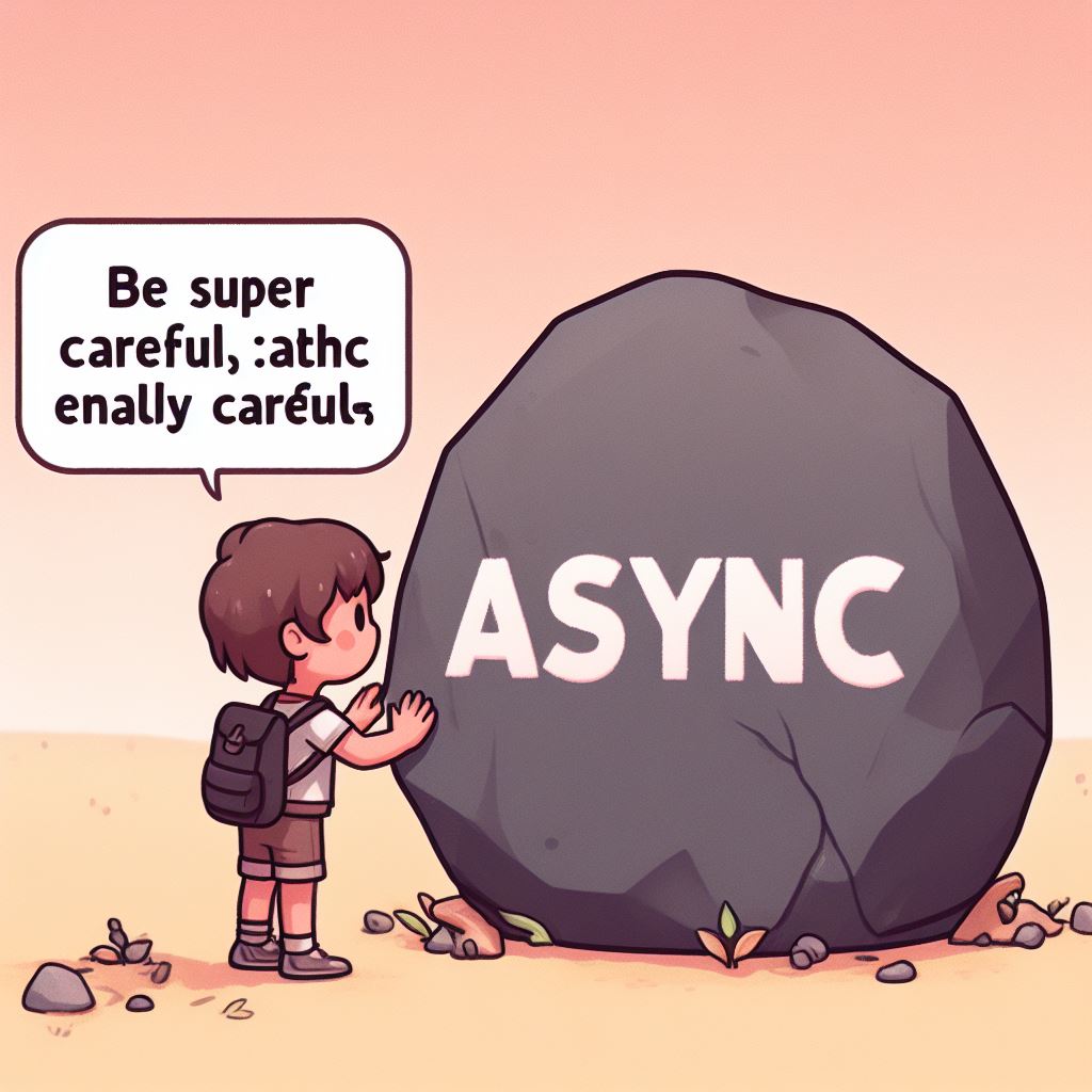
I told it to be super careful with the letters
, and that improved the
results a bit, but it made the AI add that phrase to the image.
The solution for me was to prompt do not misspell
.
Dealing With Small Images
I wanted images to use in my slides, so they either had to be big and in a 16:9 aspect ratio, or have no background so I could use them with a flat color background.
Most of the AIs available, in particular the free ones, only generate small images, or they only generate square images. If that doesn’t work for you, here are some ways to work around that. If you know how to use image editors, that will be useful, but you don’t need to be an expert to do many of these things.
Cropping
It might be possible to just display a part of the image, or the image in a smaller size. If that’s the case, you can just crop it. In my case, I want big images in my slides, as they are projected on a big screen and there was nothing else in the slides. I wanted the images to blend with the background, so I didn’t want a hard cut on the edges.
One of the simplest tricks you can use is to crop the image in a circle or rounded rectangle. Something about cropping images in circles makes the cut look intentional. Check this slide example:
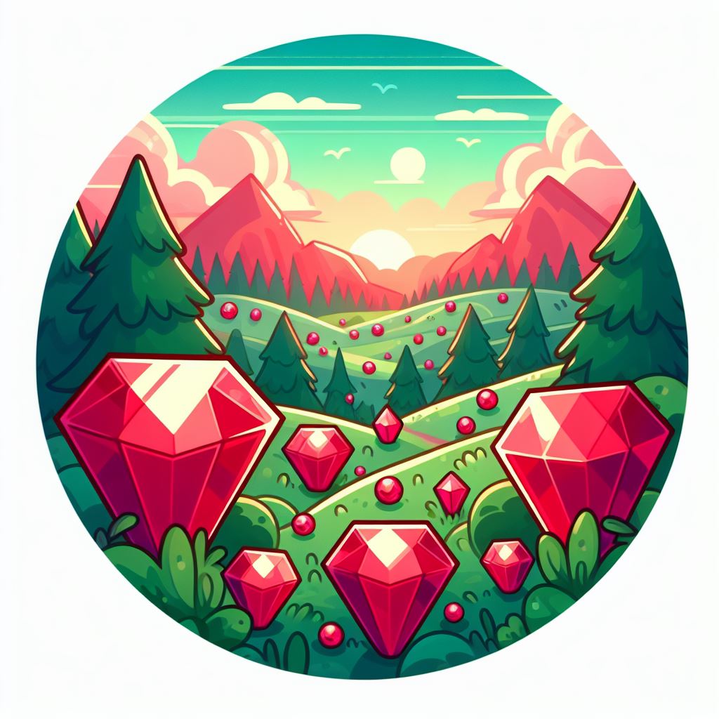
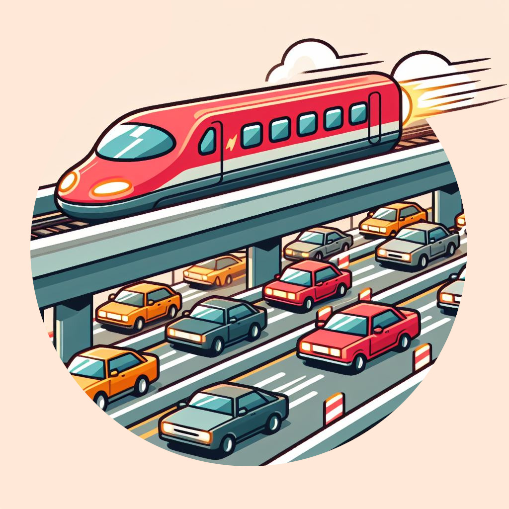
If you have some skills with image editors, you can also make some parts of the image go outside the circle, which has a nice effect.
Removing Background
Images with transparent backgrounds are really useful on slides because you can use them on top of a flat color and they will blend nicely. Unfortunately, all the AIs I tried cannot generate images with transparent backgrounds. If you ask for that you might get a “fake PNG” (you know, those with a checkerboard background, not actual transparency).
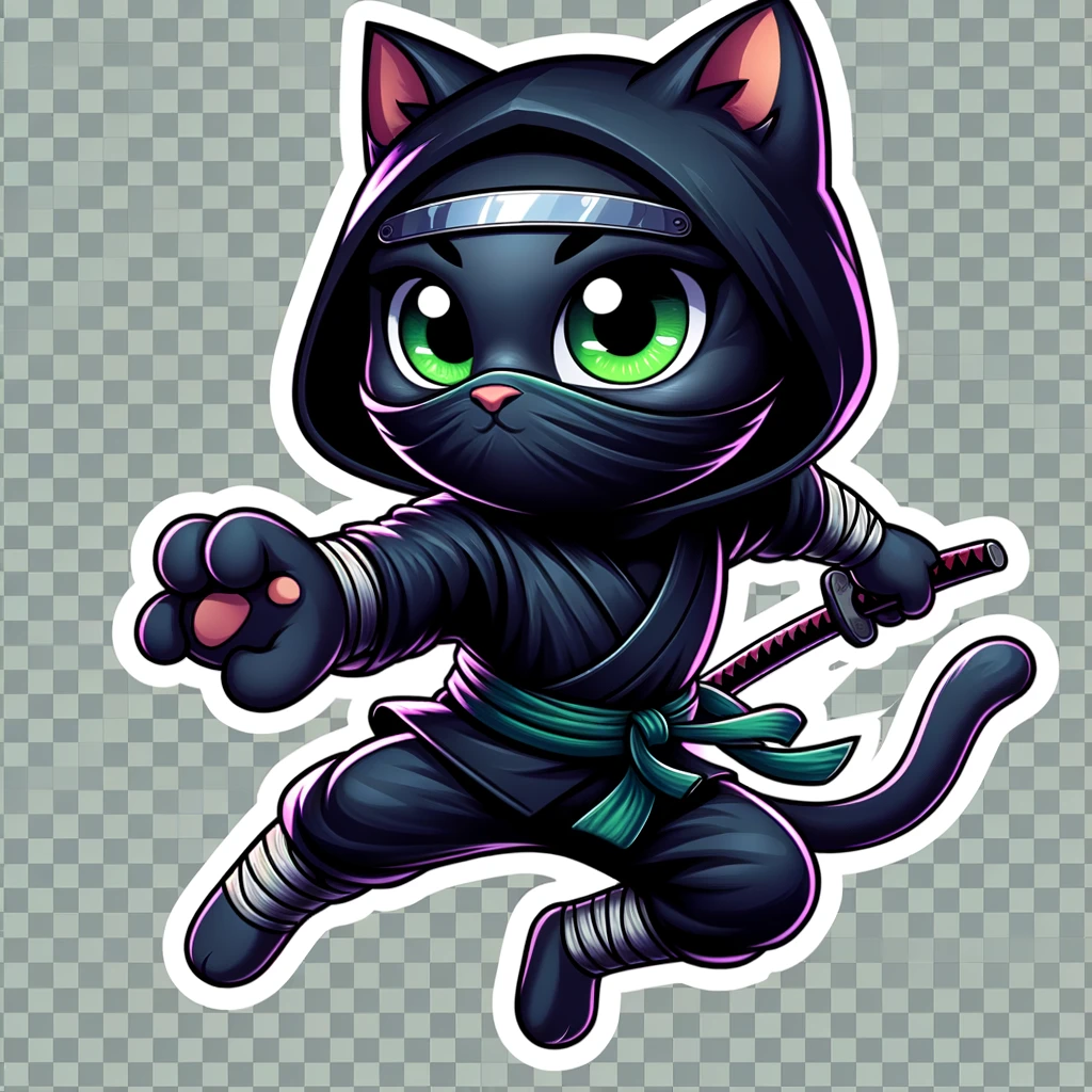
I have a few options to deal with that. The first one is to ask for images with flat color backgrounds. Then, all you need to do is to put that image on top of something that has the same color as the background. Voilà! You can know have this image in any aspect ratio you want.
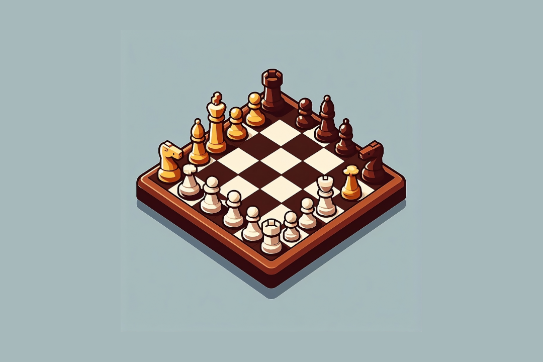
It’s possible that the “flat” background in your AI-generated image will not be super consistent: instead of a single color, you might get a gradient or many shades of the same color. If you put that on top of a flat background, you might see the edges of the image. In this example, parts of image blend with the background better than the others. The lower left corner is visibly using a different shade than the background.
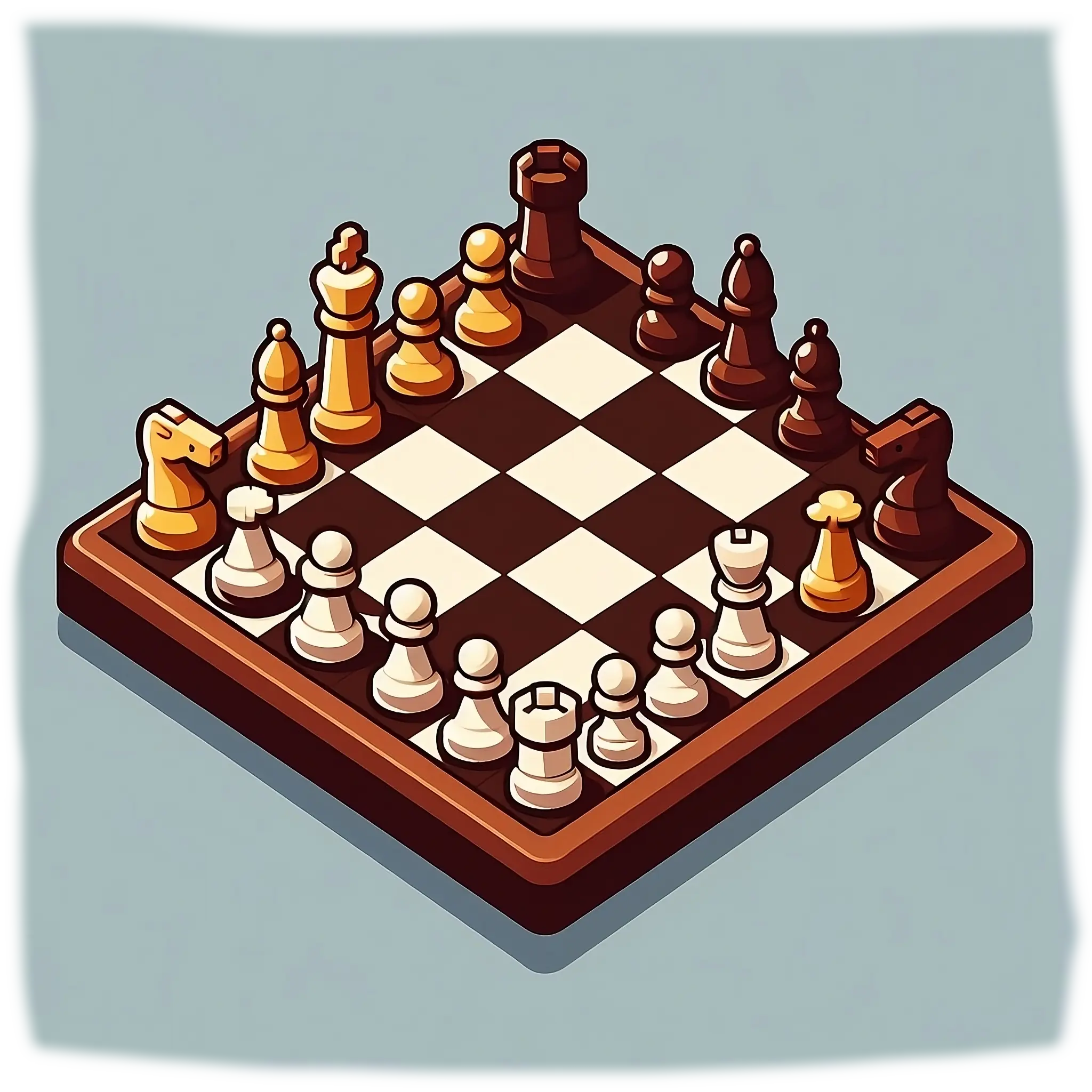
To fix that, you can blur the edges of the image a bit. I used an eraser tool with a gradient or some opacity, so the edges would blend better with flat color in the background.
Alternatively, you can take an image that does have a background (flat or not), and use another AI to remove it. I used https://erase.bg/ and it worked well.

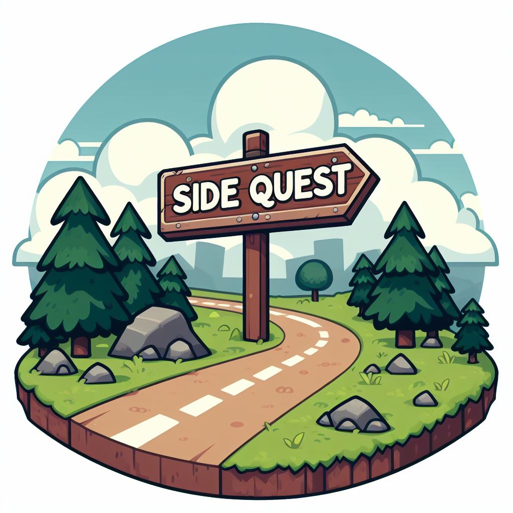
Another tip is to ask AI to generate images that don’t touch the edges of the
canvas. That allows you to easily crop or extend them, if needed. You can prompt
in a vignette*
to get images that live inside a “little island”.
Upscaling
If you need higher-quality images, upscaling the image might be just enough. There are plenty of AIs available to upscale images. I like using https://upscale.media/ because it can upscale up to 4 times and it has an “AI-enhance” feature that makes the final result smoother and better looking than just upscaling it.
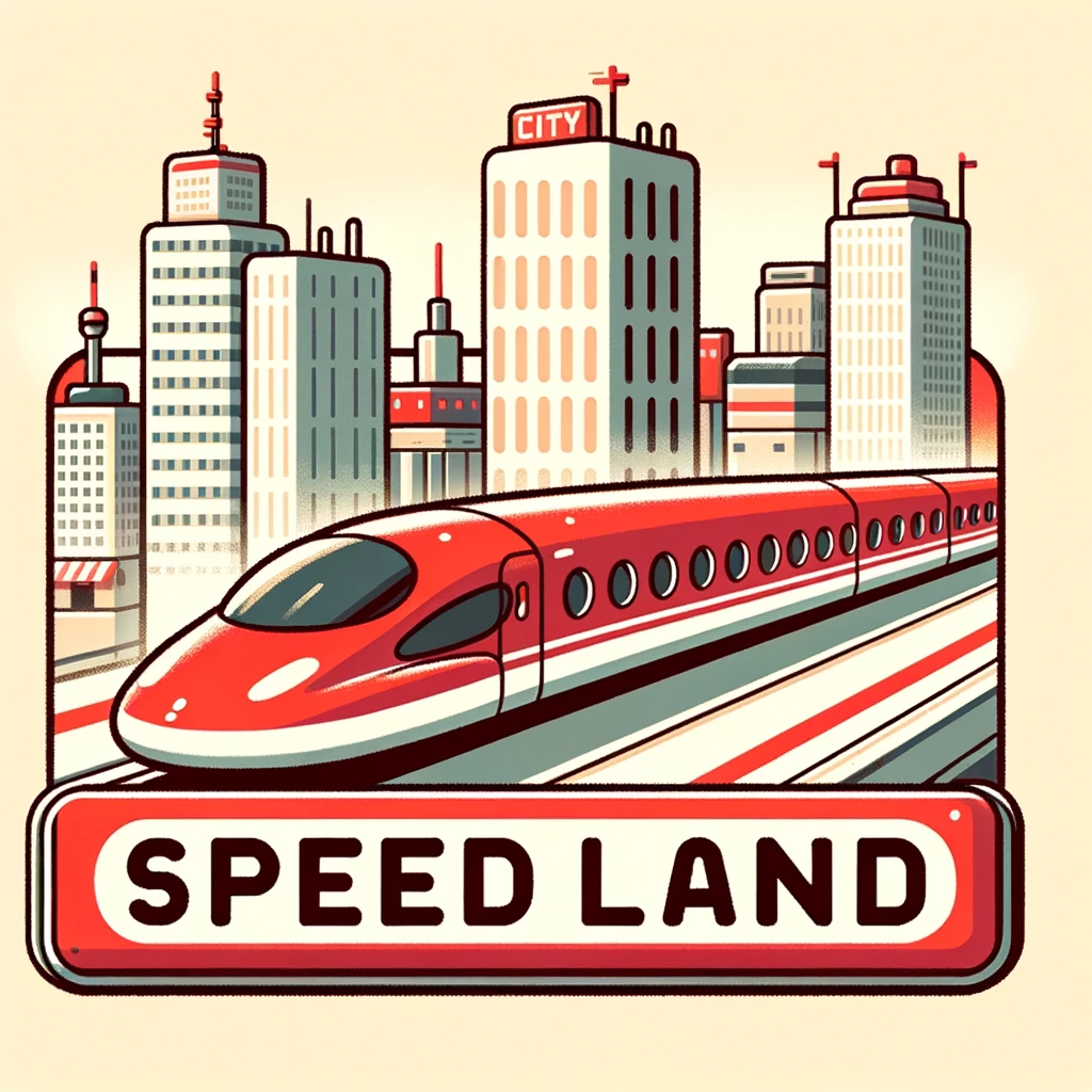
Check the upscaled version:
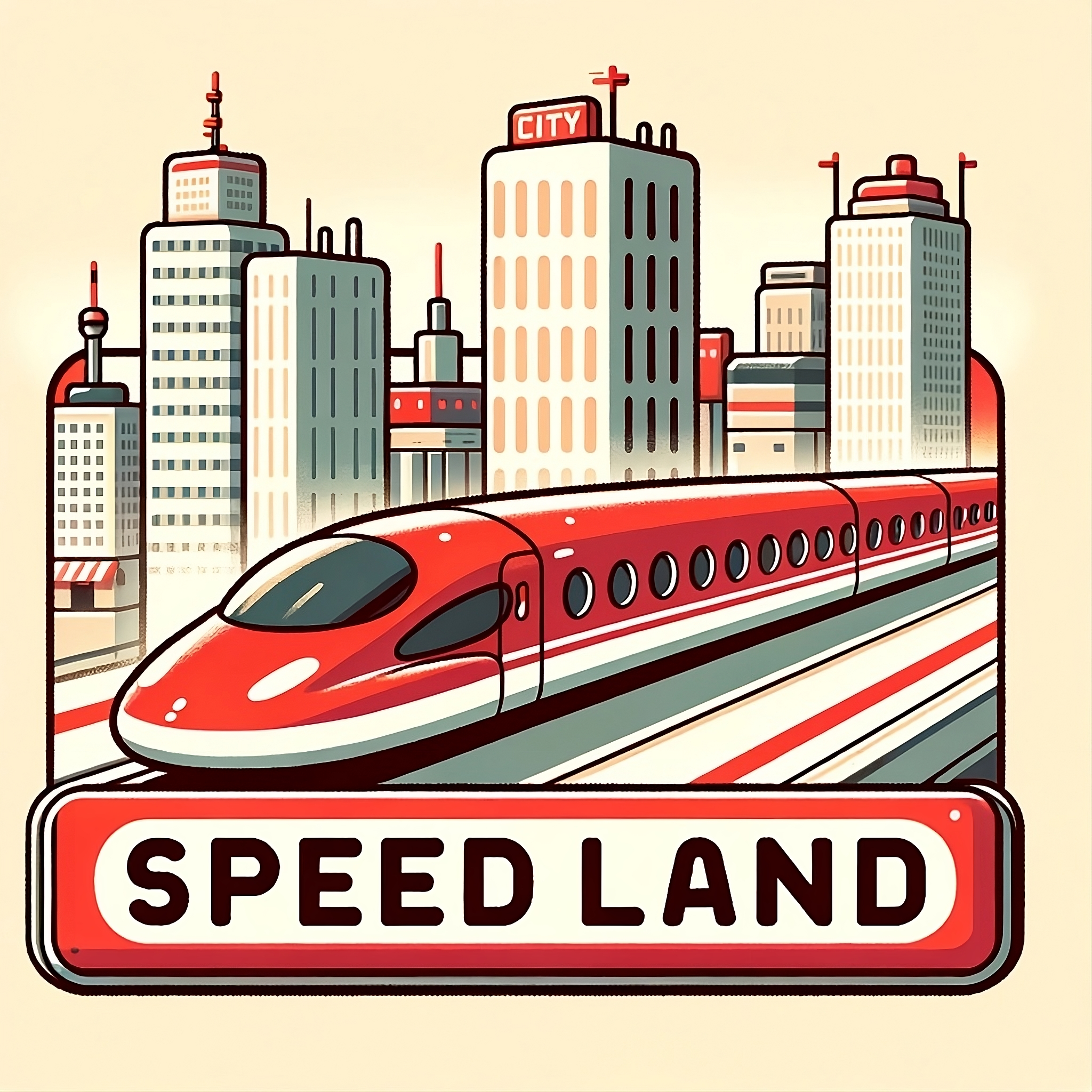
Feel free to use any other upscaling service you like. They’re not sponsoring me in any way (I wish they were), I just like their service.
Extending
If you need images in a different aspect ratio (like 16:9), extending the image might be the solution. There are some AIs that can extend images, but in my experience, none of them were very good. The results were inconsistent, or just plain bad. You could easily spot the generated parts because they looked different and out of place.
See this example of an extended image. Both the left and right sides were extended and contain inconsistent art and overall weirdness (especially the upper-right corner).

If you can, try extending as few parts of the image as possible. I couldn’t get this to look very good, so I worked around it by blurring the generated parts. The center of the image was the focus, so I blurred the edges. You can use any kind of blur you want (gaussian, focus, motion, etc), but in this case, I used GIMP’s Mean Curvature Blur. It helped smooth out some of the rough parts, and it worked with the cartoon-styled art.

If you pay attention, the weirdness is still there, but I did some dry runs of my talk and no one noticed it. Unless someone looks very closely, they won’t notice that, so don’t overthink it.
It’s also possible to extend an image by copying its sides. This is particularly effective on symmetric images. Adding some blurring to the copied parts can help smooth out the transitions. Here, I just cloned the sides of the image until it reached the aspect ratio I wanted.

Cleaning Up
As you saw in the previous examples, AI-generated images are not perfect. Having some skills with image editors will help you a lot. For example, I liked one of the images generated but wanted to use a different text. I used GIMP’s clone tool to erase the text, so I could add my own on top of it.

Another use case I had was fixing some weird stuff that the AI created. I didn’t like the face in the Statue of Liberty picture in this example, so I erased some bits again using the clone tool.

As I mentioned before, images with AI-removed backgrounds may still contain some background bits. This is a good chance to fix that manually with usual image editing tools.
All that said, keep in mind that, as with many things, getting it right from the source is the best way to achieve good results.
Thoughts
It’s funny how AI sometimes fails to do what computers do best: being
consistent. You ask for a flat color bg, and it gives you one that looks like
one color, but it’s tens of slightly different shades of that color (if you
color pick, you’ll get different values). Or you might ask for something very
specific like Don’t add text
or Don’t draw faces
and that’s exactly
what it does 🤦🏽♂️.
While it wasn’t effortless to get the images I wanted, the final result was worth it. It required a lot of prompting, and some manual work to get things right but I’m happy with the final result.
It was interesting to experience that, like LLMs for code, generating images also required iteration and manual work. They helped me augment my abilities, but they didn’t replace them.
