Accessibility and inclusive design checklist
Everyone, regardless of device, circumstance, or ability, should be able to read, and take action on your content. This is increasingly more important as more and more services necessary to living everyday life digitize: paying your bills, buying groceries, talking with friends, etc. Some of the best things you can do to improve your product’s accessibility are also some of the easiest. Following is a list of items you can audit yourself:
Language support
Provide a document language
Programmatically specifying a document language lets screen readers know how to properly pronounce your content.
Be sure to also identify sections where the language changes, such as quotes or foreign phrases. If your app is localized, the programatic identification should update when the language updates.

Document structure
Section your content
Break up sections of content into easily-digestible “chunks” of related information. Both headings and landmarks can do this. For headings, ensure that they describe the content they contain, and are ordered in a logical manner.
Colors
Use proper color contrast
The ratio between the foreground color of your content and the background color it is placed on top of must have a ratio that helps guarantee it can be read in low vision scenarios.
Tools such as WebAIM’s Contrast Checker and Stark can help you determine if the ratio you are using is sufficient.

Images and visual media
Describe your images
Most images should include an alternative description, for those who cannot see it. An alternate (also known as alt) description should succinctly describe the content of the image.
The W3C’s WAI Web Accessibility Tutorials provides an alt decision tree to help you determine what images need a description.

Video content
Provide captions and transcripts
Video content that includes audio should display synchronized captions. Caption content should include speech, but also relevant sound effects and music.
Transcripts are also important to provide, especially for longer-form audio such as podcasts.

Form items
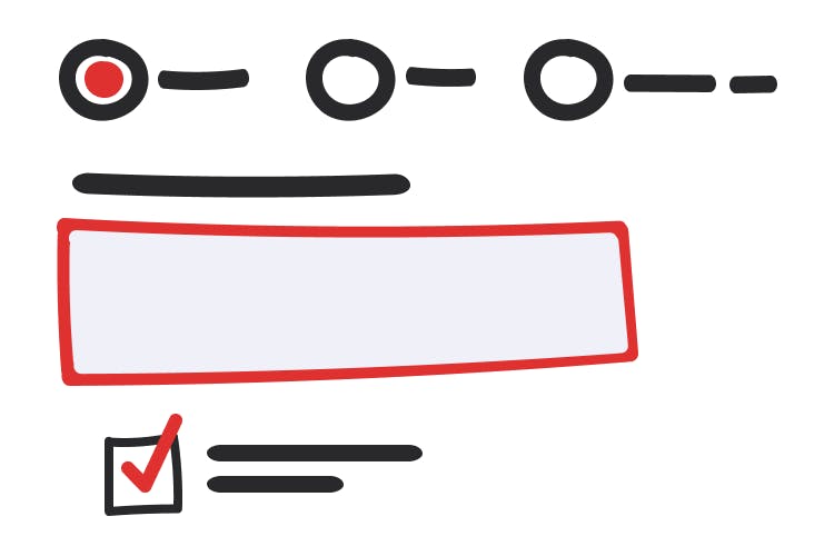
Give inputs labels
Checkboxes, radio buttons, and single and multiline text inputs all need to have a label programmatically associated with them. The label provides a description of what the input is for. Labels should be concise and describe what kind of input the form represents (ex:“Phone number”).
