GasBuddy
Bringing an app with millions of users into the modern age of mobile design
Challenge
Modernizing mobile app
Outcome
Increased user engagement, successful product redesign launch
Image of the GasBuddy project
Who is Gas Buddy?
Founded in 2000, Gas Buddy connects more than 60 million users with real-time, accurate fuel pricing information from over 140,000 unique stations in the United States, Canada, and Australia.
GasBuddy's mobile apps were first released in 2010, and have been downloaded over 60 million times.
GasBuddy was ready to move toward a future beyond just fuel prices, allowing users to find reliable reviews of gas station amenities and services, get special discounts, learn more about retailers and services, make ratings and recommendations, connect with other users, complete purchases, and much more.
With a rebrand in progress to support this new future, we worked with GasBuddy to improve their existing iOS and Android interfaces and user experiences to bring them into the modern age of mobile design, and find a system that would allow new features to be added logically.
Defining the sprint goals
Stakeholders from the GasBuddy team met with us to start the project off with a Product Design Sprint.
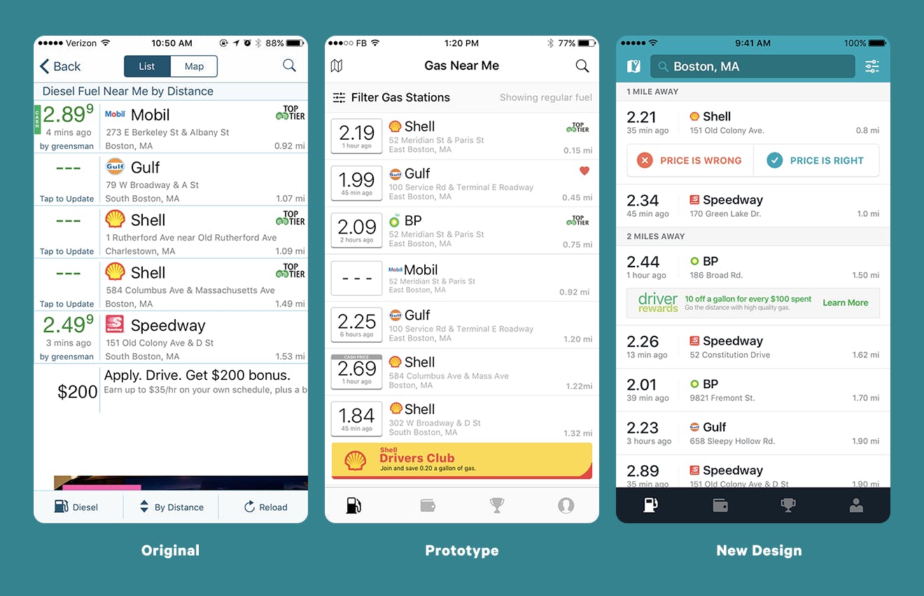
The team went into the sprint focused on developing design patterns to increase engagement, highlight functionality, and to make future changes easier. We interviewed GasBuddy “Power Users” to learn how the app was being used already. With the help of these interviews and insight from the GasBuddy team, we determined that moving the app’s architecture away from a bloated and cluttered home screen would improve the overall user experience and alleviate some of the product development struggles.
Image of the GasBuddy project
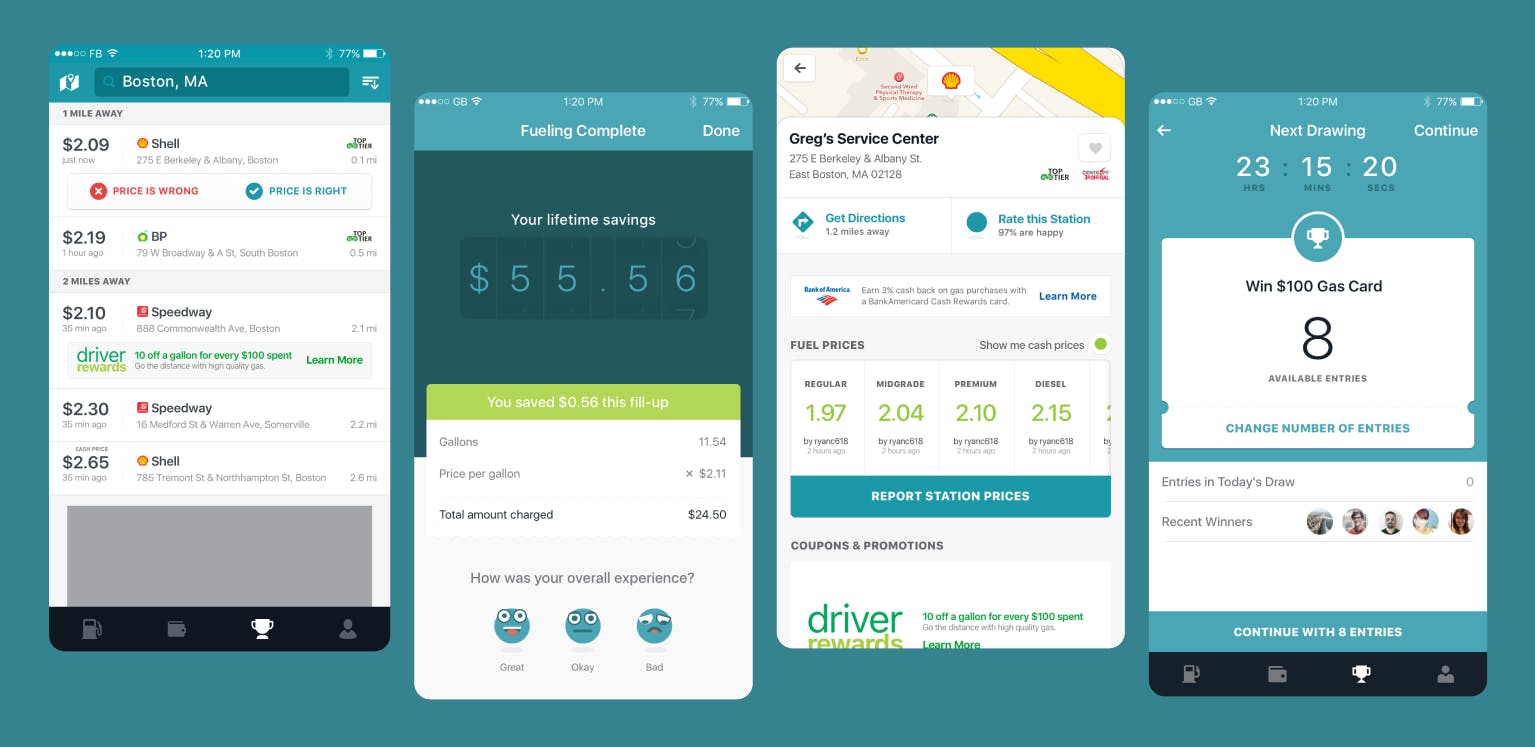
Getting the prototype in front of users
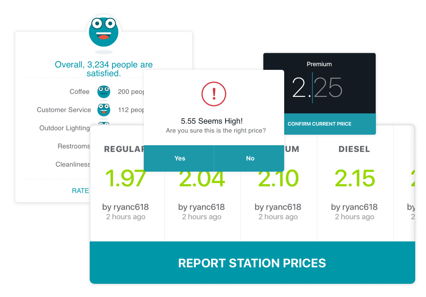
In the prototype, we introduced a major navigation and information architecture change by moving away from the home screen to a tab bar. In addition to getting users right to the “Find Gas” view, the tab bar also surfaced previously buried features like Challenges. And, we worked on increasing price reporting by making the calls-to-action to report prices clearer and more enticing.
We tested our prototype with both current and new GasBuddy users. We went through scenarios and tasks with each participant and interviewed them about their current driving and gas purchasing habits. Through prototyping and testing, we were able to rapidly validate and invalidate our assumptions, and confidently move forward with the rest of the design.
Image of the GasBuddy project
What happened after the sprint
The results of the sprint gave us a clear path forward through the rest of the project
While our prototype was generally well received, we had plenty of pieces to improve and more screens to build out. We continued to work iteratively and collaboratively with the GasBuddy team, holding daily standups and sharing in progress work in Marvel to collect feedback and improve designs. Once we felt a design was ready, we used UserTesting.com to put it in front of people and continue to improve our designs.
When it was time to execute on the redesign, we used Zeplin to communicate and collaborate with the GasBuddy mobile developers who would be implementing the new design.
By decluttering the interface and using native design patterns, we increased feature discoverability and engagement across the app. We quickly collected feedback and made changes before our designs were developed by testing them along the way. We worked with their team’s designers to bring together their new brand while establishing design patterns that allow for easier future development and design. The user experience overhaul and new design system set Gasbuddy up for both a successful redesign launch and for continued product improvements as their internal design team grows.